📸 SNAPSHOT - Issue 111
Welcome to a brand new Issue of my Magazine. A truly brilliant one, enjoy the read :)
In partnership with

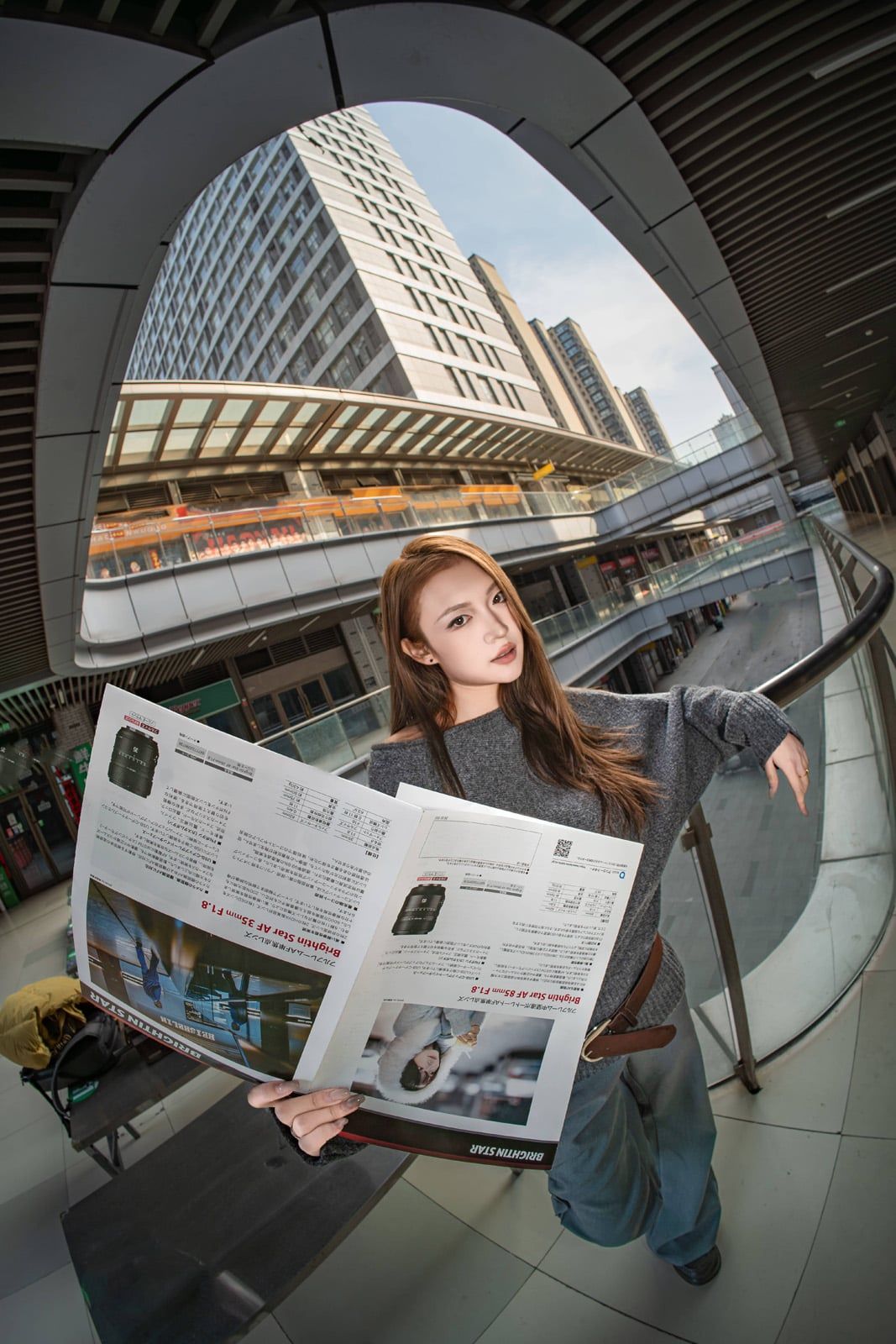
Brightin Star’s New 11mm f/2.8 II - A Closer Look
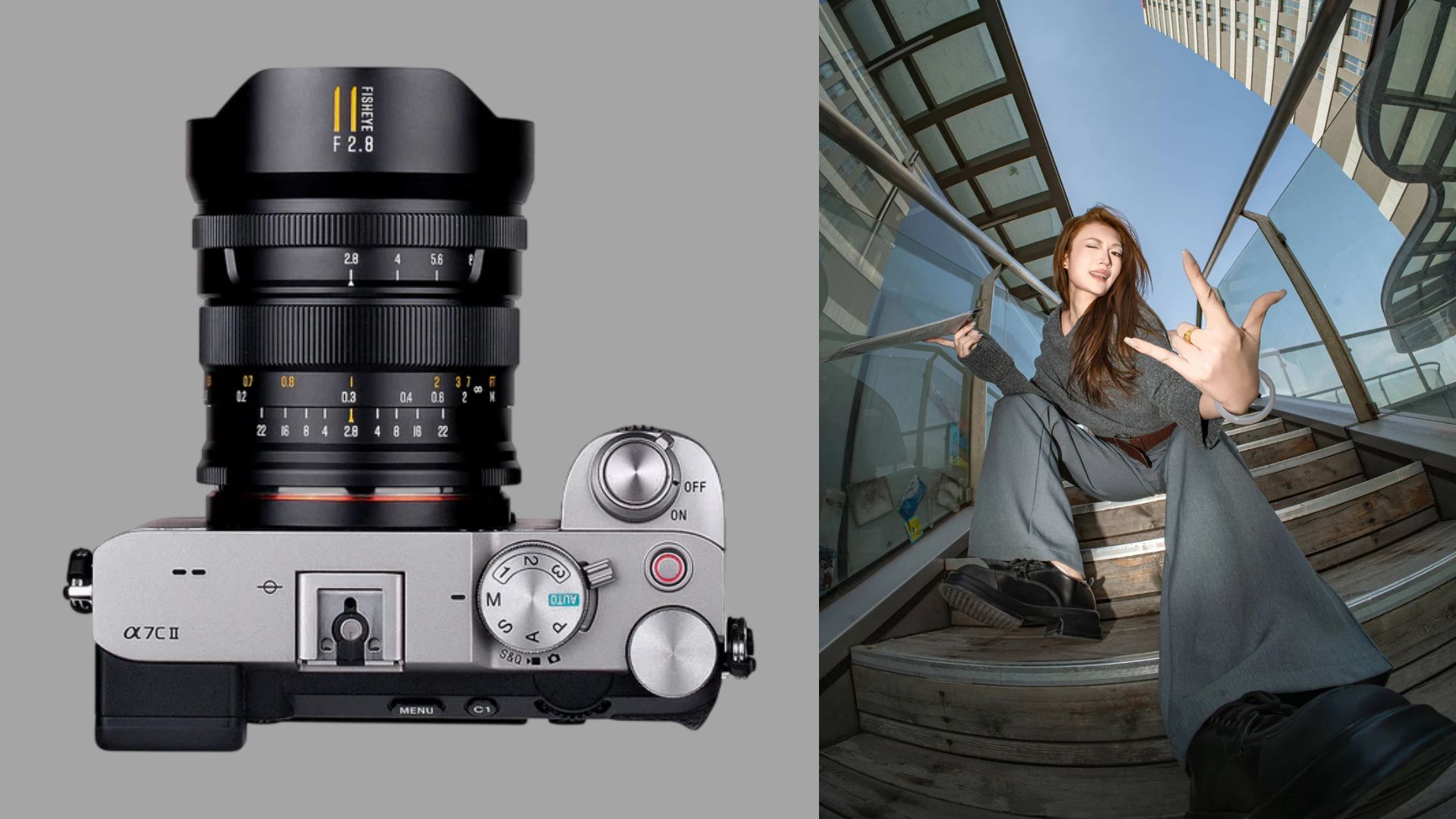
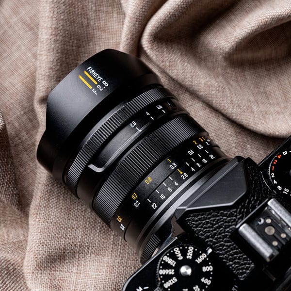
Brightin Star has officially announced the MF 11mm f/2.8 II, a follow-up to its ultra-wide prime that brings some design changes and optical updates to the lineup. The overall idea stays the same, but the company has tried to refine both handling and image quality this time around.
The standout feature is still the field of view. At 182 degrees, this is a very wide lens, even by ultra-wide standards. It is built for capturing as much of a scene as possible in a single frame, which makes it a good fit for things like landscapes, architecture, or more experimental shots where distortion becomes part of the look.
The lens has an aperture range of f/2.8 to f/22, so it is flexible enough for different lighting conditions, while also giving some control over depth of field. It uses an eight-blade aperture, which should produce fairly defined starbursts when shooting point light sources at smaller apertures.
On the optical side, the lens is made up of 11 elements in eight groups and uses IMC coating, which is meant to help with contrast and flare control. Brightin Star says the updated design improves sharpness and overall rendering compared to the previous version, though how noticeable that is in real-world use will likely depend on the situation.
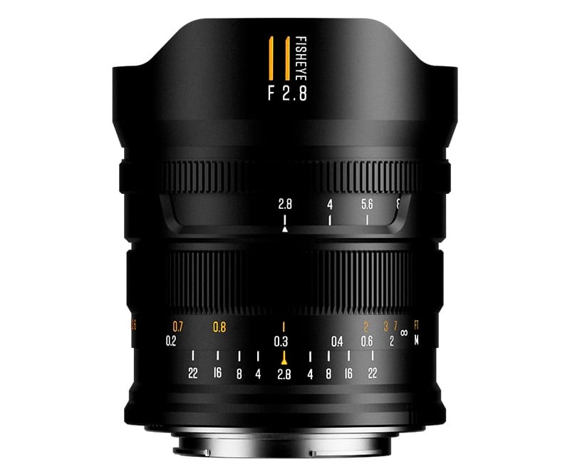
The build is all aluminum, and it comes in at around 550 grams. The design has been cleaned up a bit compared to the earlier version, but it is still very much a manual lens. You get manual focus and a stepless aperture ring, which makes it a bit more usable for video, especially if you want smoother exposure changes.
One interesting detail is the minimum focusing distance, which is under 20 centimetres. That is quite close for a lens this wide and opens up some creative options, especially if you want to exaggerate foreground elements while still capturing a huge background.
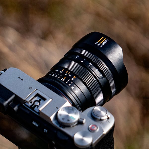
The MF 11mm f/2.8 II is available for Sony E, Nikon Z, Canon RF, and L-Mount systems, so it covers most full-frame mirrorless setups. It is priced at $249.99.
A few sample shots:


Learn The Art Of Photography

Get full and free access to my Creator University - The World’s Best Online University for Photographers & Creatives: Get access to hundreds of amazing photography courses, learn from professional photographers, connect with students and much more!
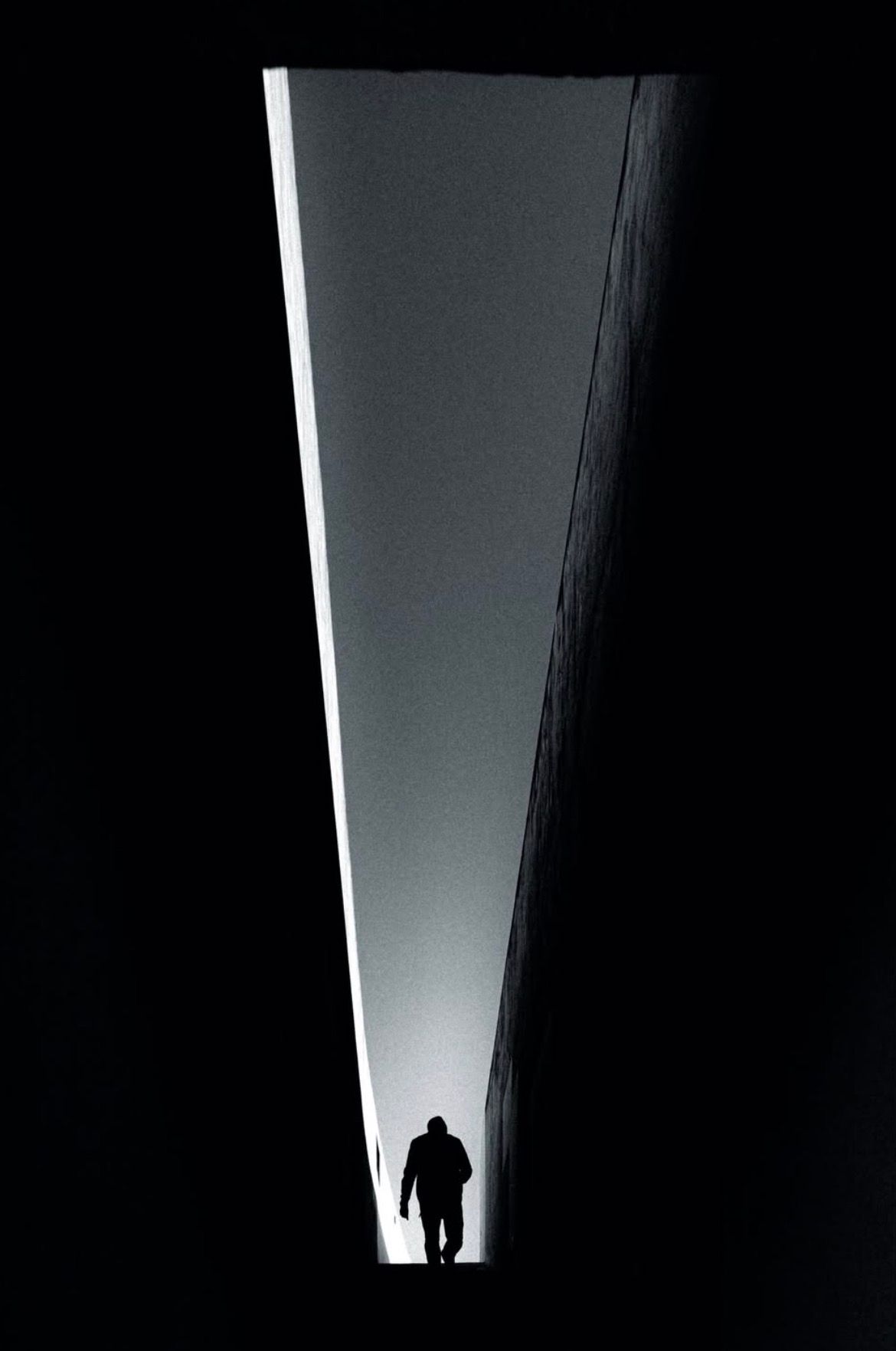
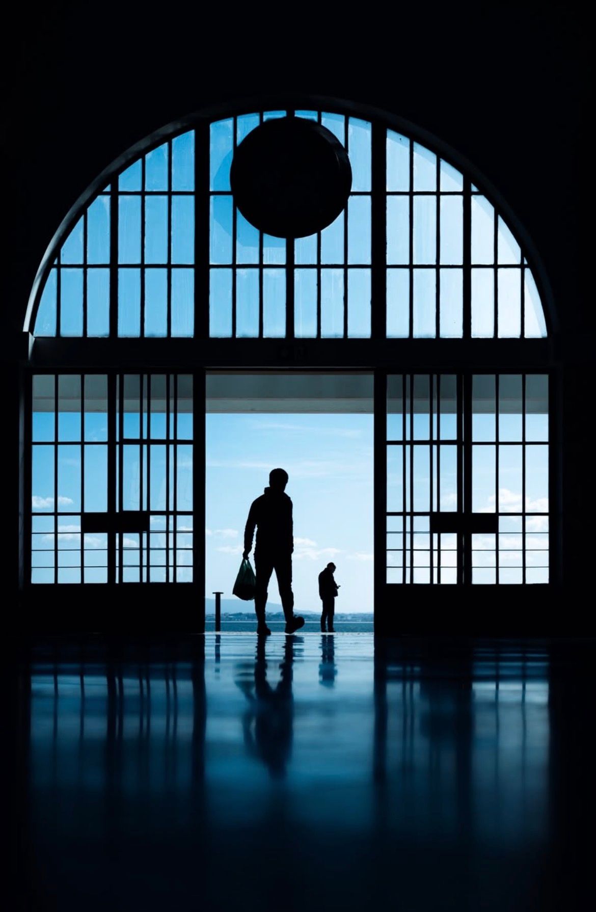
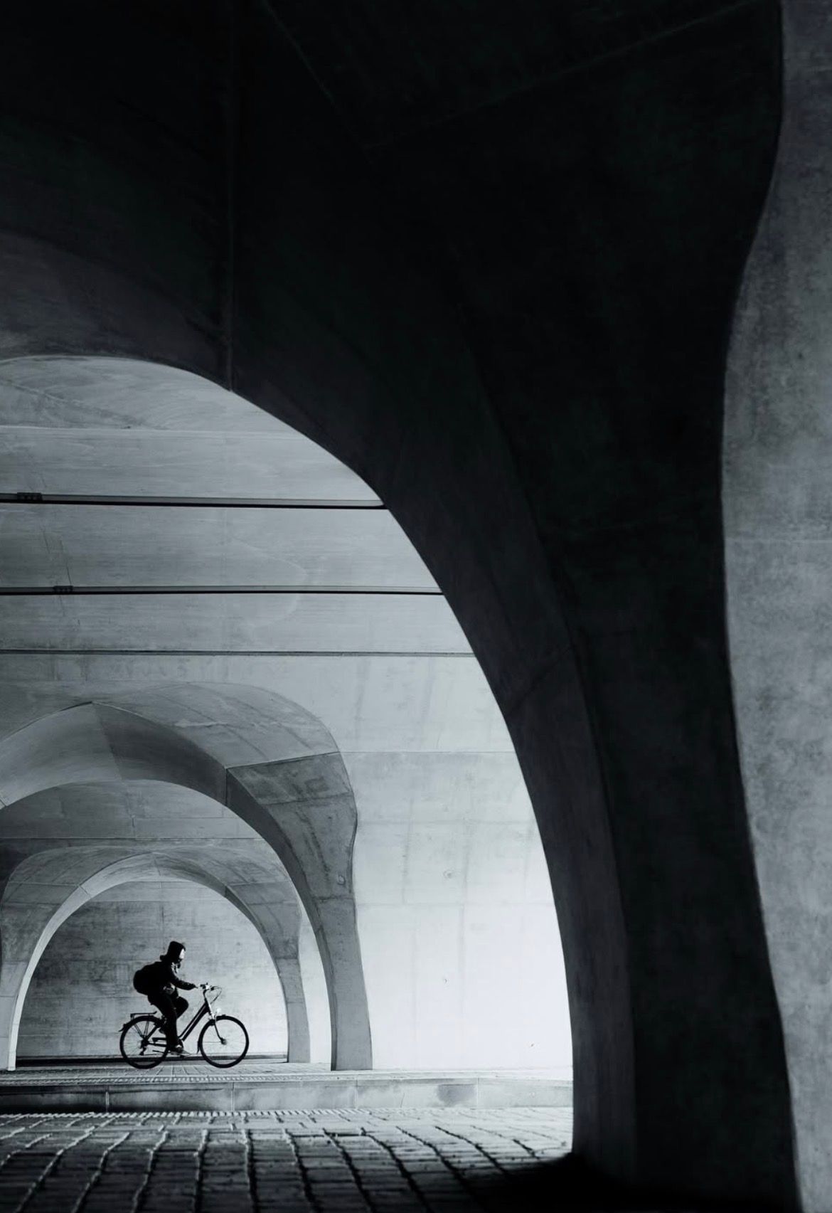
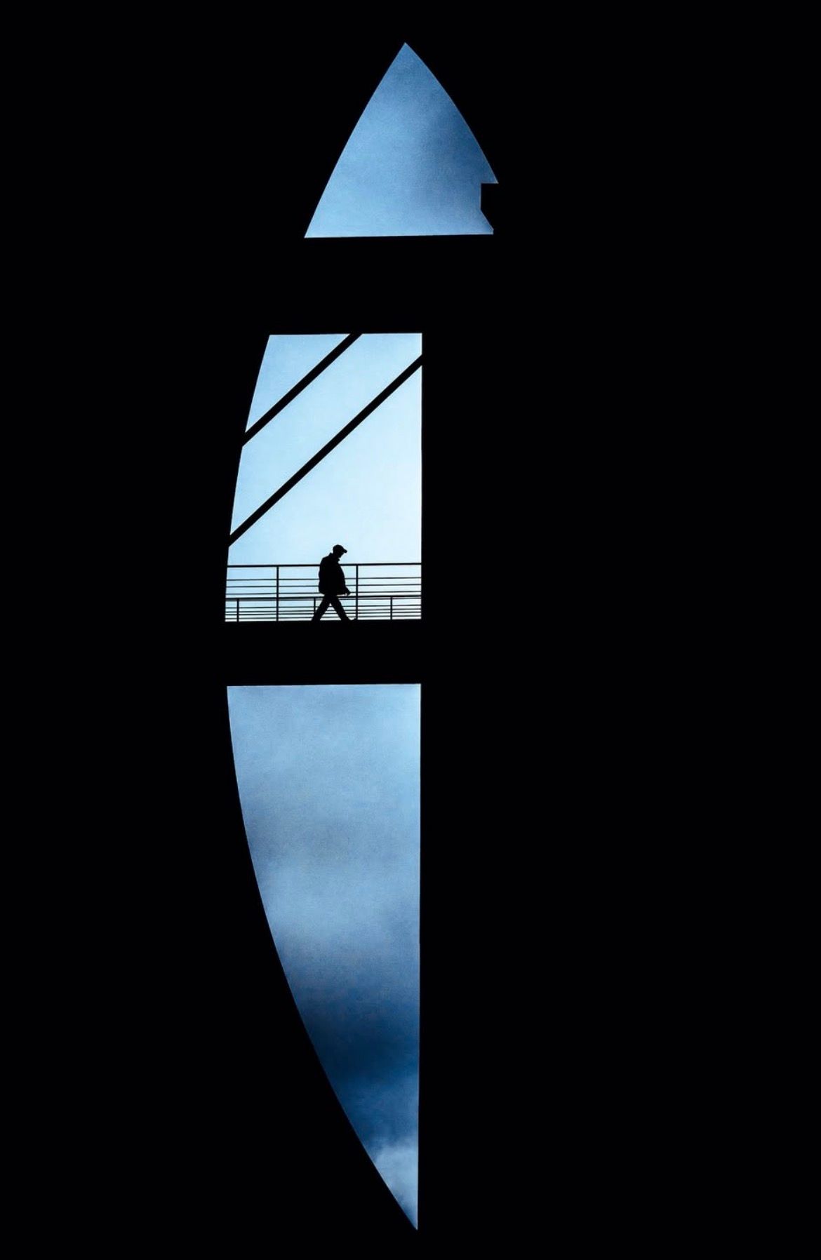
Interview with Marco Wilm
This week’s Interview with Marco, a talented photographer from Germany. I am truly honoured to have had the opportunity to interview him!
You can find him on Instagram as: @marco.wilm
Enjoy the amazing Interview ;)

Can you tell us a bit about yourself?
I’m a Berlin-based Fine Art Street Photographer. My work sits at the intersection of street photography, minimalism, and fine art, with a strong focus on composition, geometry, light, and the relationship between the human figure and urban space. Alongside my photography, I also run international Fine Art Street Photography workshops and I have a background in music, which strongly influences how I think about rhythm, atmosphere, and composition.
How did you first get into photography?
Photography started very intuitively for me. At first, it wasn’t about building a career or developing a style, it was simply about curiosity and the desire to capture something I found visually interesting. Over time, I became more and more aware of what I was naturally drawn to, clean compositions, strong light, minimal scenes, and moments where a person interacts with their environment in a meaningful way. That’s when it shifted from a hobby into something deeper.
What are your favourite shooting conditions?
I’m drawn both to strong, direct light and to softer, overcast conditions. Hard sunlight with deep shadows can create very graphic, high-contrast scenes, while cloudy days often bring a quieter, more atmospheric mood that I also really enjoy. That said, I don’t really think in terms of “good” or “bad” conditions. Every situation has its own visual potential. Overcast light can be perfect for softer, more minimal compositions. Rain introduces reflections and an added sense of depth. Night creates isolation, contrast, and a very distinct atmosphere.
What is your favourite photography location right now?
I’m less attached to specific cities and more to certain types of environments. I’m especially drawn to places with strong, clean architecture, spaces that offer clear lines, interesting geometry, and a sense of openness. That being said, cities like Berlin, Copenhagen, Paris, or Antwerp offer a lot of visual potential because they combine architectural diversity with human movement. But ultimately, I believe a strong image can be made almost anywhere. It’s less about the location and more about how you see and interpret it.
What does photography mean to you?
Photography is a way of understanding and shaping the world. It allows me to take something complex and chaotic, like a city, and reduce it into something clear, structured, and meaningful. It’s a process of observation, selection, and refinement. At the same time, it’s also a very personal process. The way I compose, what I include, what I leave out, these decisions reflect how I see and feel. So photography becomes a form of expression, but in a quiet, controlled way.
What gear do you use?
I use a Sony A7R V, mainly because of its high resolution, reliability, and overall performance. It allows me to work precisely and gives me flexibility in post-processing. In terms of lenses, I often use zoom lenses like a 20–70mm or 70–200mm, depending on the situation. They allow me to adapt quickly and refine my framing without losing the moment.
Do you prefer shooting in the chaos of a busy street or in quieter, more intimate spaces?
I definitely lean towards quieter, more controlled environments. While busy streets can be exciting, they often come with a lot of visual noise. I’m more interested in clarity, structure, and intentional composition. Quieter spaces give me more control over the frame and allow me to reduce distractions. I often look for clean backgrounds or architectural scenes and then wait for the right person to enter the frame. That approach requires patience, but it aligns much more with my visual language.
Can you walk us through your editing process?
My editing process is quite intentional but also intuitive. I start by selecting very carefully. Most images don’t make it through this stage. I’m very critical and only keep images where composition, light, and moment truly work together. When editing, I focus on enhancing what is already there while giving my creativity and intuition the freedom to explore new possibilities. Color plays an important role, so I often refine tones to create a consistent and calm atmosphere. I usually lean towards cold, blue tones, which has become an important part of my overall style.
How do you decide on what moments to capture and which ones not? Or do you just shoot everything?
I don’t shoot everything. My approach is quite selective. Usually, I find a scene first, something that has strong compositional potential, and then I wait for the right moment. I’m not reacting randomly to everything happening around me. I’m anticipating. I look for alignment: the right person, in the right position, interacting with the scene in a way that completes the composition. If that alignment isn’t there, I often don’t take the shot. That doesn’t mean I never experiment, but in general, I try to be intentional. It’s less about quantity and more about precision.
What are some of your favourite photography techniques and why?
Some of the techniques I use most are rooted in composition. Framing and sub-framing are very important to me, using architectural elements to guide the viewer’s eye and create layers within the image. Geometry and symmetry also play a big role, as they create structure and balance. I also work a lot with light and shadow as compositional elements. Light is not just illumination, it becomes part of the design. A shadow can define a shape, isolate a subject, or create tension.
Another key aspect is timing. Even in a very controlled composition, the human element is unpredictable. Capturing the exact moment where everything aligns is essential.
How did you find your unique photography style?
I think finding a unique style is rarely a single moment. It is usually a slow process of reduction, obsession, experimentation, and repetition. In my case, it developed over years of shooting, failing, refining, and becoming more honest about what truly moves me visually.
At the beginning, I was photographing many different things and trying out different approaches, which I think is a very important phase for every artist. But over time, I noticed that I was always drawn back to the same elements: strong geometry, minimal compositions, clean structure, the relationship between architecture and the human figure, and moments where everything aligns for just a fraction of a second. I became less interested in simply documenting what was in front of me and more interested in creating fine art images that feel timeless, intentional, and emotionally deep.
A big part of finding my style was also learning to trust what I naturally respond to. I realized that I am not attracted to visual chaos. I am attracted to order, tension, balance, negative space, subtle color harmony, and very precise compositions. At the same time, I did not want to create images that felt cold or empty. The human presence became essential, because it adds emotion, scale, unpredictability, and life. That balance between control and unpredictability is at the heart of my work. So my style came from combining several worlds that genuinely feel like me: the candid nature of street photography, the formal precision of fine art, the reduction of minimalism, and the emotional atmosphere of cinematic light and color. Over time, these influences stopped feeling like separate ingredients and became one language.
Do you see yourself as a street photographer, minimalism photographer, …? And why?
I would describe myself primarily as a Fine Art Street Photographer. Street photography is definitely the foundation of what I do, because my work is rooted in real public space, unposed moments, and the unpredictability of life. I do not stage the people in my images. The human element is candid, and that is very important to me. That spontaneity gives the image authenticity and tension. It is what makes the process exciting, because no matter how carefully I study a location, I can never fully control the decisive human moment.
At the same time, I do not see my work as traditional street photography in the classic documentary sense. My intention is usually not to capture social reality in a raw or journalistic way. I am more interested in transforming reality into something poetic, graphical, calm, and timeless. That is where the fine art aspect comes in. I am searching for images that go beyond observation and become visual statements, images that feel carefully distilled, almost like visual poems.
Minimalism is also a very important part of my visual language. I am deeply drawn to reduction. I like removing distractions and creating compositions where every element has a purpose. In my work, less is often more. Negative space, clean backgrounds, isolated figures, and restrained color palettes help create tension and clarity.
How do you decide whether or not a photo is better in black and white or colour?
For me, that decision depends entirely on what carries the image. If the image is built primarily on shape, light, contrast, gesture, and composition, then black and white can often strengthen it. By removing color, you remove one layer of information, which allows the viewer to focus more directly on structure, emotion, and form. Black and white can make an image feel more distilled, more timeless, and sometimes more powerful.
But if color is an active part of the image, if it creates the mood, the tension, the harmony, or the emotional identity of the frame, then converting it to black and white would actually weaken it. In many of my photographs, color is not just decoration. It is part of the composition. A soft blue wall, a warm light against a cool background, or a subtle dialogue between tones can completely define the image. In those cases, color is essential.
What I usually ask myself is what is the soul of this photo? Is it the geometry and contrast? Or is it the atmosphere created by color? Does color add something meaningful, or does it distract? Does black and white intensify the frame, or flatten it?
What’s the most challenging thing about photography for you?
The most challenging thing for me is that photography asks for two opposite qualities at the same time: absolute control and total openness.
On one hand, my work depends heavily on precision. I care deeply about composition, balance, alignment, and the exact placement of elements within the frame. I often spend a long time studying a scene, searching for the right angle, refining the geometry, and waiting for the visual structure to feel right. My standards are very high, and I know very clearly when something is slightly off.
On the other hand, because I work with real life and candid moments, I also have to accept uncertainty and that I might miss a moment. I cannot fully control who enters the frame, how they move, whether the light changes, whether the perfect moment lasts half a second or never happens at all. That tension between precision and unpredictability is what makes this genre so difficult, and also so addictive.
Can you walk us through a typical shooting day?
A typical shooting day usually starts before I even leave the house, because a lot of the process begins mentally. Especially when I’m travelling. I often already have certain locations, light situations, weather moods, or visual ideas in mind. I may revisit places I know well, or explore new ones, but even when I go to a familiar location, I remain open to surprise and also constantly push myself to find new angles. I do not like approaching a day with a rigid shot list. I prefer to arrive prepared, but receptive.
Once I am out, I walk a lot. Observation is a huge part of my process. I am constantly scanning for potential scenes, interesting architecture, clean backgrounds, strong light, reflections, shadows, layers, shapes, or places where a human figure might interact beautifully with the environment. Sometimes I follow an interesting character until I find the right background to match, however, most times, I find a scene first and then wait for the right subject to enter it.
What is your favourite subject to shoot?
My favourite subject is the relationship between the human figure and urban space. I am especially fascinated by moments where a person seems to complete a composition that already exists architecturally. A wall, a staircase, a passage, a shadow, a facade, a reflection, these elements can create a visual stage, but it is often the person entering that stage that gives the image its emotional charge. The human subject brings scale, fragility, tension, and narrative possibility.
Do you listen to music during your creative process and if yes how do you think it influences you?
Music plays a very important role in my life, and I also come from a musical background. It has definitely shaped the way I perceive rhythm, atmosphere, and emotion in my work and also influences my compositions and sense of space in my photos.
However, when I’m out shooting, I never listen to music. For me, being fully present is essential. I rely not only on what I see, but also on what I hear, footsteps, conversations, subtle movements. These sounds often help me anticipate moments before they happen. In a way, every city has its own rhythm, its own pulse, and I want to be completely immersed in that. I see the street almost like a living composition, and the natural soundscape is part of how I read and understand it.
When it comes to editing, it’s different. That’s where music becomes a strong companion in my process. It helps me enter a certain emotional state and refine the atmosphere of the images. I’m drawn to artists like James Blake, Olafur Arnalds, Moderat, Radiohead, or Max Richter, music that feels layered, introspective, and atmospheric. But in general, my taste is quite diverse, and I listen to many different genres depending on the mood.
Who are some photographers or other artists that inspire you?
I am inspired by artists who have a clear and unmistakable visual voice, artists whose work feels distilled, intentional, and deeply personal. In photography, I am naturally drawn to people who understand composition, atmosphere, and the emotional power of simplicity. I admire photographers who can create strong visual tension with very little, and who are able to transform ordinary urban moments into something poetic or timeless. But my inspiration does not come only from photography. In many ways, I am equally influenced by architecture, cinema, painting, and music.
How do you know when you’ve nailed the shot? Is it instinct or something else?
It starts with instinct, but it is not instinct alone. Usually, I feel it immediately when something special has happened, a unique unrepeatable moment. There is a kind of inner click, a moment where I know that composition, light, timing, and human presence have aligned in a way that is rare. That first recognition is instinctive. It is almost physical. But after that, there is also a more analytical layer. I look at the frame and ask myself very specific questions:
Is the composition truly balanced? Is every element where it needs to be? Does the person strengthen the image or just occupy it? Is there tension, clarity, atmosphere? Does the image feel resolved?
For me, I know I have nailed the shot when the image feels inevitable. When nothing feels random, unnecessary, or forced. When the composition is clean, the human element feels alive and perfectly placed, and the overall frame carries both visual strength and emotional resonance.
How important is composition in photography?

The rest, 5 more questions of this Interview + an additional exclusive photograph selection, are for Premium subscribers only.
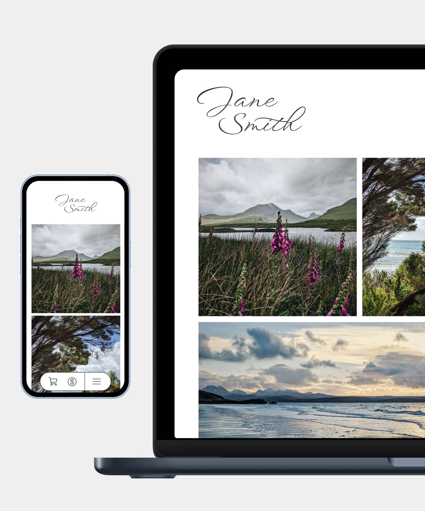
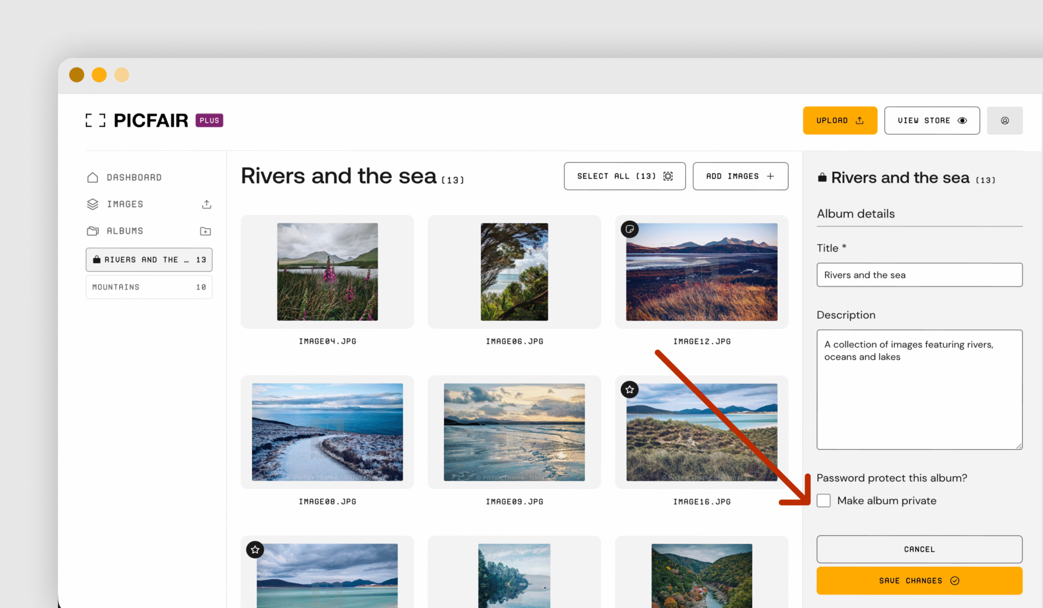
Picfair’s New Private Photo Albums
Picfair is pushing further into the professional and semi-professional side of photography with the introduction of private albums, a new feature meant to handle client delivery and more advanced workflows.
It is a noticeable change for the platform. Picfair has mostly been known as a simple way for hobbyists to build online photography stores, but the company says demand has been changing. More photographers are starting to use it in ways that go beyond just selling images, and that is what this update is responding to.
Picfair itself is essentially a marketplace and store builder that lets photographers sell digital downloads or physical prints through customisable storefronts. It takes care of things like licensing, printing, and global shipping, while you still control how your work is presented and priced. According to the company, more than 1.5 million photographers have signed up worldwide.
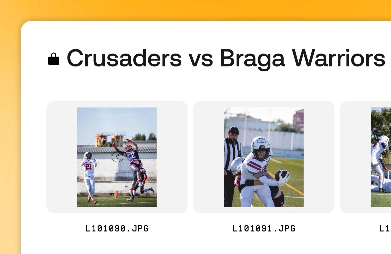
The addition of private albums is tied to what Picfair describes as a growing overlap between those groups. Hobbyists are getting more serious about their work, while professionals are looking for simpler, more affordable tools. In some cases, photographers have already been using Picfair in unintended ways to deliver images to clients.
Founder Benji Lanyado says that trend has been pretty clear. “We’re seeing a fascinating convergence happening. Our hobbyist users are starting to graduate towards more professional practices and habits, they are using better kit and software, and are taking their photography a little more seriously,” he says.
“At the same time, we’ve had thousands of pro and semi-pro photographers sign up to the site over the last few years, ‘hacking’ our store functionality to deliver images to clients, they’re doing it because our setup is simpler and more affordable than the professionally focused tools out there. The hobbyists and the pros have both been asking us for private album functionality, so we’re now delivering it to them.”

The new feature lets photographers create curated galleries that can be shared privately with clients or collaborators, which moves Picfair closer to being a client delivery tool.
Outside of that, the rest of the platform stays the same. Users still have access to different storefront themes, customisation options, and the ability to sell both digital files and prints, with Picfair handling production and shipping.
“We’ve always wanted to be a place where hobbyists can express themselves and grow. But it’s been wonderful to see more pro and semi-pro photographers sign up to the platform. Ultimately, they’re driven by the same things – aspiration, and a passion for photography. We’ll keep building the tools they need to support that journey,” Lanyado says.
Private albums are available now to all Picfair users.
Photography Tip of the Week


The weekly photography tip is only accessible to Premium Subscribers of The Magazine For Photographers.
Photo Analysis
Welcome to the part of the Magazine Issue where we take a closer look at a photo and analyse it so that you can learn and better your own photography from it ;)
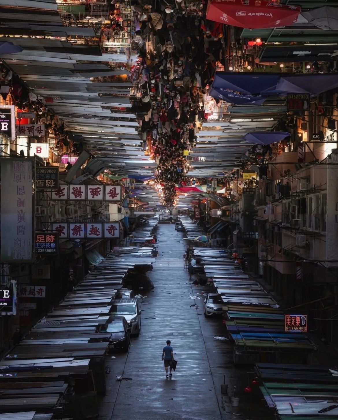
Photo by: @jarvisl.photography
Let’s Analyse this Photo
Composition & Framing
What works well:
The composition/creativity is the standout/special aspect here. We have the mirrored split between the busy market on top and the empty one below which is super striking right away (for those of you that don’t know, this is a pretty famous Hong Kong street market). It pulls you in because it feels very surreal, especially at first glance.
The central street as well as the market stalls act as very strong leading lines guiding your eye straight through the frame and connecting both halves of the photo.
The symmetry works really well too. It is not perfectly 1:1 (obviously things change once the market is actually open), but it is balanced enough that it feels visually satisfying.
Depth is excellent and probably my personal favourite part. What you notice immediately (at least I do) are those four rows of market stalls/the roofs → four roof lines that start in all four edges of the frame and then converge in the centre → this gives the whole thing a really strong 3D look and just this immersive feeling.
What could be better:
Because it is a composite, the transition between the two halves can feel a bit abrupt once you notice it. That can slightly break the illusion, however there are things you can do to kind of mitigate that → make an even better transition between light, tones, colour etc. where the two photos merge.
Light & Atmosphere
What works well:
The contrast in atmosphere between the two halves is really strong. The top feels alive, chaotic, noisy, while the bottom feels quiet and empty.
The lighting supports that contrast nicely too. → brighter and more chaotic above, softer and more subdued below.
The slight nighttime glow from the market lights in the top half adds energy and a sense of life (the bottom shot I guess is the early morning after).
What could be better:
The lighting between the two halves does not perfectly match, which makes the edit slightly more noticeable → obviously this is also kind of wanted → the photographer wanted to show the contrast, but it ties into what I said before → if you want the illusion to really feel ‘really real’ you want to match those two halves in things like light as well as possible.
(In the upper photo) Some highlights are a bit harsh/light sources blow out.
The lower photo feels slightly underexposed in places, especially toward the sides making it loose detail.
Colour & Tone
What works well:
The colours in the top half are rich and varied, which works well with the busy market atmosphere.
The bottom half being more muted works conceptually because it reinforces the idea of the market being closed and lifeless.
What could be better:
The bottom photo could maybe use a bit more tonal separation to avoid feeling too flat.
Story & Emotion
What works well:
This is obviously where the photo really shines. The idea itself is great, showing the same place in two completely different states.
The top half tells the story of energy, commerce, crowd, noise, life, and the bottom half tells the opposite, emptiness, quiet, maybe even a bit of loneliness with only that one man walking.
Together, it feels like a commentary on time, routine, and how places transform throughout the day.
What could be better:
The connection between the person below and the crowd above is not fully explored, meaning it could be interesting if there was a stronger visual or narrative link.
Balance
What works well:
The symmetry helps balance the frame overall, especially along the central axis.
The empty lower half is balanced by the dense upper half ‘conceptually’.
The lone man helps anchor the lower half so it does not feel completely empty.
What could be better:
Visually, the top half still feels heavier due to the crowd, detail, light etc.
Join Our Photographer Group!

Get access to the best photographer group/community for networking, collaborating, gear talk, feedback on your work and so much more!
Something You Have To Check Out
The Matcha That Ruined All Other Matcha

As winter softens into spring, many of us crave energy that feels clean and steady. Not the jittery spike-and-crash kind.
That’s why I keep coming back to Sun Goddess Matcha by Pique. It’s easily the best matcha I’ve tasted.
In a market full of dull, bitter powders, this ceremonial-grade matcha stands apart for both flavor and purity. Crafted by Japanese tea masters and shaded 35% longer, it’s naturally rich in antioxidants and L-theanine to support calm focus and balanced energy.
The result is vibrant, smooth matcha that carries you through brighter mornings and fuller days. No spikes. No crashes. Just sustained energy that works with your body.
If you’re ready for a better morning ritual, try Sun Goddess Matcha here. 🌿🍵
Photographer of the Week
Photographer of the week goes to: Jamie Leach
You can find him on Instagram as: @jbc.photo.uk
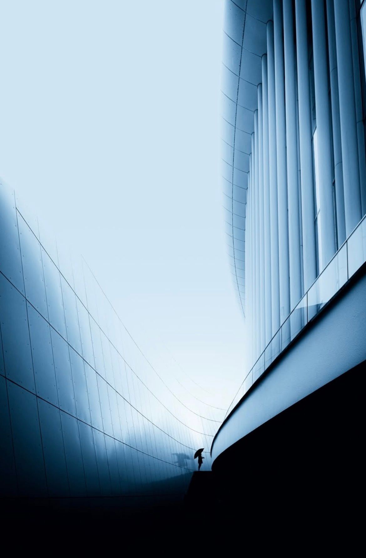
A few photos of his:
Also want your photos featured in the magazine? Become a member here!
The Rest of this Issue is for Premium Subscribers
