📸 SNAPSHOT - Issue 73
Welcome to a brand new Issue of my Magazine. A truly brilliant one, enjoy the read :)

In this Issue
Samyang’s New Prima Lenses - A Closer Look
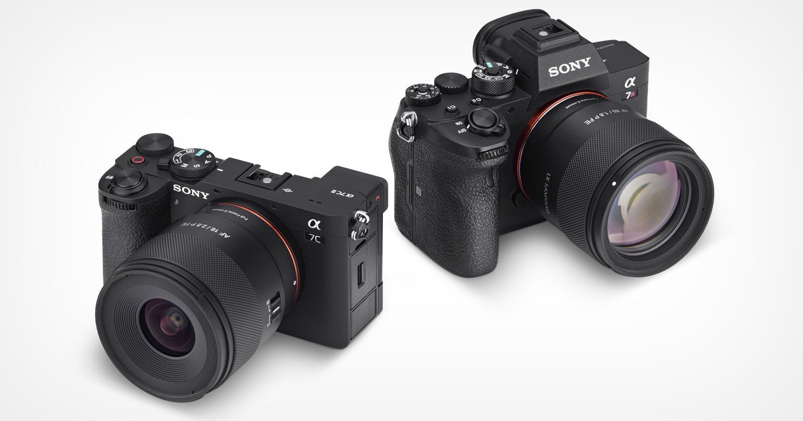
LK Samyang has introduced two new lenses in its Prima series lineup: the AF 16mm f/2.8 P FE and the AF 85mm f/1.8 P FE. These new E-mount lenses follow last year’s 35mm f/1.4 P FE and are designed for photographers and content creators looking for compact, affordable primes without giving up too much on optical quality.
The Prima name, drawn from the Latin word for “first” or “important,” reflects the series’ goal: to offer lightweight, approachable lenses for newer shooters or hybrid creators working across both photography and video. Samyang says the lenses are meant to be the kind that stay on your camera often: reliable, portable, and easy to use.
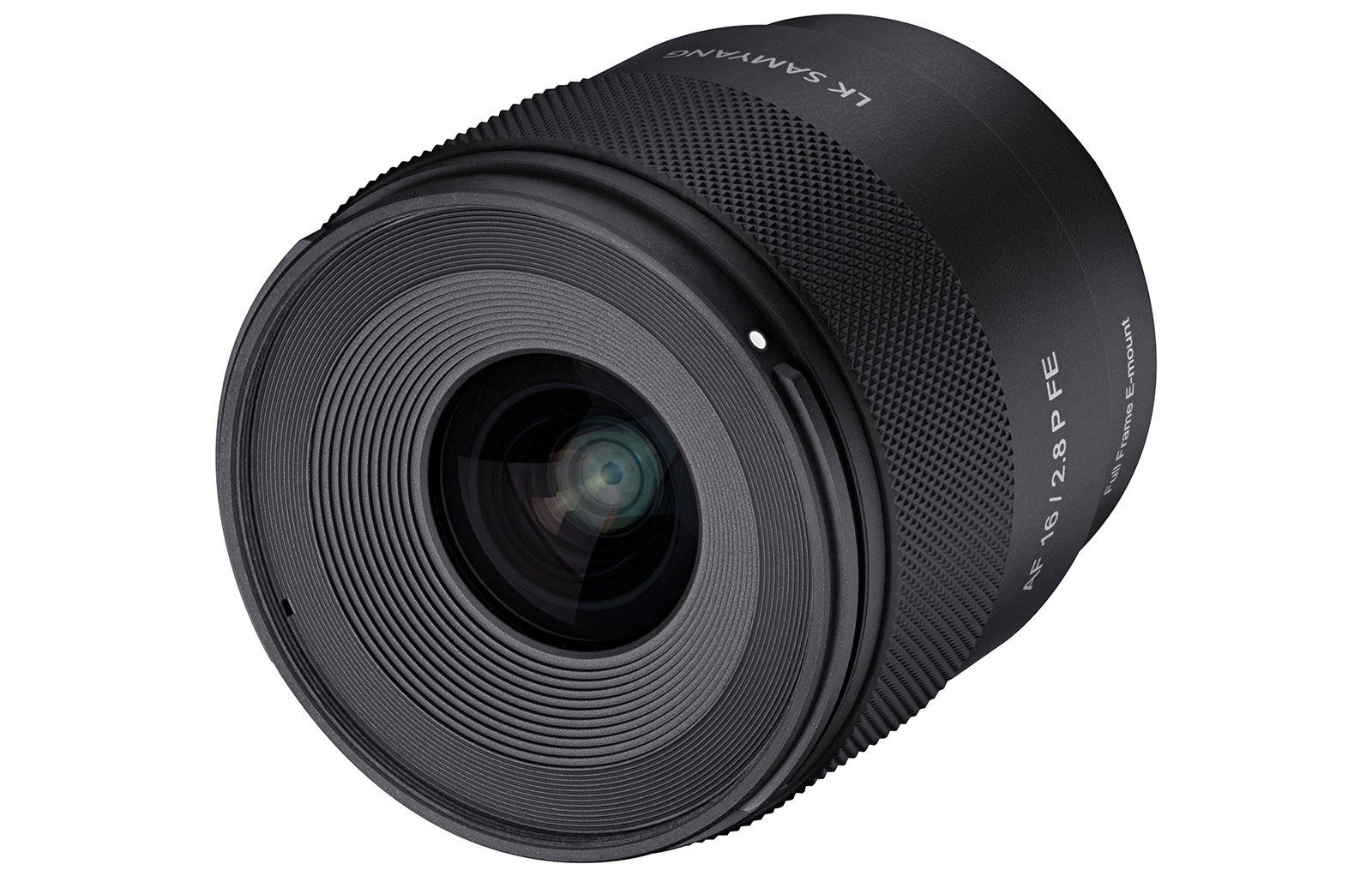
16mm f/2.8 P FE
Both lenses are built from Samyang’s proprietary high-strength engineering plastic. They keep things minimal on the outside, with just an AF/MF switch and a USB-C port hidden in the mount for firmware updates.
A newly designed focus ring with a more tactile surface rounds out the handling improvements. Each lens is also weather-sealed to an IP5 standard, which provides basic dust resistance.
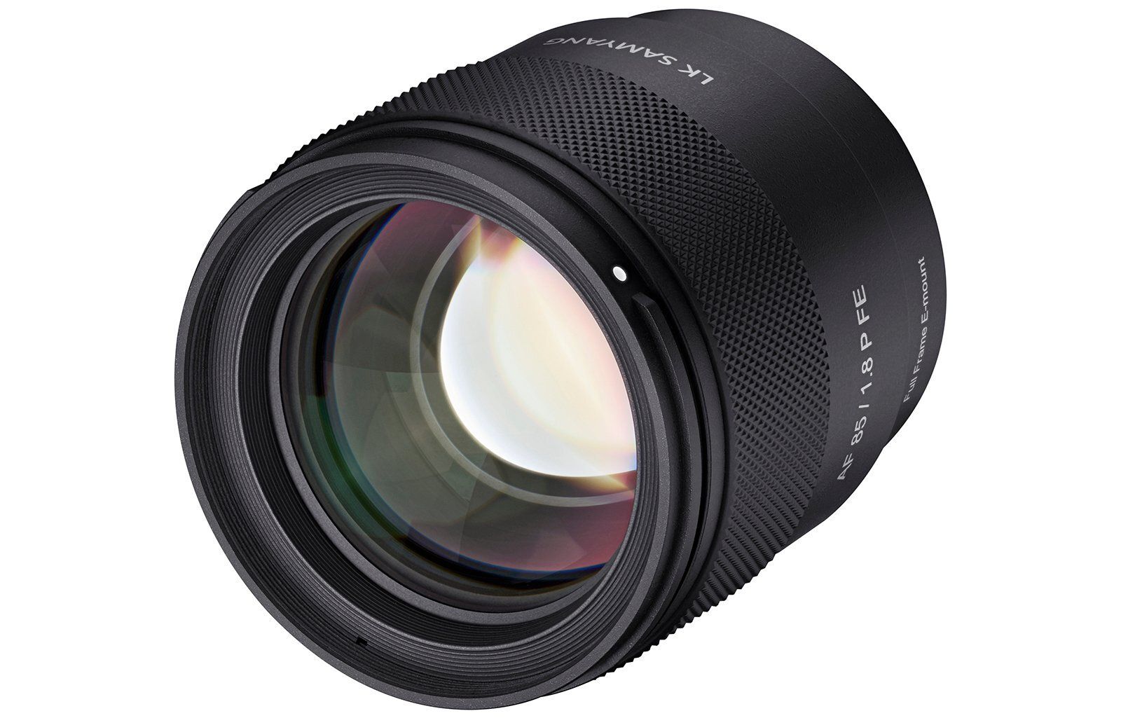
85mm f/1.8 P FE
The 16mm f/2.8 P FE is a particularly compact wide-angle option, weighing 207 grams and measuring 70.5mm long. It’s described as a “semi-macro” lens thanks to its 1:3 reproduction ratio and a minimum focusing distance of just 12cm. On APS-C cameras, it delivers a 24mm equivalent field of view and gets close to half-macro territory.
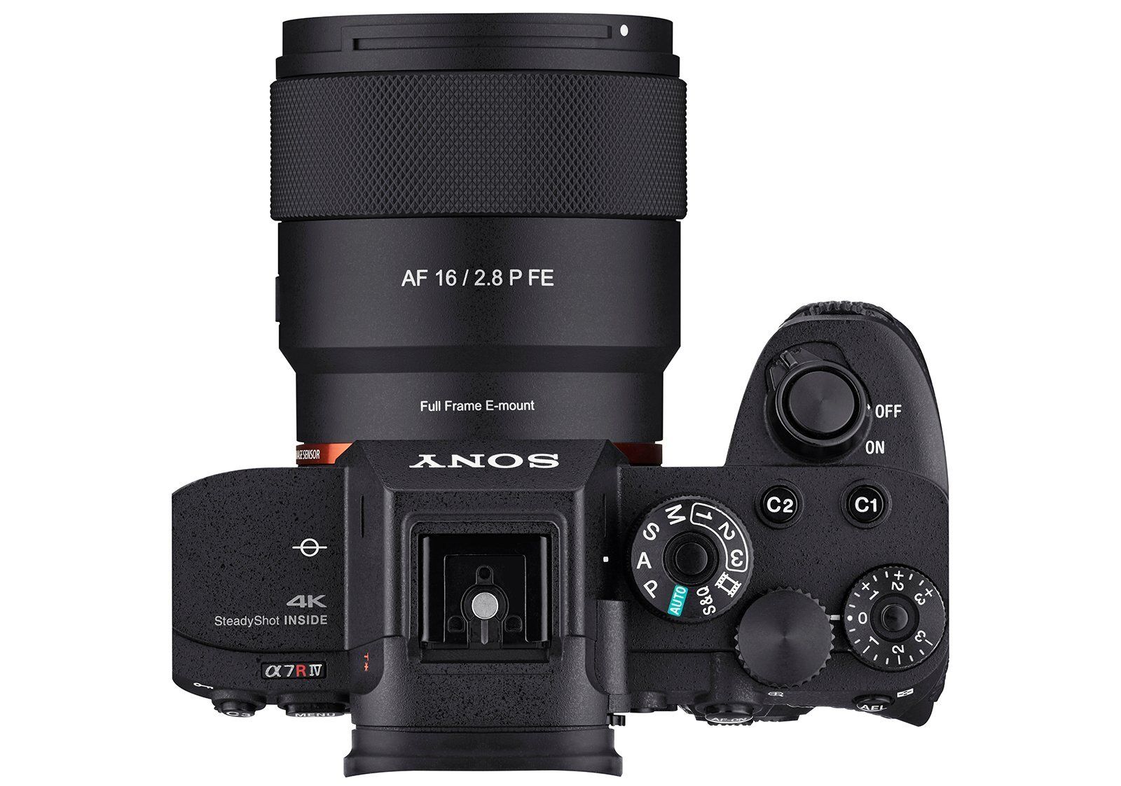
Inside, the lens is made up of eight elements in seven groups, including one aspherical, three extra-low dispersion, and one high refractive element. It uses a seven-blade aperture diaphragm (f/2.8 to f/22), supports 62mm front filters, and uses a linear STM motor for autofocus.
The 85mm f/1.8 P FE follows a similar design philosophy. It’s only slightly larger at 272 grams and 71.5mm in length. This one’s clearly aimed at portrait photographers, with Samyang emphasizing its ability to produce smooth bokeh and subject separation. The optical formula includes nine elements in eight groups with one high-refractive index and three extra-low dispersion elements.
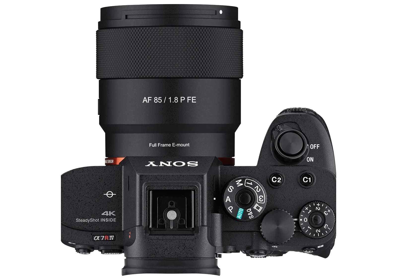
It features a nine-blade aperture (f/1.8 to f/22) and a minimum focusing distance of 80cm. Like the 16mm, it also includes the USB-C port and AF/MF switch and is dust-resistant.
Both lenses are priced at $399 and are expected to ship soon under the Rokinon brand name.
Learn The Art Of Photography

Get full and free access to my Creator University - The World’s Best Online University for Photographers & Creatives: Get access to hundreds of amazing photography courses, learn from professional photographers, connect with students and much more!
Interview with Patrick Noack
This week’s Interview with Patrick Noack, a street/architecture photographer from Germany. I am truly honoured to have had the opportunity to interview him!
You can find him on Instagram as: @patrick.noack
Enjoy the amazing Interview ;)

Can you tell us about yourself?
My name is Patrick Noack, and I’m a photographer from Germany. I mainly focus on cityscapes, specially when I travel, as well as street photography and occasionally landscapes. Over the years, photography has become much more than just a creative outlet for me. It’s a way of observing the world with intention. My goal is always to capture something that feels honest, atmospheric, and visually compelling.
What drew you to photography in the first place?
I actually stumbled into photography somewhat by accident. When I moved into a new apartment, I wanted to hang up some wall art but couldn’t find anything online that really fit my taste. That frustration led to an idea: why not create my own images? I grabbed a camera and started exploring the city with fresh eyes, photographing the architecture, light, and urban life. What began as a practical solution quickly turned into a genuine passion. It made me realize how many stories are hidden in plain sight, waiting to be captured.
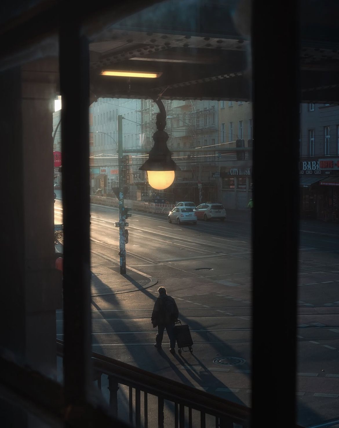
What is the best spot to take photos in your city?
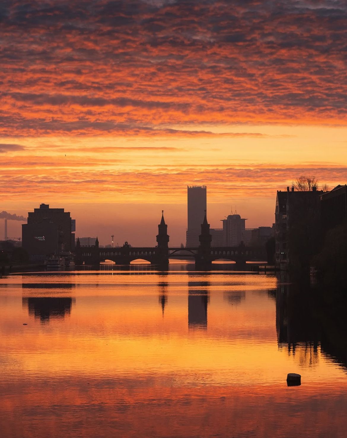
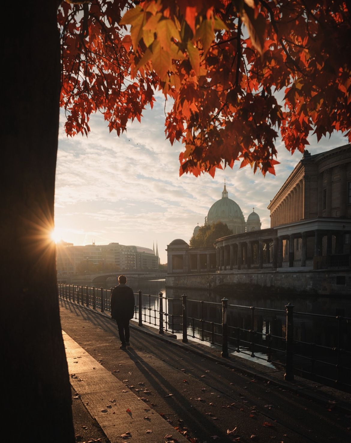
In Berlin, one of my absolute favorite places to shoot is Museum Island. It has a timeless beauty, and the way the architecture reflects on the Spree River, especially in the early morning light, is something that never gets old. I usually go there at sunrise, when the city is still quiet and the light is soft. There's a calmness in those hours that helps me focus on the details and atmosphere I'm trying to convey. Even though I’ve been there countless times, it always offers something new, a different cloud pattern, a subtle shift in light, or even just a person walking through the frame.
What’s your favorite time of day to shoot—sunrise, sunset, or something else?
Definitely sunrise. There’s something almost meditative about getting up early, walking through empty streets, and watching the first light of the day hit the buildings. Everything is calm, and the lack of crowds gives me space to experiment and take my time with compositions. It's also when I find the most interesting colors and tone.
How do you scout locations for your shoots? Do you plan ahead or go with the flow?
It depends. When I’m in Berlin, I usually plan quite a bit. I research spots, weather forecasts, even how shadows might fall at a certain time of day. But when I’m traveling, I try to stay flexible. I love walking around a new city with no specific plan, letting the atmosphere guide me. Sometimes, the most interesting shots come from spontaneous discoveries. That balance between planning and improvisation is key.
Is there a dream location/city/country you haven’t photographed yet but really want to?
There are a lot of places still on my list, but Japan is at the very top. I’m fascinated by the contrast between its ultra-modern cities and serene natural landscapes. The culture, the architecture it all feels incredibly photogenic. I think Japan offers the perfect mix of cityscape and street photography opportunities, and I can already imagine getting lost in the side streets of Tokyo or photographing a quiet morning in Kyoto. I guess Japan is on every photographer’s bucket list.
Black & white photography or colour? And why?
I’m very much on Team Color. Life is just too colorful to ignore. I’m drawn to dramatic skies, reflections, and the unexpected palettes that come from certain weather conditions or lighting. Fog, thunderstorms etc. they all add emotion and complexity to a scene. That said, I do appreciate black and white for certain images, especially when I want to emphasize form, contrast, or mood without the distraction of color. But most of the time, color helps me tell the story I want to tell.
Do you prefer shooting in dramatic weather or when it’s calm and clear?
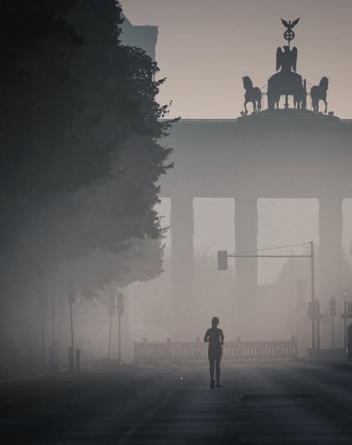
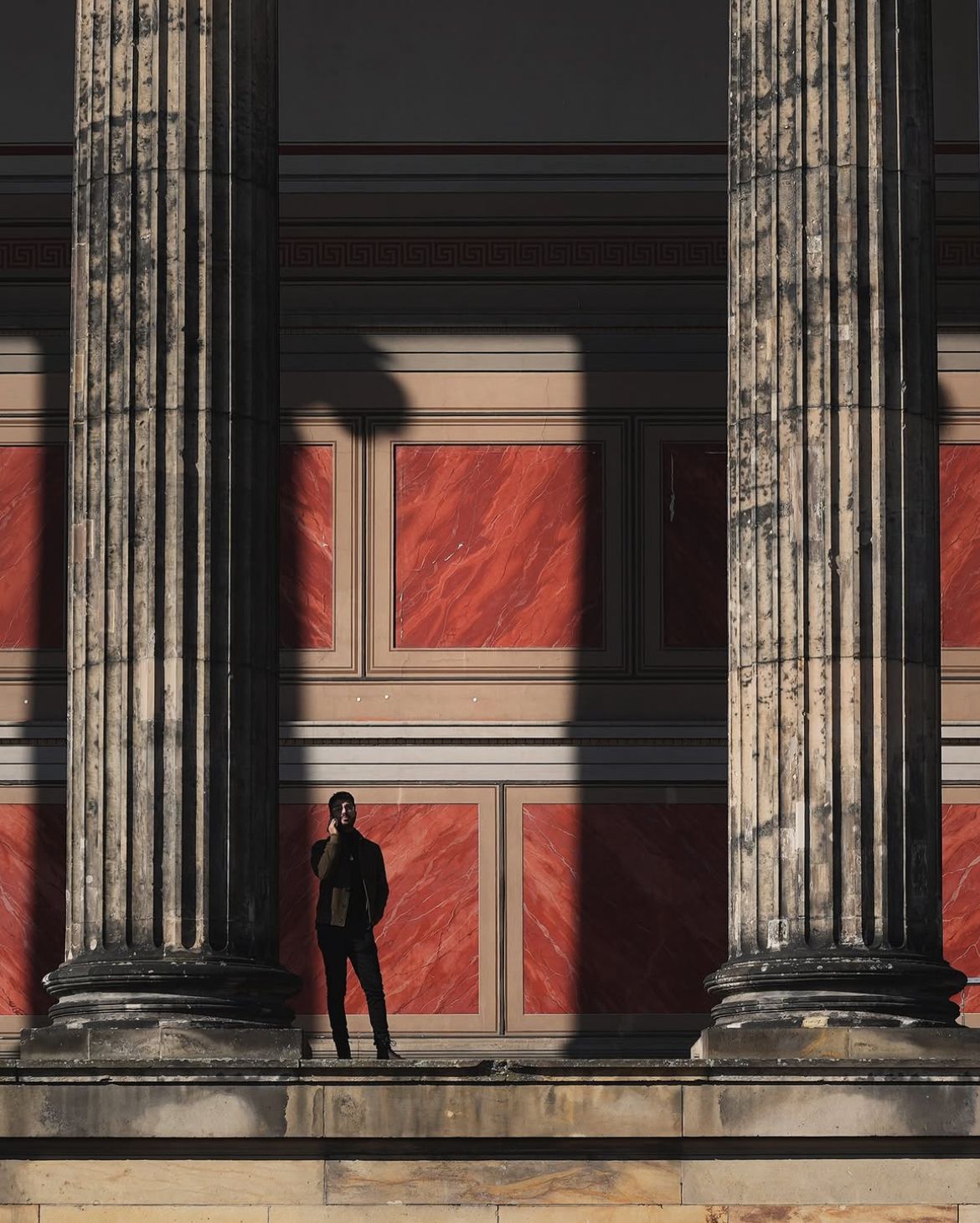
I love dramatic weather. Fog is especially beautiful because it softens the city, creates layers, and adds a bit of mystery. Thunderstorms, heavy clouds, and even rain can transform an otherwise ordinary scene into something cinematic. However, for street photography, I prefer clear weather and the golden hour for the best light.
What is your favourite subject to shoot?
My favorite subject is that rare combination of an epic sunrise, a little bit of mist, and a perfectly timed street moment. When all those elements align, it feels like magic. It doesn’t happen often, but when it does, it reminds me why I love photography.
Why street photography?
Street photography excites me because it’s unpredictable. Unlike cityscape photography, which often depends on specific light conditions and compositions, street photography gives you the freedom to shoot anytime. It pushes you to stay alert and present, to observe people and their interactions with the environment. And when it all clicks, the timing, the subject, the light, you capture something genuine and unrepeatable. It’s raw and spontaneous, and that makes it incredibly rewarding.
What’s the biggest challenge you face as a photographer?
Staying motivated, especially when a shot I’ve planned doesn’t work out. Sometimes I return to a location multiple times and still don’t get the image I have in mind. That can be frustrating. But I’ve learned that photography is all about persistence. Not every shoot yields gold, and that’s okay. The process itself (showing up, trying again, adjusting) is just as important as the outcome.
How do you approach editing your shots? Do you aim for realism or go for a more artistic vibe?
My editing style has evolved quite a bit. Early on, I was drawn to heavy edits: vivid colors, exaggerated contrasts. But over time, I started to strip things back. Now I lean toward a more minimal, natural feel. I still aim for mood, often leaning into darker tones, but I want the photos to reflect the way the scene actually felt to me. That’s more important than realism or perfection.
What role does patience play in your process? Do you ever wait hours for the perfect shot?
Sometimes I wait a long time for the right light, or for a person to enter the frame in just the right way. Other times, I have to revisit the same location several times before everything aligns. I’ve waited hours in the cold for a sunrise that never really happened, but I’ve also had spontaneous moments where everything just clicked within minutes. You never know, so you have to be willing to wait.
Do you have a favourite lens or piece of gear that you can’t shoot without?
My absolute favorite is the Sony 24mm f/1.4 G Master. It’s sharp, fast, and incredibly versatile. I pair it with my 50mm depending on the scene. Between those two lenses, I can shoot almost anything I want, wide cityscapes, tighter street shots, even the occasional portrait or landscape.
How do you manage to make a familiar spot look fresh and unique in your photos?
It’s all about shifting perspective. That could mean shooting at a different time of day, changing my angle, using a different focal length, or simply paying closer attention to the light. Even the most familiar places can look new when you approach them with curiosity. I try to see them as if it’s my first time there.
What’s your approach to capturing a particular mood in a picture?
Mood starts with light. If the lighting is off, the image often falls flat. So I plan most of my shoots around the kind of mood I want to create. That might mean waiting for a foggy morning, or heading out just after a storm. I also use composition and color grading to enhance the emotion I’m trying to convey, but the foundation is always the light.
Are there any photographers or artists who inspire your work?
Definitely. Saul Leiter has been a major influence his use of color, reflections, and layered composition is just masterful. I also admire the work of Fan Ho and Alex Webb for their storytelling and sense of atmosphere. Beyond photography, I get a lot of inspiration from movies and music, especially those that create strong visual worlds.
What role does composition play in your photography?
Composition is one of the most important elements of a strong photograph. I often use tools like the golden ratio or leading lines to guide the viewer’s eye, but I also rely a lot on instinct. If something feels balanced and interesting, I go with it. The goal is always to create a visual flow that keeps the viewer engaged and invites them to explore the image.
How important is light, and how do you work with it?
Light is everything. It shapes the scene, creates mood, and adds depth. I spend a lot of time studying how light moves through the city, how it hits buildings, reflects off surfaces, or cuts through fog. I use natural light exclusively, and I plan many of my shoots around sunrise or golden hour because that’s when the light is at its most dynamic.
What’s your advice for someone who wants to get started with photography?

The rest, 6 more questions, of this Interview are for Premium subscribers only.
Nanlite’s New Portable Light
Nanlite has introduced a new addition to its lighting lineup: the Pico, a compact RGBW LED light for mobile filmmakers and photographers who want something portable without sacrificing too much control and power.
At 130 grams (around 4.6 ounces), the Pico is definitely portable. It’s small enough to fit in a jacket pocket or small camera bag, but still manages to pack in quite a bit of functionality. It’s built around Nanlite’s Nebula C4 Light Engine and offers a wide CCT range from 2700K to 7500K, plus a green/magenta adjustment of ±150, which is fairly unusual at this size and price point. This gives users the option to match the light with a variety of ambient lighting conditions more precisely.

In terms of brightness, the Pico delivers 4,211 lux at a distance of 0.3 meters (at 5600K). It supports full 360° hue control and up to 100% saturation. The CRI and TLCI ratings are both 95, and TM-30 scores (Rf 92, Rg 99) suggest the light performs consistently well across the color spectrum.
One of the more thoughtful features of the Pico is its flip-body design, which houses a 1500mAh battery. Depending on brightness settings, the light can run for up to 6.5 hours on a single charge. It also supports USB-C charging and can be used while plugged in, which honestly should be a standard feature on all such lighting equipment.
Mounting flexibility is another interesting area for this light. The Pico includes a 12-position yoke for tilt control, a magnetic base for mounting on metal surfaces, a 1/4″-20 thread, and a cold shoe adapter. That means it can be attached to a camera rig, light stand, or of course used handheld, depending on the situation.
The light also includes 14 built-in effects (things like fire, lightning, and emergency vehicle flashes) which can be adjusted to suit the scene. Settings are controlled through a small 1.28-inch circular display and a simple knob/button interface. For users who want more granular control, the light can connect to Nanlite’s Nanlink app over Bluetooth, allowing for remote operation and firmware updates.
A snap-on magnetic diffuser is also included in the box, offering a quick way to soften the light without adding bulk. It’s a practical touch, especially for creators who are frequently shooting in varied environments. Priding for the Pico is at $35.
Photo Analysis
Welcome to the new part of the Magazine Issue where we take a closer look at a photo and analyse it so that you can learn and better your own photography from it ;)
Photo by: @yoru_photo_2
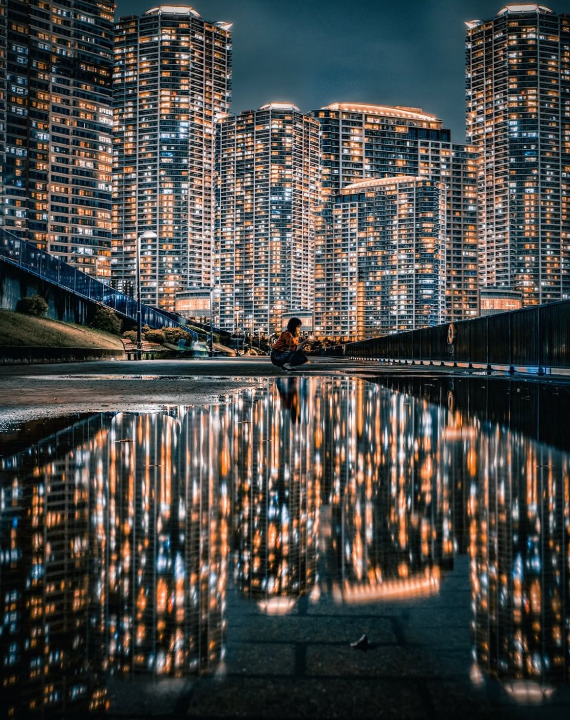
Let’s Analyse this Image:
Light & Atmosphere
What works well:
The city lights are what makes this shot interesting. They almost glitter through the photo and the contrast between the cool elements (the sky, the buildings themselves, the rails, etc.) and warm windows is very effective.
There is this surreal glow to everything, it definitely feels like something out of like a futuristic anime or cyberpunk film.
The way the lights/buildings reflect in the puddle gives the whole photo this very distinct look.
What could be better:
Some of the building lights are very intense and verge on clipping. You lose a bit of nuance in those top floors. Not only are the lights intense, but there are just so many of them (+ the reflection) a lot of people might find it too overwhelming.
The lighting on our subject (the girl) is quite flat, she almost feels like an afterthought compared to the drama above. Also it is a bit unfortunate that she is wearing a brown/orange top and blue trousers, which is the exact colour palette of the background. All this combined makes her not stand out that well. A little more separation or rim light would definitely help (as well as a change of clothes if this was/is a planned shot of course (which I think it was)).
The dark areas around the bottom edges feel a bit murky. Just lifting them slightly could reveal more texture without ruining the atmosphere.
Structure & Composition
What works well:
The puddle reflection is a nice move, it locks in the symmetry and gives the whole photo visual weight and interest.
The use of verticality is spot on. The eye moves naturally from the foreground reflection, up through the person, and into the buildings behind.
There are strong leading lines on both (middle) sides of the image guiding the viewer towards our subject (this does make up a bit for the ‘‘subject-backround’’ separation issue)
What could be better:
The balance isn't quite perfect, the right side is a bit visually heavier, mostly due to the railing (especially because the railing is kept so dark, if that were not the case the two towers on the left (so that one additional tower) would have balanced the railing out perfectly)).
Colour & Tone
What works well:
The color palette is bold and deliberate. Deep blues + glowing oranges = instant visual impact.
The tones are smooth, with clean transitions between light and shadow. Yes, it is processed heavily, but it doesn’t look overcooked. (One thing that definitely helps with ‘‘realism’’ is the fact that if you look closer into the puddle you can notice some imperfections (leaves, dirt etc.). I think its good that the photographer kept that and didn’t edit it out))
The reflections carry the color really well. No muddy tones in the puddle, it’s sharp and vivid.
What could be better:
The overall saturation is very high. It works here, but one notch down might’ve made it feel slightly more refined.
Story & Emotion
What works well:
This photo falls into the category of the ‘‘tiny human in a big city’’ shots. However normally these photos carry a lot of cold tones and low saturation to make the city feel like it is ‘‘pressing down’’ on us humans, so these photos often have a depressing note in them. This photo however feels warm and inviting which is a nice twist.
What could be better:
It’s a bit detached emotionally. The girl is just too small to read an expression or gesture, so you’re left filling in a lot yourself.
If the girl had been doing something subtle (which the viewer could see clearly) like looking at their phone, tying her shoes etc. it could’ve added a bit more life to the scene.
In general this photo leans much more into the aesthetics/visuals and the storytelling naturally gets left behind in those kind of shots.
Photography Tip of the Week


The weekly photography tip is only accessible to Premium Subscribers of The Magazine For Photographers.
Photographer of the Week
Photographer of the week goes to: Lucky Mark
You can find him on Instagram as: @luckymarkphotography
A few of his photos:
The Rest of this Issue is for Premium Subscribers
