📸 SNAPSHOT - Issue 80
Welcome to a brand new Issue of my Magazine. A truly brilliant one, enjoy the read :)
In partnership with


In this Issue
Brightin Star’s New 50mm f/1.4 Lens

Brightin Star has introduced the 50mm f/1.4 III, the latest version of its compact manual-focus prime lens for APS-C mirrorless systems. It comes in a wide range of mounts, including Micro Four Thirds, Canon EF-M, Fujifilm X, Sony E, and Canon RF.
The standout feature here is the bright f/1.4 aperture. That wide opening gives photographers plenty of room to play with shallow depth of field, producing the kind of creamy background blur that helps isolate a subject and draw attention to it. It also makes the lens useful in low-light situations where a slower lens might struggle. Portrait shooters and still-life photographers in particular will likely find the fast aperture appealing, but it’s versatile enough for everyday use as well.

Inside, the optical design uses six elements in 10 groups. Among them are one extra-low dispersion (ED) element and one high-definition (HD) element, which help reduce chromatic aberrations and flare while keeping contrast high. Brightin Star has also applied coatings designed to maintain color accuracy and improve light transmission, which can be helpful when working in mixed or difficult lighting conditions.
The lens can focus as close as 16.5 inches (42 centimetres), giving some flexibility for near-subject shots while still keeping a wide perspective. An eight-blade aperture contributes to the character of the out-of-focus areas and can create more defined sunstars when stopped down.
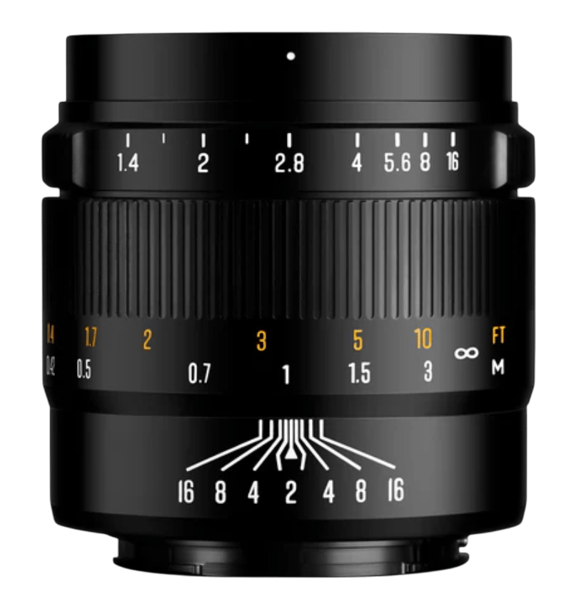
On the handling side, the 50mm f/1.4 III keeps things straightforward. It’s a fully manual lens with a smooth, well-damped focus ring that allows for precise adjustments. This is especially useful for video shooters who want consistent, controlled focus pulls, and it works well for photographers who prefer deliberate, hands-on control. The clicked aperture ring includes cine-style markings, giving you a way to adjust exposure settings more accurately without having to rely solely on the camera interface.
Physically, the lens weighs about 13.9 ounces (395 grams), has a compact size and metal construction. The design also integrates the aperture ring cleanly, ensuring it’s easy to operate without feeling cramped.
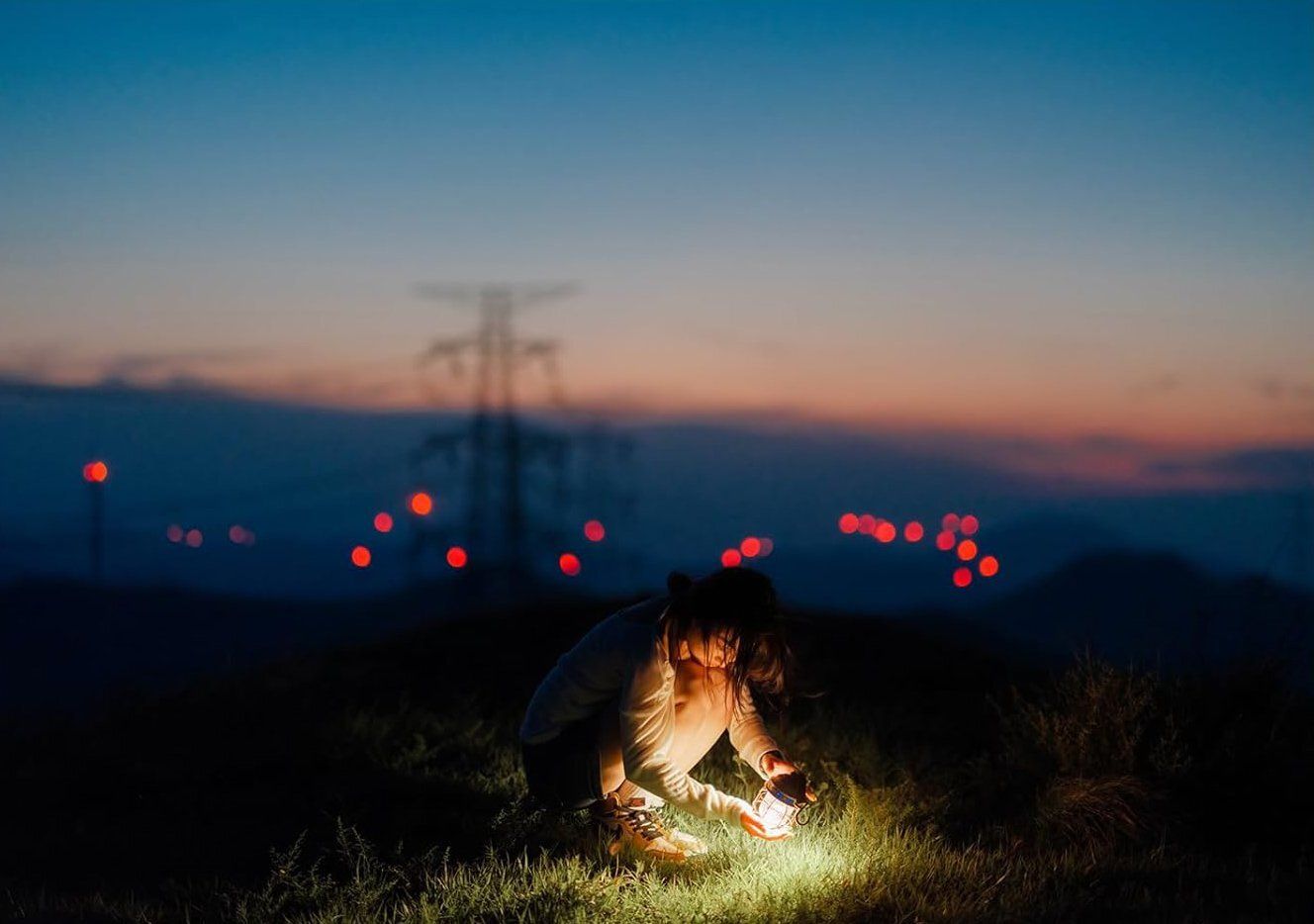
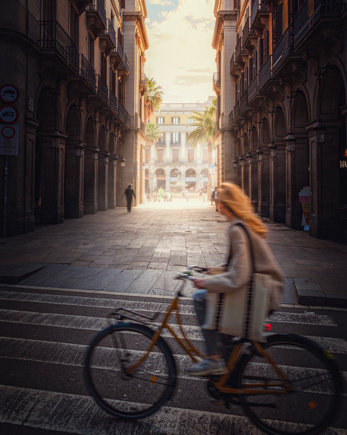
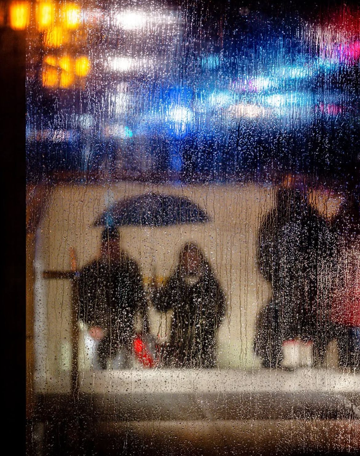
A few sample shots:


The Brightin Star 50mm f/1.4 III is available for $120 until September 11, after that, the standard retail price will be $130.
Learn The Art Of Photography

Get full and free access to my Creator University - The World’s Best Online University for Photographers & Creatives: Get access to hundreds of amazing photography courses, learn from professional photographers, connect with students and much more!
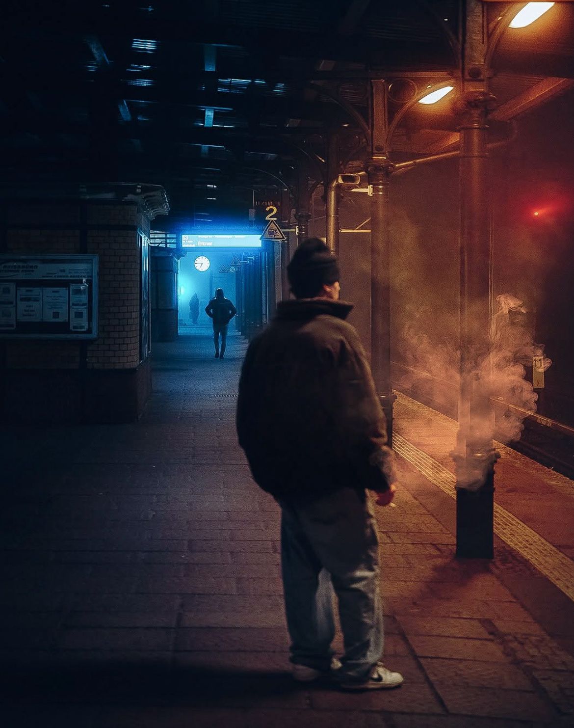
Interview with Oleg Teply
This week’s Interview with Oleg, a photographer based in Germany. I am truly honoured to have had the opportunity to interview him!
You can find him on Instagram as: @teply.visuals
Enjoy the amazing Interview ;)

Can you tell us a bit about yourself?
My name is Oleg. I was born in Ukraine, but I’ve been living in Germany since my student years. Photography has been a part of my life since childhood. Some of my earliest memories are of my father developing film in a small room with only a red light. Watching those blank sheets of paper slowly reveal images felt like magic to me. That moment never left my mind, and I think it’s where my curiosity for photography began. Over the years, my interests moved through different subjects: at first architecture, then concerts and events, and finally street photography. Each of those stages shaped me in some way. Berlin has been a big influence too it’s a city full of contrast, rhythm, and atmosphere, and living here continues to inspire the way I shoot and see the world.
How did you first get into street photography? Was it love at first click?
Street photography wasn’t something I planned to pursue, it just came naturally as my interests evolved. I started with architecture, where everything was structured and predictable. Then I moved into events and concerts, where you have to capture energy in real time. From there, it felt like a short step into the streets. At first it was just small experiments, but I quickly realized how much I enjoyed it. I wouldn’t call it love at first click, but it grew into something that now feels essential to me.
You do a lot of nighttime street photography too, any tips for shooting at night?
Night photography is probably what I enjoy the most. I’ve never been a morning person, so it suits me well (laughs). But beyond that, there’s something about the city after dark that completely changes the mood. Colors are stronger, contrasts are sharper, and the streets feel more cinematic. My main tip would be: don’t fight the darkness, work with it. Expose for the highlights the streetlights, the signs, the windows, and let the shadows stay dark. That’s where the mystery is. A tripod can be useful, but I often prefer to stay handheld for flexibility. And finally, don’t rush. Night photography is about patience, waiting for the light and the subject to line up.
How do you decide where to go and shoot?
It depends. Sometimes I head out with a clear idea in mind a location, a theme, or even just a particular light I want to capture. Other times, I simply wander with no plan at all. I enjoy that just as much. Walking without a fixed goal feels like hunting, you don’t know what you’ll find, but you stay alert and ready. Even if I don’t come back with great photos, the act of walking and observing feels like meditation. It clears my mind and helps me see the city differently.

Do you have a favourite city or spot for street photography? Why?
Every city has its own soul. During the day, a street can feel loud and chaotic, but at night the same street might turn poetic and quiet. That duality is what attracts me. In Berlin, I often find myself around Museum Island or Friedrichstraße, but I don’t like to stick to one place too much. Traveling has shown me that every city has something special, Lisbon, Prague, Kyiv, all of them offered me different moods. So instead of a single “favorite,” I would say my favorite spot is always the one that surprises me the most that day.
What’s your go-to gear setup when you hit the streets?
I shoot full-frame and at the moment I’m using a Nikon body. My preferred lenses are fast primes, 35mm, 50mm, and 85mm. The 35mm gives me versatility and is probably the one I use the most. The 50mm feels natural for portraits and closer street shots, while the 85mm allows me to isolate subjects and compress the background. Over the years, I’ve learned that gear doesn’t matter as much as how you use it, but having reliable tools that fit your style does make a big difference.

Do you prefer shooting in the chaos of a busy street or in quieter, more intimate spaces?
Both. Busy streets have their own energy but they can also feel overwhelming. Quieter spaces allow me to slow down, observe, and really focus on the details that matter. Often, I’ll combine both: for example, finding a quiet frame within the middle of chaos. That balance is something I enjoy searching for.
What are your favourite shooting conditions?
Evenings and foggy days. Evening light has a glow that makes the city feel alive in a very different way than during the day. Fog adds mystery, transforms familiar places, and makes them feel like a film set. But honestly, every condition has its value. Rain, snow, harsh sun they all create different moods, and learning how to adapt to each one keeps me creative.

What’s your take on the ethics of street photography—like shooting strangers without asking?
Street photography is about capturing real life as it happens. For me, the balance lies in being respectful. I don’t intrude on people or invade their space. I prefer to observe quietly, without disturbing the natural flow of a scene. At the same time, I believe it’s important not to overthink it. If you’re always worried about being “allowed” to take a picture, you’ll miss the moment entirely.
Reels or photos, and why?
Both have their place, but reels allow me to build rhythm, to connect images into a flow that feels like poetry in motion. Photos freeze one moment, reels tell a small story with many. I enjoy experimenting with both formats because they push me to think differently about my work.

How has your photography style evolved over the years?
In the beginning, I was all about structure and detail, photographing architecture and lines. Then I moved into concerts and events, which forced me to react quickly and capture energy. Over time, I felt a need to step away from documenting for clients and focus more on creating moods. That’s what led me to street photography. Today, my style leans toward cinematic atmospheres, often dark and moody. I think of it as a mix of everything I’ve learned so far.
What role does storytelling play in your work?
Storytelling is what gives meaning to an image. For me, it’s not about a literal narrative but about atmosphere. A single photo can feel like a scene from a movie, hinting at something before or after that frame. That’s the kind of storytelling I’m after, not answers, but questions that make people pause and imagine.
If you could travel anywhere in the world for street photography, where would it be and why?
Big cities are always the most inspiring for me. They carry energy, history, and so many hidden stories. I’ve seen a lot of Europe, but I still dream of places like New York, Tokyo, and London. They each have their own rhythm, their own visual language. New York, for example, feels like the birthplace of street photography. Tokyo has a futuristic atmosphere that fascinates me. London has its own mix of old and new.
What’s the most challenging thing about street photography for you?
The biggest challenge is timing. Everything happens so fast. You see a scene forming, but you only have a second or two to frame it before it’s gone. Sometimes you succeed, sometimes you miss it. That pressure can be frustrating, but it’s also what makes the process exciting.

What is the best location in Berlin for street photography and why?
Berlin is full of locations. Mitte offers historical backdrops, Museum Island has timeless architecture, and the U-Bahn is always interesting for its atmosphere. Kurfürstendamm is great for mixing people and city life. I don’t have one “best” spot, what makes Berlin special is that it constantly changes. A location that feels ordinary one day might give you an incredible photo the next.
Do you work with photography trends or are you trying to avoid them?
I pay attention to trends because they reflect how people connect visually today. But I don’t chase them. I try to absorb what feels interesting and adapt it in my own way. Authenticity is more important than following what’s popular at the moment.
Who are some photographers or other artists that inspire you?
I don’t have one single name I always return to. Inspiration comes from many places from classic street photographers, from younger creators I see online, and from daily life. Sometimes a stranger passing in the street inspires me more than a famous name.
How do you know when you’ve nailed the shot?
You start to feel it with experience. Often, the frame appears in my mind before I press the shutter. When the subject enters it exactly how I imagined or sometimes even better, I know I’ve nailed it. That instinct grows the more you practice.

How important is composition in photography?
Composition is essential. It’s what transforms an ordinary moment into something meaningful. I like to keep my images simple, not overloaded with details, but always with clear compositional elements that guide the eye.
What’s your advice for someone who wants to start exploring street photography?
Just start. Don’t worry about mistakes or bad photos they’re part of the process. Go out often, experiment with angles and light, and learn to be patient. Street photography is about observation, and the only way to improve is to practice.

How important is lighting in photography?
Light is the language of photography. It sets the mood, directs attention, and can completely transform a scene. Soft light brings poetry, hard shadows bring drama. For me, the most fascinating thing is how light can turn an ordinary corner into something cinematic.
Do you ever use sound or music to influence how you shoot?

The rest, 6 more questions, of this Interview are for Premium subscribers only.
New ON1 Photo RAW Update

ON1 has pulled the curtain back on Photo RAW 2026, the newest version of their all-in-one RAW photo editor, set to arrive this October. The update brings some of the most meaningful improvements the software has seen in years, focusing on three core areas: masking, resizing, and creative effects, while also introducing workflow tweaks, expanded compatibility, and even a few things for analog shooters.
Masking, long one of ON1’s headline features, gets its biggest overhaul since Super Select AI. Photo RAW 2026 introduces one-click subject and background masking, with the option to add, combine, or subtract multiple mask layers in a single edit.

Doubles exposure tool
Edge detection has also been reworked, allowing finer isolation of tricky subjects like hair, trees, or textured fabrics. In practice, that should mean less manual cleanup for portraits and outdoor work.
On the creative side, ON1 has added four new filters. Depth Lighting simulates cinematic-style light falloff, Split Field reimagines the classic graduated filter with more flexibility, Double Exposure blends multiple images directly in-app, and Motion introduces realistic motion blur effects for still images. ON1 has also cleaned up the Effects module with better search tools, a favourites system, and a new set of “starting point” presets to help users dive in faster.

motion blur effect
Perhaps the biggest practical change is the full integration of Resize AI into the main application. Previously available as a separate product, Resize is now built directly into Photo RAW 2026, offering two dedicated AI models. The “Highest Quality” option focuses on detail and is aimed at tasks like restoring old images or producing large-format prints, while the “Standard” option prioritizes speed, making it more practical for batch work or lower-quality files.
There are also updates for photographers working with film. A new Negative Mode automatically inverts film scans while applying baseline colour correction, and native grayscale support improves the way black-and-white files, whether from older digital cameras or scanned film, are handled. The interface itself has been made more flexible, with movable panels and customizable workspaces. The Perspective Tool has been upgraded as well, now allowing independent horizontal and vertical adjustments while maintaining proper scaling.

As with each yearly release, ON1 has expanded its list of supported cameras, adding recent models from Sony, Fujifilm, Panasonic, and OM System. Photo RAW 2026 will launch in October, available both as a standalone editor and in a MAX Edition that supports use as a plugin for Photoshop, Lightroom Classic, Capture One, and other platforms.
Something You Have To Check Out
Find your next winning ad creative in seconds with AI

Most AI tools promise you thousands of ads at the click of a button. But do you really need more ads—or just better ones?
Kojo helps you cut through the noise. We analyze your paid social data to uncover the ideas with the highest chance of success. Then, our AI predicts which concepts will perform best, so you don’t waste budget testing what won’t work.
Instead of drowning in endless variations, Kojo sends your best idea straight to a real human creator who makes it engaging, authentic, and ready to win on social. The entire process takes less than 20 seconds, giving you certainty before you spend and better performance without the waste.
Why gamble on guesswork or settle for AI spam when you can launch ads proven to work, made by people, and backed by data?
Photography Tip of the Week


The weekly photography tip is only accessible to Premium Subscribers of The Magazine For Photographers.
Photo Analysis
Welcome to the new part of the Magazine Issue where we take a closer look at a photo and analyse it so that you can learn and better your own photography from it ;)
Photo by: @rkrkrk

Let’s Analyse this Image:
Composition & Framing
What works well:
The stepping stones are fantastic, they’re such a strong leading line. They start right in the foreground and take your eye directly to the pavilion, but because of the subtle lean to the right in the line of stones, just before the pavilion, your eye doesn’t just go to the pavilion, but also toward the person standing on the right, which ties the elements together.
There is really nice layering here → first the stepping stones in the front, then the pavilion and the person, and finally the distant mountains. That layering makes the scene feel three-dimensional and gives it depth.
The pavilion sits in a good spot compositionally speaking: balanced between the mountains and framed by the mist.
The overall balance in the photo is strong too, yes the large mountain on the left is heavy, but it is offset nicely by the person on the right.
Having the person on the right side gives the frame extra scale and a bit more complexity.
What could be better:
The very bottom of the frame cuts into the first (left) stepping stone. A bit more breathing room would give the path a stronger anchor, but to be fair stepping further away could have just introduced another stone on the right, so maybe this is already the best we can get.
The person on the right is good for scale, but they introduce a sort of conflict → are they the subject or is it the pavilion?
The leading lines could have been even stronger if the photographer had gotten lower to the ground, but that might also have created imbalance with how the background layers line up, so it is something you would have to handle carefully.
Light & Atmosphere
What works well:
The light here is really nice, the soft, golden sunrise/sunset glow (along with the haze of course) creates a calm mood and makes the whole scene feel timeless.
The mist rising from the water is doing a lot for the atmosphere. It gives depth, softens the background, and makes the whole place feel surreal.
The very subtle light on the mountains (the left one especially) adds a sense of scale and you get some texture and shape in them.
What could be better:
The highlights in the sky lean a little bright. It works for warmth, but you lose a touch of gradient detail there.
The mist flattens the background a bit, it adds mood but it also hides some of the landscape that could make the image richer and pull out some textural interest. However all in all, I personally think the mood/atmosphere the haze adds to the image is worth that ‘‘trade-off’’
The pavilion roof could use a bit more separation from the mountain behind it. Right now the tones are close, so it doesn’t pop as much as it could.
Color & Tone
What works well:
The warm tones of the sky, pavilion, mountains/greenery contrast really nicely with the cooler blues of the stepping stones and surrounding water.
The overall palette feels natural and cohesive, nothing sticks out as too unnatural.
The tones in the mountains are handled well, with enough shadow to give depth without losing detail.
What could be better:
The blues in the stepping stones are very strong. They work compositionally, but they do dominate the palette a little, so turning that down slightly could be an option.
The highlights in the sky could use a little more control, the gradient feels a bit blown at the top.
Texture & Sensory Detail
What works well:
The stepping stones are full of texture and the patterns on their surfaces, combined with the wet shine, make them feel super three-dimensional and tactile.
The mist adds a sensory quality too, like you can feel the dampness in the air through the picture.
The pavilion has a lot of fine detail and texture as well, especially in the roof.
What could be better:
The water on the left is very smooth, it lacks a bit of texture (compared to the rest of the frame), which makes that side feel flatter and even creates a bit of visual imbalance.
As touched on before, the mountain texture in the distance gets lost in the haze a little.
Photographer of the Week
Photographer of the week goes to: Paddy
You can find him on Instagram as: @pdy_graphy
A few photos of his:


The Rest of this Issue is for Premium Subscribers
