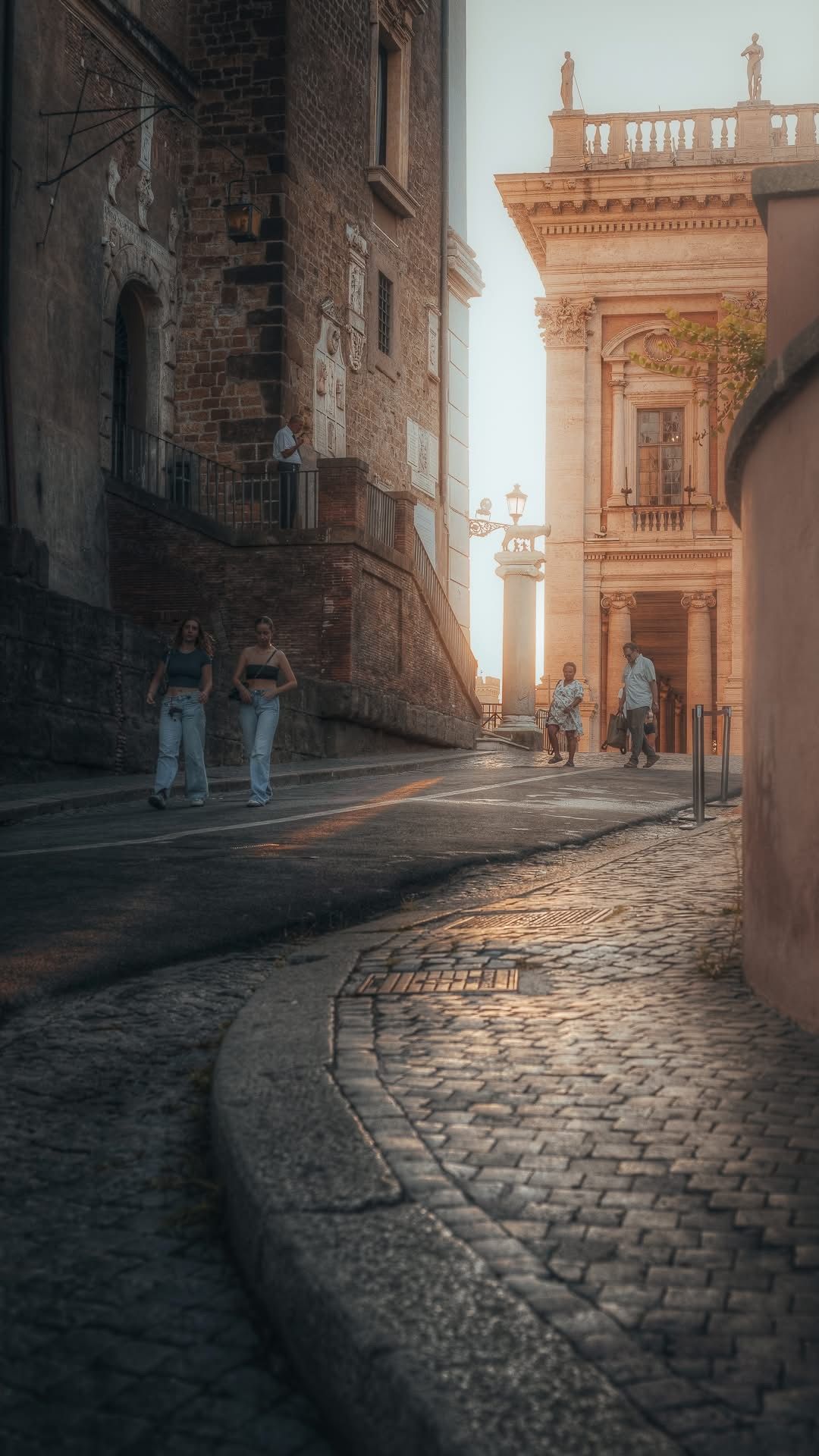
📸 SNAPSHOT - Issue 84
Welcome to a brand new Issue of my Magazine. A truly brilliant one, enjoy the read :)
In partnership with

In this Issue
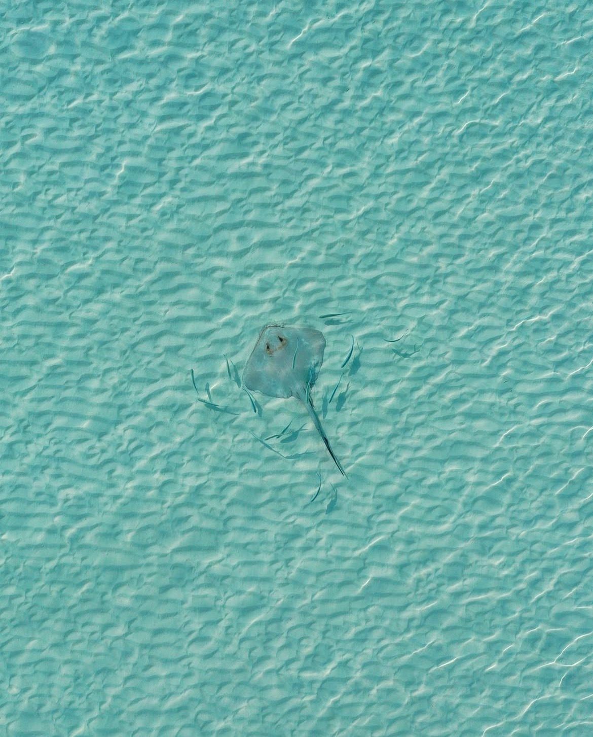
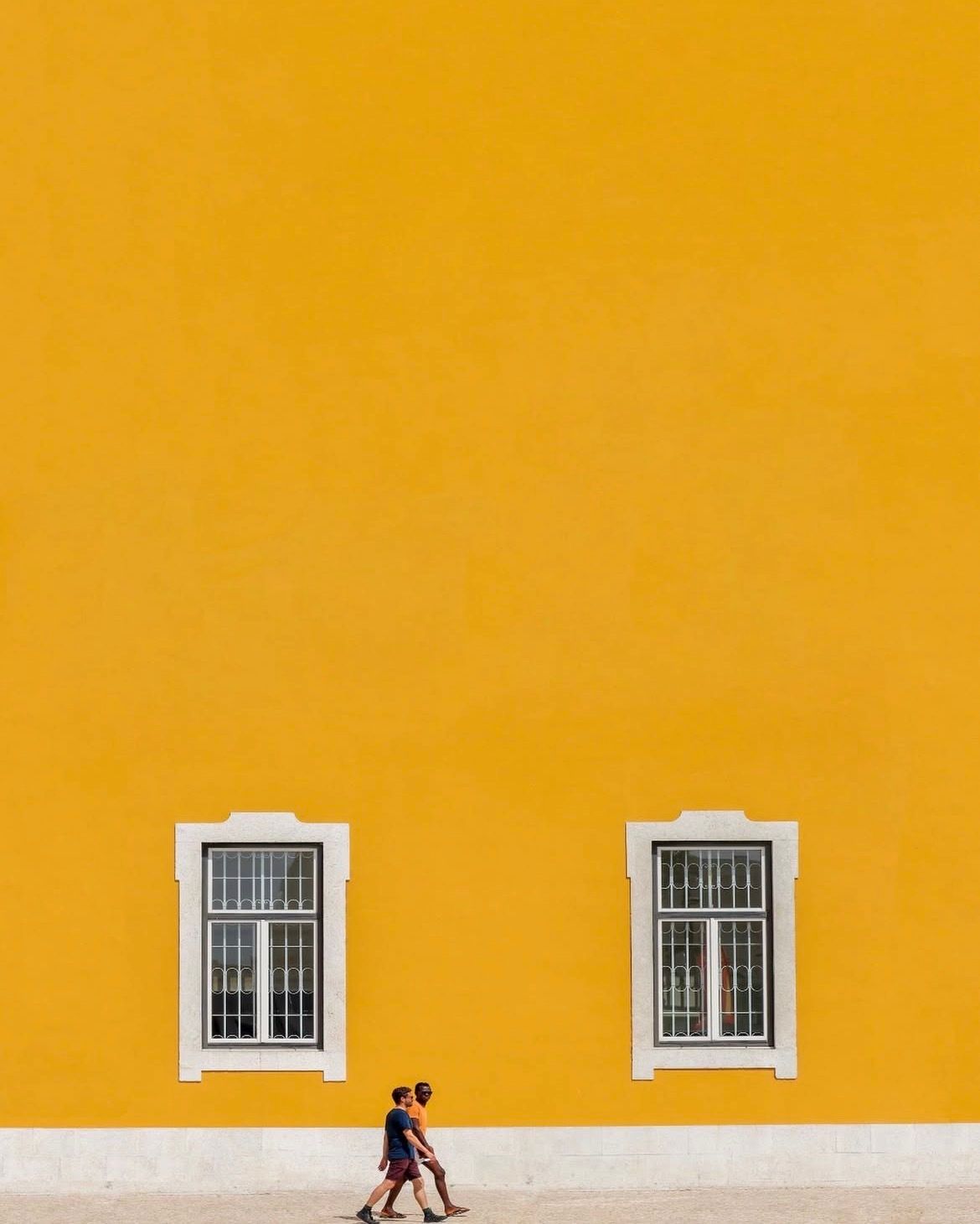
Sony’s New Macro GM Lens - A Closer Look
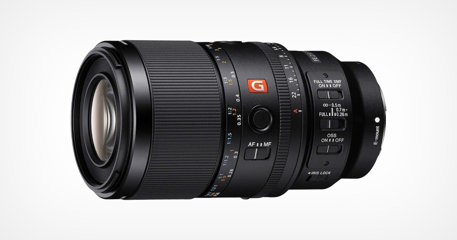
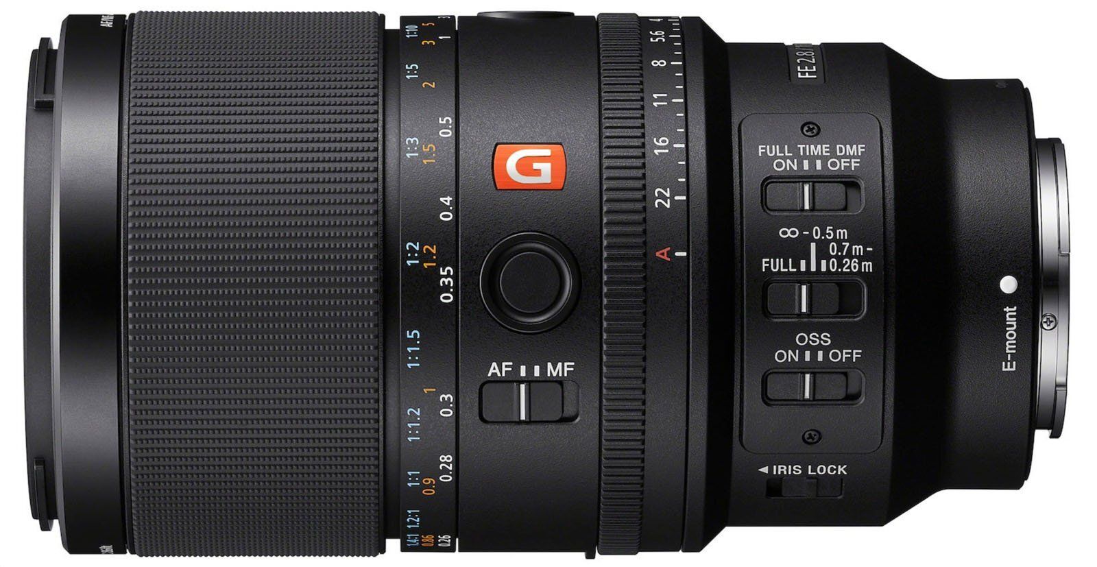
Sony has officially unveiled its first G Master lens built specifically for macro photography, the FE 100mm f/2.8 Macro G Master OSS. This is the follow-up to the 90mm f/2.8 G Macro OSS that came out nearly ten years ago, a lens that’s long been considered one of the best in its class.
Inside the lens are 17 elements in 13 groups, including a pair of XA (extreme aspherical) elements to clean up bokeh and minimize onion-ring patterns, and two ED elements to keep chromatic aberration under control. Like all G Master glass, the emphasis is on detail and smooth rendering. The 11-bladed aperture diaphragm should help keep out-of-focus highlights round and natural, while Sony’s Nano AR Coating II is designed to cut flare and ghosting when shooting against strong light sources.
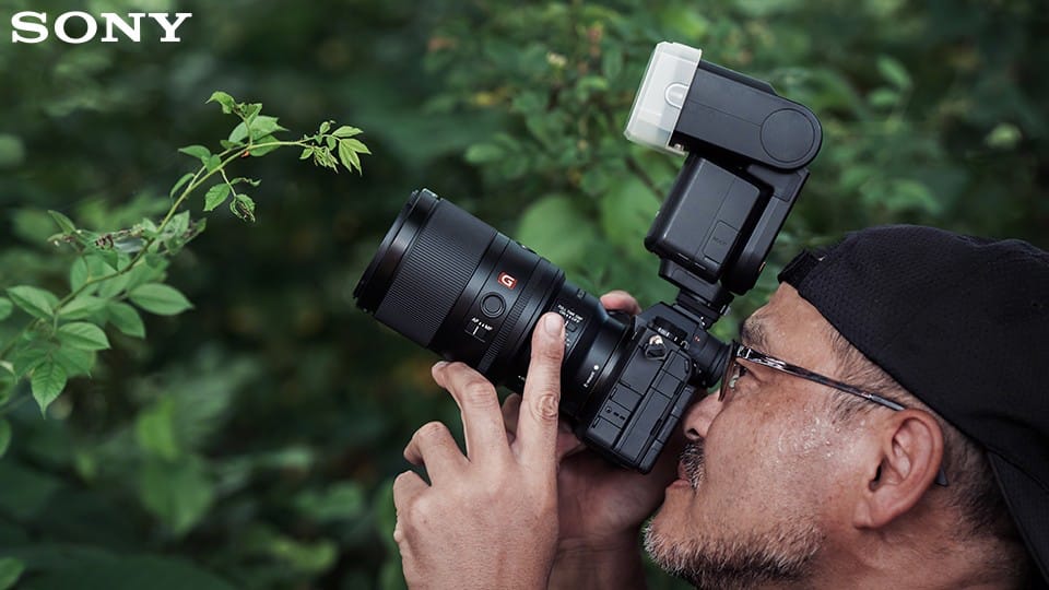
Autofocus has taken a serious step forward compared to the older 90mm. The new lens is powered by four XD Linear motors, the same fast and quiet system found in Sony’s high-end telephotos. According to Sony, focus acquisition is 1.9x faster than the 90mm, which means the lens can handle 120 fps bursts on the Alpha 9 III or 4K 120p video on newer Sony cameras. Macro lenses often hunt or feel sluggish at close range, so real-world testing will show how much of a difference this makes, but the early promise looks strong.
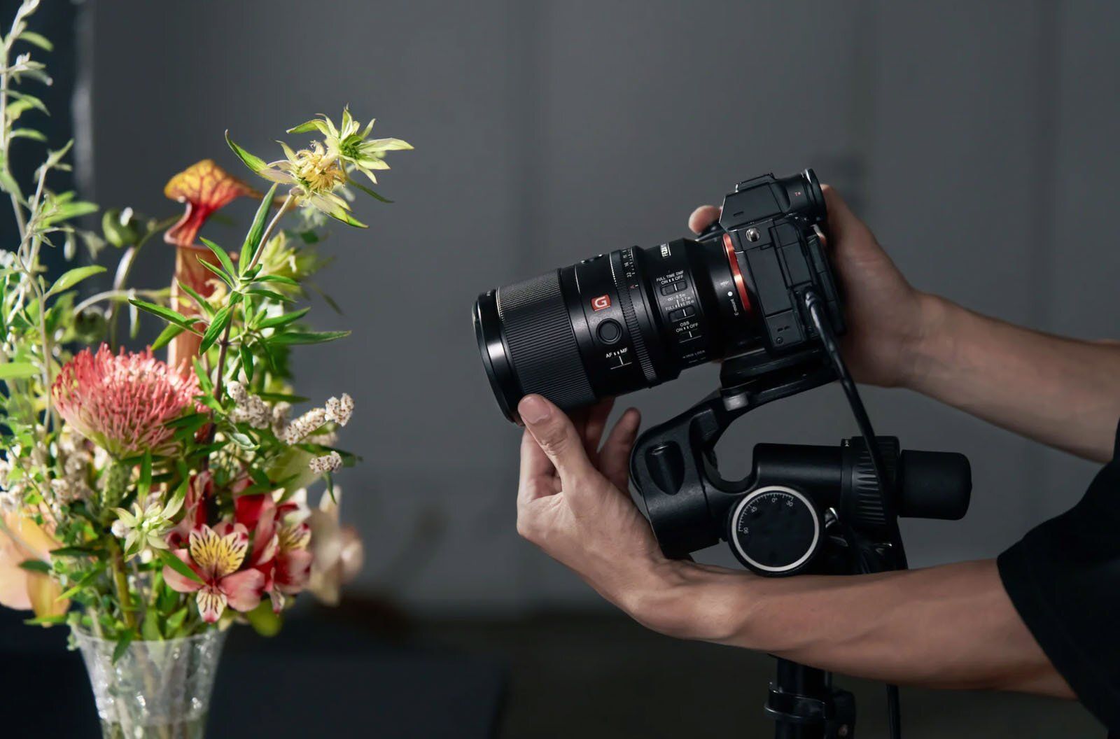
What really sets the new 100mm apart is magnification. Most full-frame macro lenses top out at a 1:1 reproduction ratio, but this one goes to 1.4:1 straight out of the box. That’s already more magnification than the norm, but the kicker is that it also supports teleconverters. Attach the 1.4x teleconverter, and it becomes a 140mm f/4 macro with 2:1 magnification. Throw on the 2x teleconverter, and you’re looking at a 200mm f/5.6 macro capable of 2.8:1 magnification, all while keeping autofocus intact.

Sony also reworked stabilisation. Like its predecessor, the lens has Optical SteadyShot (OSS), but this time the system doesn’t just consider focal length. It also factors in focus distance, which should provide noticeably better results at macro ranges where even tiny shakes are magnified. The OSS system works together with in-body stabilization for extra stability, particularly useful for handheld close-ups.
Physically, the 100mm Macro GM is close in size and weight to the old 90mm. It measures 147.9mm (5.8 inches) long, weighs 646 grams (22.7 ounces), and has a 67mm front filter thread. It’s slightly longer and heavier than the 90mm, but the design looks very similar at a glance. The lens is also internally focusing, so the barrel doesn’t extend as you focus, which is always a plus for macro work and for video shooters who want consistent balance.
The lens is dust- and moisture-resistant, with seals at every seam and gasket-protected switches. The front element has a fluorine coating to repel dirt, water, and oil. Controls include focus hold buttons, a focus mode switch, a focus range limiter, an aperture ring with click/de-click option, and on-lens OSS controls. It also carries over the focus clutch system from the 90mm, letting photographers snap quickly between autofocus and manual focus by sliding the focus ring forward or backward.
While designed for macro, the 100mm focal length also makes the lens a strong choice for portraits, weddings, and other mid-telephoto uses. Sony says sharpness is excellent wide open, while out-of-focus areas remain smooth, making it just as capable in everyday shooting as it is for detailed close-ups.
The Sony FE 100mm f/2.8 Macro G Master OSS is available for preorder starting today. Pricing is set at $1,499, with the first units expected to ship on November 13.
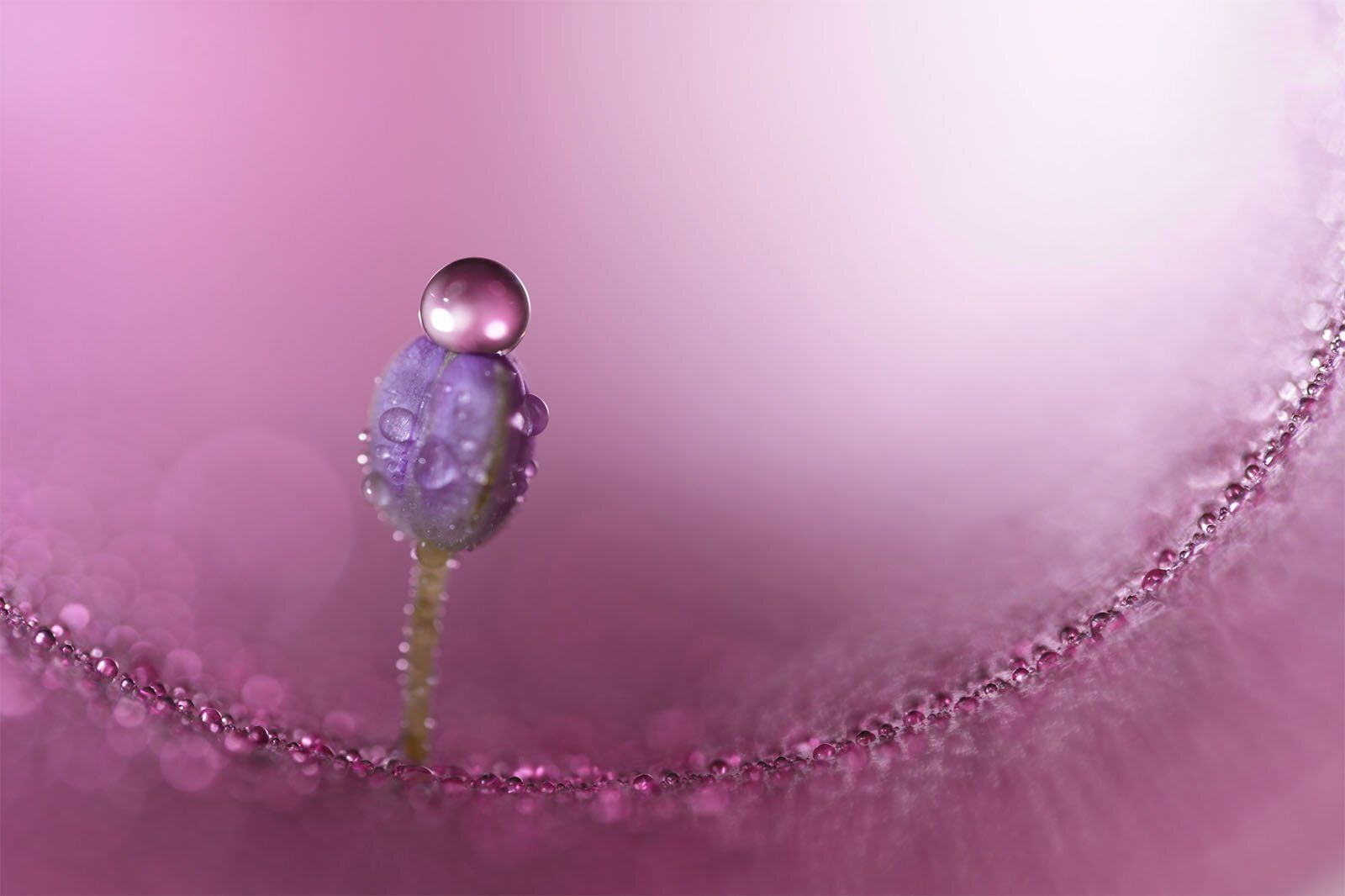
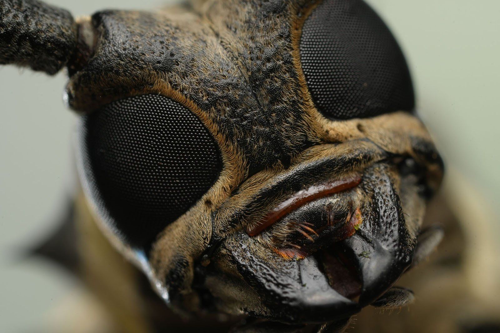
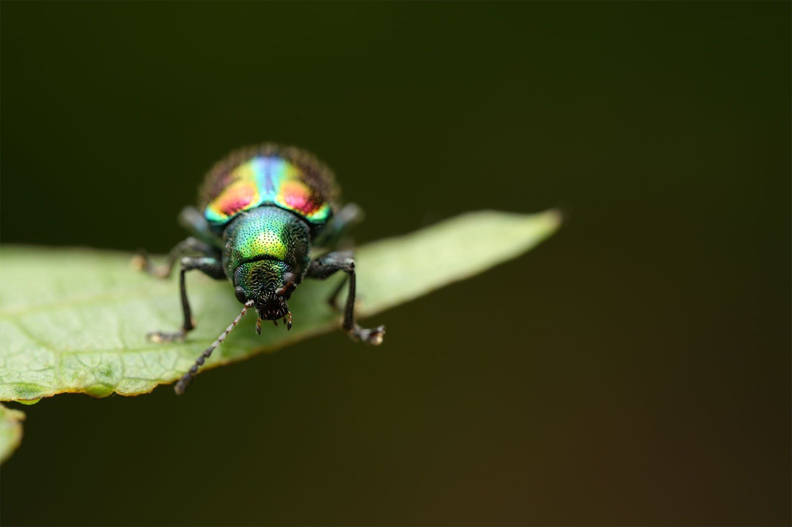
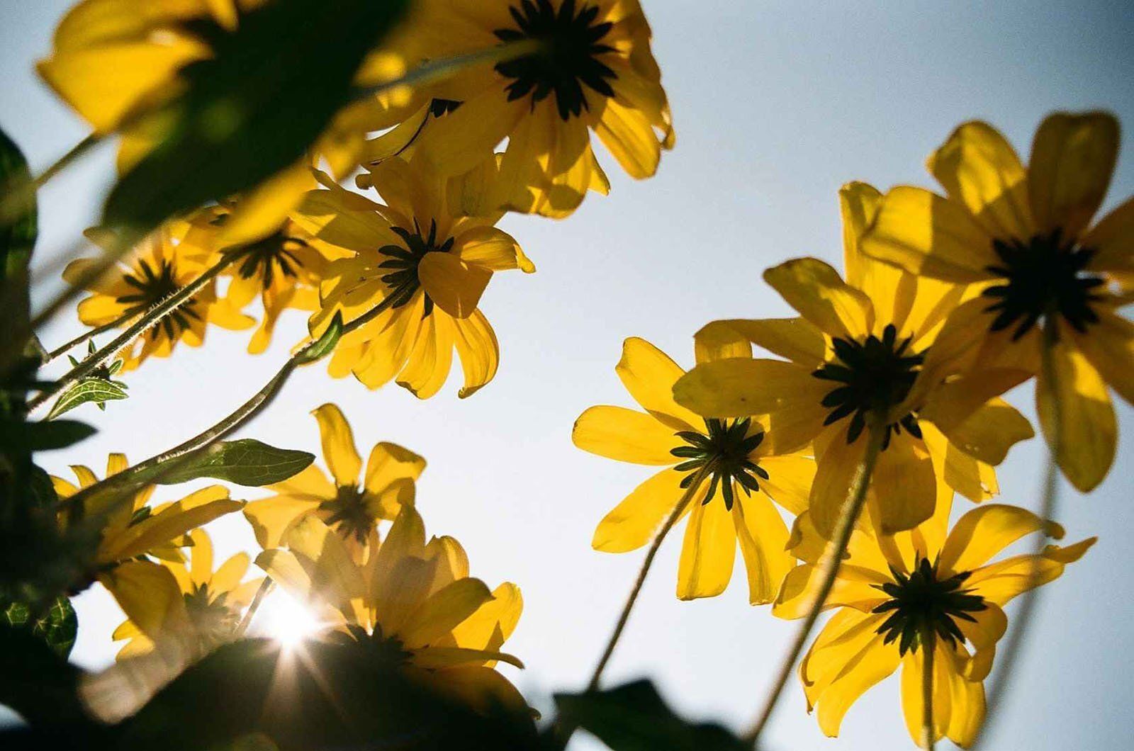
A few sample shots:
Learn The Art Of Photography

Get full and free access to my Creator University - The World’s Best Online University for Photographers & Creatives: Get access to hundreds of amazing photography courses, learn from professional photographers, connect with students and much more!
Interview with Marcus Cederberg
This week’s Interview with Marcus, a talented photographer from Sweden. I am truly honoured to have had the opportunity to interview him again, this time with a closer look at his new work!
You can find him on Instagram as: @marcuscederberg
Enjoy the amazing Interview ;)

Can you tell a bit about yourself?
I’m a 57-year-old hobby photographer from Sweden, living in the middle part of the country with my wife, family, and two dogs. Outside of photography, I work full-time as an IT manager, which is a completely different world, full of deadlines, structure, and technical details. Photography gives me balance, because it is about slowing down, observing, and creating instead of managing. I wouldn’t call myself a professional, but I do take my photography seriously. Over the years it has gone from something I did just for myself into something that connects me with people around the world through social media and exhibitions. It’s a hobby, yes, but one that gives me focus, joy, and a creative outlet I can’t imagine being without.
How did you get into photography?
My father was both a photographer and a journalist, so cameras and film were always around when I grew up. I can still remember the red glow of the darkroom and the smell of the chemicals when he developed film. At the time, I didn’t realize how much that environment shaped me. When digital photography became easier to access, I started experimenting, but strangely it wasn’t until the iPhone came along that I really got hooked. Having a camera always in my pocket made it natural to take pictures almost every day. That constant practice helped me develop my eye, and over time, I began to understand what I was drawn to: minimalism, calm, and strong composition.
What role does composition play in your photos?
For me, composition is everything. Without a strong composition, even the most beautiful subject can feel boring or unbalanced. Minimalism, which is the foundation of my work, is especially unforgiving when it comes to composition. You strip away details, and what remains has to work perfectly. I spend a lot of time deciding what not to include, because often the power of an image lies in the empty spaces around the subject. I see composition as the difference between a nice snapshot and a photograph that holds attention. It’s not about rigid rules, but about training the eye to notice balance, rhythm, and simplicity in scenes that others might walk past.
What do you think sets your work apart from others?
I think my focus on subtraction makes my work stand out. Many photographers want to capture as much as possible in a single frame — every detail, every color, every movement. I go the other way, trying to reduce and simplify until only the essentials remain. It’s about creating a strong mood with as little as possible. Maybe it’s a very Scandinavian approach, influenced by design and architecture around me, where simplicity is valued highly. I also believe consistency has played a role. Over the years, I’ve stuck to a minimal, calm aesthetic. People who follow my work often tell me they can recognize my photos instantly. That, for me, is the best compliment, that I’ve created a style that feels personal and recognizable.
How do you stay inspired and motivated?
Because photography is a hobby, it has to stay fun for me. If it starts to feel like work or pressure, the enjoyment disappears. On good days, inspiration comes naturally, a shape, a shadow, or a color suddenly jumps out at me. On harder days, I remind myself that not every photo has to be a masterpiece. Sometimes it’s about enjoying the walk with my camera and just being present. Posting on social media and getting feedback from people also motivates me. It’s a great feeling when someone says my photo made them feel calm or gave them joy. That’s what keeps me going, even on days when inspiration is low.
What qualities do you think make a great photographer?
I think one of the most important qualities is developing a unique style and sticking with it. There are so many photographers today, especially on social media, and what makes someone stand out is consistency. I also believe passion and patience are important. Photography takes time, both in practice and in waiting for the right moments. For myself, I’d say I’ve always been a mix of an artist and a businessman. I care about the creative side, but I also think about how to share and present my work so people can discover it. In others, I appreciate when they’re authentic, when you can look at their work and feel it truly represents who they are.
What gear do you use?
I use a Canon M50 with different lenses and a DJI Mini 3 Pro drone. The main reason for this setup is that it’s light, small, and easy to bring anywhere. I like being able to walk freely without carrying a huge bag of gear. That’s important for me, because photography should feel enjoyable, not like a workout. Of course, sometimes I look at other photographers’ gear and think about what I’d buy with an unlimited budget. But honestly, my current equipment has never let me down. I believe the person behind the camera matters much more than the gear. The Canon M50 might not be the most “professional” setup out there, but it fits perfectly with my style and my way of working.
What software do you use and how long do you spend editing?
I usually edit in Pixelmator and Affinity Photo. For a long time I avoided Photoshop because it felt too complicated, but recently I’ve started to experiment with it, especially since the new version includes AI tools that make some processes easier. Editing can be very quick, sometimes the photo comes almost directly out of the camera and needs very little adjustment. Other times, I can spend hours fine-tuning colors, shapes, and details to get the exact mood I want. Editing is a creative process in itself, almost like painting. I like both extremes, the satisfaction of a photo that works right away, and the deep dive of editing one photo for hours until it feels finished.
How did you find your style?
By accident, actually. I was with my family at a public pool and took a photo of a pair of orange sunglasses hanging on a hook against a big green wall. It was such a simple shot, but when I posted it on Instagram, it got a strong response. That was the moment I realized minimalism, color, and composition could create something powerful. Later, when Instagram featured me as a suggested user, my following grew quickly, and I felt motivated to keep refining that direction. Over time, I noticed that I always returned to simple, minimal scenes with strong lines and colors. That became my style, not something I planned, but something that revealed itself through practice and response.
Reels or photos?
I enjoy both, but photos will always be closest to my heart. Instagram started as a photography platform, and that’s where I feel most at home. Reels have become important because of how people use social media now, influenced by TikTok, but I see them more as a way to complement my photos. They allow me to show a bit of process, behind-the-scenes, or to create movement from stills. But inspiration, for me, still comes mostly from photographers who work with photos. That’s the format where I find the most creativity, and it’s also where I feel my work belongs.
What does photography mean to you?
Photography is my hobby, but also much more than that. It’s a way to relax, to explore, and to connect with others. I’d say 90% of my shooting is just for fun, but the process itself is meaningful. I also appreciate photography as an art form. I visit exhibitions and museums as often as I can, because seeing how others approach the medium is inspiring.
How would you describe your style?
Minimalistic, calm, aesthetic, and simple — but still powerful. That’s how I’d describe it. I aim for photos that give people a sense of peace but also make them stop and look twice. For me, the best compliment is when someone says my photos are calming or that they recognize them instantly as mine. That’s what I strive for, simplicity with personality.
Do you prefer shooting alone or with company?
Always alone. Photography is my time to focus, to think, and to be present in the moment. When I’m alone, I can take all the time I need without worrying about anyone else. If I’m with company, I get distracted and can’t get into the same flow. For me, photography is also a kind of meditation, and that’s something I only really achieve when I’m by myself.
What do you think about AI in photography?
AI is both exciting and a little scary. I’ve started to experiment with it, and it can be fun to see what’s possible. At the same time, I believe it’s important to separate AI-generated images from photography. Photography is about capturing real moments and interpreting them. AI will change a lot in art and society, no doubt about that, but I don’t think it will replace real photography. People will always appreciate authenticity, just as vinyl records or analog photos are still valued today. For me, AI is a tool to play with, not something that defines my work.
Any tips for beginners?
The most important thing is to find your own style and stick to it. Don’t get lost in comparing yourself to others. Be active on social media, interact with your followers, and join communities that inspire you. Think about your work from the perspective of others too: what story are you telling, and what do people take away from your photos? And most importantly, keep it fun. If you enjoy it, you’ll keep going, and that’s how your photography will naturally improve.
How do you decide when a photo is “finished”?
It’s mostly a gut feeling. Sometimes I know straight away when I see the image on the screen. Other times I try different crops or edits until something just feels right. When I no longer feel the urge to change anything, then it’s finished.
Do you ever collaborate with other artists?
I usually work alone because photography for me is very personal and also quite solitary by nature. But I’ve done some collaborations with other photographers and even artists from different fields, and it’s always interesting to see how different visions can come together. Sometimes we shoot the same subject and end up with completely different interpretations, which is inspiring. Other times I’ve contributed photos for projects that included design or writing, and it’s exciting to see how my work can live in another context.
What’s your long-term goal with photography?
For me, the main goal is to keep enjoying it. Photography started as a hobby and I want it to remain fun and meaningful, not just another obligation. Beyond that, I would love to do more exhibitions, because showing your work in print and sharing it in person is a very different experience than posting online. A photo book is also something I’d really like to create one day, a collection that ties together my minimal style and the themes I’ve worked with over the years. But most importantly, I don’t want to lose the joy of it. As long as photography continues to give me that sense of curiosity, discovery, and freedom, that’s already success for me.
Do you think living in Sweden affects your style?
Yes, absolutely I touched on this above. Sweden and Scandinavia in general is very minimal in its design and its landscapes, and I think that influence is visible in my photography. The long winters with muted light, the wide open spaces, and the quiet atmosphere all play into the way I compose and edit. Even when I travel to other countries, I often end up seeking the same kind of simplicity. I think it’s partly cultural too. Scandinavian design has always valued calm, clean lines and balance, and without even trying, I find myself looking for the same qualities in my photos.
What is your favourite part of the creative process?

The rest, 6 more questions, of this Interview are for Premium subscribers only.
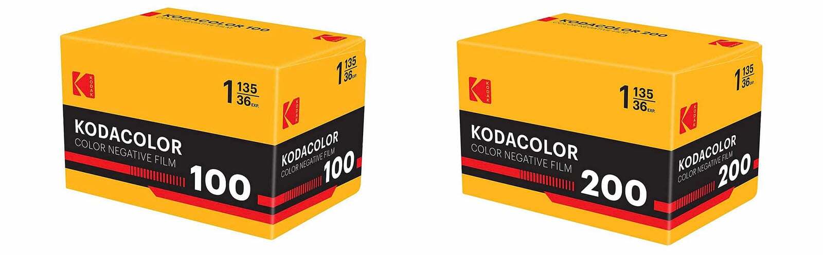
Kodak’s New Colour Negative Films
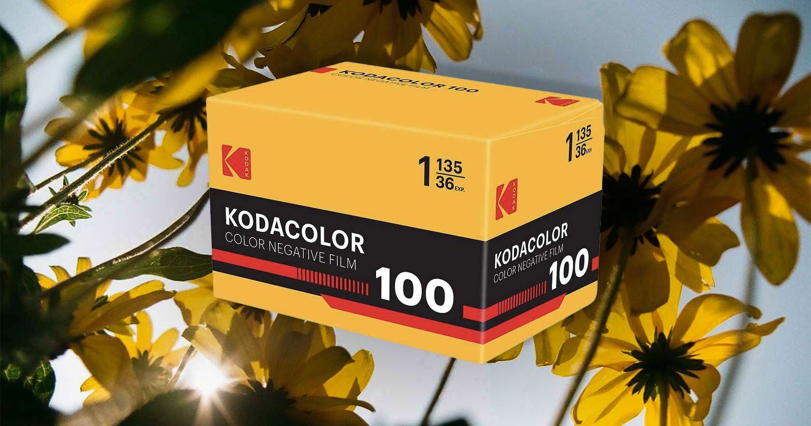
Kodak has surprised the film community with not one, but two brand-new colour negative films. After word leaked earlier this week that Kodacolor 100 had quietly popped up at retailers like Unique Photo, the company has now officially confirmed its release, along with a second stock, Kodacolor 200. Both are available now in 35mm format, marking the first time in over a decade that Kodak itself has launched new still photography films under its own name.
For years, Kodak has kept its catalog fairly steady, relying on mainstays like Ektar 100, Gold 200, Portra 400, and Tri-X 400, while smaller boutique manufacturers have been the ones pushing out new emulsions. That’s why Kodacolor 100 and 200 feel significant, they represent fresh investment from Kodak in film production at a time when analog photography is booming again.
The films fall under Eastman Kodak, not Kodak Alaris (the division that handles much of Kodak’s professional still photography output). This distinction matters, because Kodak is also taking a more direct role in distributing these new rolls. For the first time in years, Kodak is selling film directly to distributors rather than relying entirely on third parties. The company says this move should help stabilise supply and ease some of the pricing fluctuations that film photographers have had to deal with recently.
Kodacolor itself isn’t new in name (the brand dates back decades) but the return of the label with modern formulations feels like a nod to Kodak’s past while also signaling a forward-looking commitment. According to Kodak, both Kodacolor 100 and Kodacolor 200 are “sub-brands” of its existing films, designed to deliver the same quality Kodak users expect. Kodacolor 100 is a daylight-balanced, low-speed stock that emphasizes fine grain, natural colors, and wide latitude, while Kodacolor 200 offers similar qualities with a bit more flexibility in lower light. Neither is a fast film, but together they cover everyday shooting scenarios from bright daylight to shaded conditions.
Kodacolor 200 sample image
Retailers like B&H, CineStill, and Blue Moon Camera are already stocking both emulsions, and pricing is roughly $9 per 36-exposure roll, which puts them in line with other consumer-friendly colour negative films on the market.
Photographers who have tested early rolls describe Kodacolor as a little less punchy than Kodak Gold 200 and much gentler than the saturated, contrast-heavy look of Ektar 100. Unique Photo calls the films “true-to-life” in their rendering. In sample shots released so far, the colours appear softer and slightly warm, with subtle greenish tones that lean more toward realism than boldness.
More sample images:
Kodacolor 100 sample image
Kodacolor 200 sample image
Something You Have To Check Out
🚨 Automate Podcast Guest Spots and Fill Your Calendar Fast

If you’re a coach or consultant, podcast guesting is the NEW proven & fastest path to full calendars. Stop burning budget on ads and hoping for clicks. Podcast listeners lean in, hang on every word, and buy from guests who deliver real value (like you!). But appearing on dozens of incredible podcasts overnight as a guest has been impossible to all but the most famous until now.
Podcast guesting gets you permanent inbound guests, permanent SEO, and connects you to the best minds in your industry as peers.
PodPitch.com is the NEW software that books you as a guest (over and over!) on the exact kind of podcasts you want to appear on – automatically.
⚡ Drop your LinkedIn URL into PodPitch.
🤖 Scan 4 Million Podcasts: PodPitch.com's engine crawls every active show to surface your perfect podcast matches in seconds.
🔄 Listens to them For You: PodPitch literally listens to podcasts for you to think about how to best get the host's attention for your targets.
📈 Writes Emails, Sends, And Follows Up Until Booked: PodPitch.com writes hyper-personalized pitches, sends them from your email address, and will keep following up until you're booked.
👉 Want to go on 7+ podcasts every month and change your inbound for life? Book a demo now and we'll show you what podcasts YOU can guest on ASAP:
Photography Tip of the Week


The weekly photography tip is only accessible to Premium Subscribers of The Magazine For Photographers.
Photo Analysis
Welcome to the new part of the Magazine Issue where we take a closer look at a photo and analyse it so that you can learn and better your own photography from it ;)
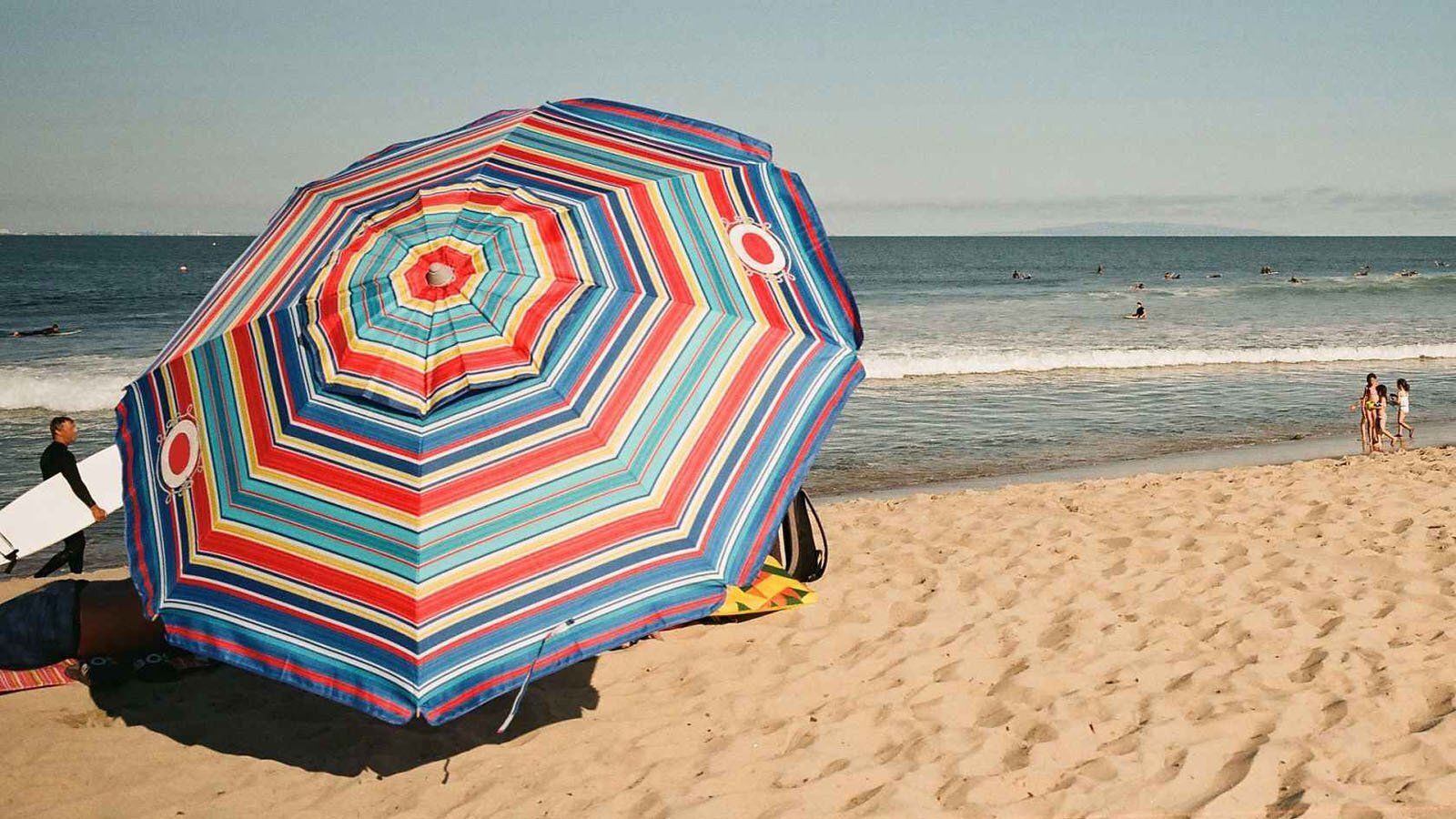
Photo by: @moumarion
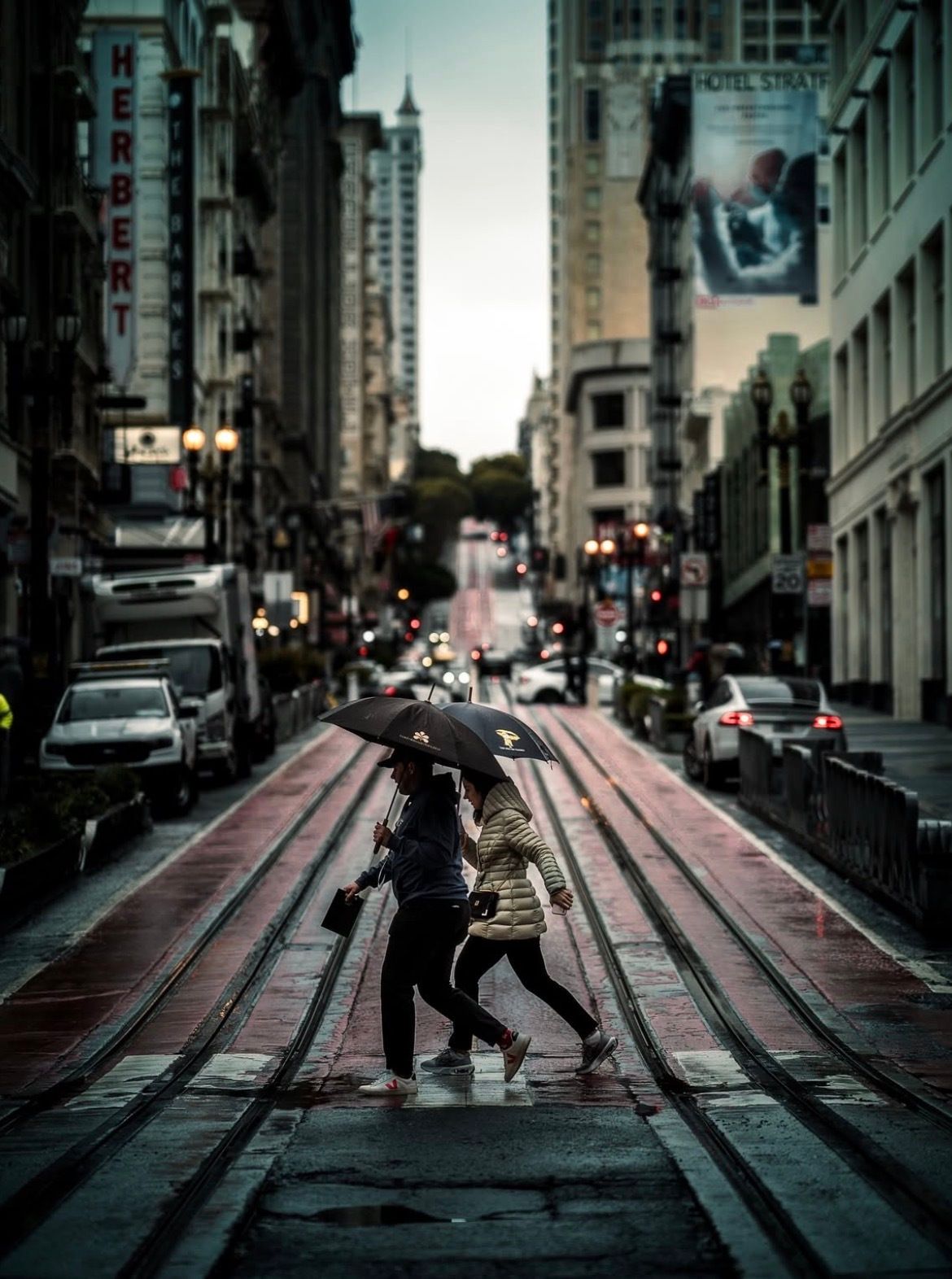
Let’s Analyse this Image:
Composition & Framing
What works well:
The centred composition (often regarded by many people as ‘‘basic’’) works here. The couple is framed right between the tram tracks, and because there is actually plenty of space above them, they don’t feel totally in the centre. Vertically, they sit in a nice spot that gives balance.
The leading lines are one of the strongest parts. The tracks and the road edges guide your eyes perfectly through the scene. Even with some of the depth being lost in the background bokeh, those lines are strong enough to still pull you in (more on that below).
The timing is very solid as well. Catching the couple mid-step adds just enough movement to keep the photo from feeling static.
What could be better:
As noted, the background bokeh is kind of tricky here. Usually, bokeh is everyone’s favourite, but in this photo it hurts more than it helps (in my opinion at least). It softens the background so much that you lose the insane depth that the road and tracks could have given (they literally go so much further). This shot could have been one of those really deep ‘‘pull-you-all-the-way-in’’ photos, but the blur cuts that short. Again, it is not SO incredibly terrible, because the lines are pretty strong, you still get some sense of that depth.
That neon yellow object (no idea what it is) on the left really doesn’t do the frame any favours. It sticks out like a sore thumb and pulls your eye away from the subjects, especially once you notice it. I would personally just edit it out (normally I am against editing things out, especially in street photography, however if it is something that tiny but distracting just get rid of it).
Light & Atmosphere
What works well:
The overcast light is doing a lot of good here. It is soft and diffused, which takes away any harsh shadows and gives everything a moody, cinematic kind of look (well that is also part to the editing of course ;)). It matches perfectly with the rainy setting as well.
The wet road reflecting the light is one of those little details that makes the photo a lot richer. The subtle glimmers on the tram tracks and pavement aren’t flashy, but they add so much texture and stop the ground from just being a flat dark surface.
The umbrellas and couple catch ‘just’ enough light to make them stand out. Even though they are pretty dark, they don’t completely disappear into the rest of the tones and background.
What could be better:
The light is a bit flat overall. It sets the mood, but it doesn’t add much drama or variation across the frame. Everything is kind of sitting at the same level tonally, which makes the shot feel a little safe/predictable.
Because of that flatness, the couple doesn’t really jump out of the scene. A touch of directional light or just a bit more separation in post would make them feel more like the real “stars” of the show.
Emotion & Story
What works well:
The umbrellas are a perfect storytelling device. The second you see them, you know it is raining, and you immediately imagine the sound of cars on wet pavement and shoes splashing across the street.
As touched on before, catching the couple mid-stride makes the photo feel alive and energetic. Also —> having the woman in that slightly hunched position gives a nice storytelling touch too —> she is probably jumping a little to avoid the puddles on the ground.
The city background adds to the story too. Even though it is rather busy, it makes the photo feel like a true city moment.
What could be better:
With the umbrellas covering their faces/the dark shadows created, you don’t get any personal connection + you can’t really read their emotions. They become more anonymous rather than individuals you can relate to.
They are walking together, but they are not interacting or connecting in a ‘‘interesting’’ way that adds emotional weight. If there was a gesture between them, the story would feel stronger. For example: them having a conversation, holding hands/arms etc. Now obviously this is not up to the photographers the only thing they can do it stay observant!
Colour & Tone
What works well:
The muted tones are perfect for a rainy-day street photo. The greys, blacks, and subtle reds all work together to really set the mood.
The reflections on the wet ground give the colour palette a bit of shine that keeps it from being completely flat → the shimmer adds just enough variation to make it interesting.
What could be better:
The reds on the road feel a little too muted. If they were bumped up just slightly, they could add a stronger pop that would also help lead the eye through the frame better.
The tones overall feel a bit compressed. There aren’t enough mid-tones, so the image reads more flat than it needs to. More contrast would have separated the layers better.
Balance
Overall, the photo feels balanced because of the centred composition and the strong symmetry of the tram tracks. That really helps keep the frame steady.
The couple’s umbrellas give enough weight to the middle section so they don’t get lost in all the ‘‘noise’’ around/behind them.
But the left side is a tiny bit heavier. Between the Herbert sign, the trucks, and that neon yellow distraction, your eye gets pulled there a little more than it should. The right side is calmer, which makes the balance tip slightly.
Photographer of the Week
Photographer of the week goes to: Iso
You can find him on Instagram as: @iso_10.0
A few photos of his:
The Rest of this Issue is for Premium Subscribers
