📸 SNAPSHOT - Issue 99
Welcome to a brand new Issue of my Magazine. A truly brilliant one, enjoy the read :)
In partnership with


In this Issue
Brightin Star’s New 50mm f/1.05 Lens

Brightin Star has announced a new manual-focus lens for full-frame mirrorless cameras, the MF 50mm f/1.05. It is coming to Sony E, Canon RF, Nikon Z, and L-mount systems.
The main talking point is the f/1.05 aperture, which is pretty fast for a 50mm lens. The aperture range runs from f/1.05 to f/11, so while it is designed to be used wide open, it can also be stopped down when more depth of field or consistency across the frame is needed.

The 50mm focal length is a familiar one, offering a natural-looking field of view. It is a versatile angle that works for portraits, street photography, documentary work, and video.
It is worth mentioning that this is a fully manual lens, with no autofocus or electronic communication, which can be a positive or negative depending on how you look at it. Focus ranges from about 1.9 feet (0.57 meters) to infinity.

The lens uses a 58mm filter thread, which keeps things practical for people who already own ND or polarising filters. Brightin Star also mentions a revised aperture ring design, aimed at improving grip and making aperture changes feel smoother during use.
Optically, the lens is built around a 10-element, eight-group design. It includes two high-refractive-index elements and two low-dispersion elements, intended to manage aberrations that tend to show up with ultra-fast apertures. Brightin Star says the lens maintains usable sharpness wide open, particularly in the centre of the frame, though lenses at f/1.05 typically involve some compromises toward the edges.

Multi-layer coatings are used to help reduce flare and ghosting, especially in backlit scenes. Brightin Star also claims very high light transmission, which should help in difficult lighting, although real-world results will depend heavily on shooting conditions.
The aperture diaphragm uses 15 blades, which should help keep out-of-focus highlights relatively round and transitions smoother as the lens is stopped down. The Brightin Star MF 50mm f/1.05 is priced at $270.
A few sample shots:


Learn The Art Of Photography

Get full and free access to my Creator University - The World’s Best Online University for Photographers & Creatives: Get access to hundreds of amazing photography courses, learn from professional photographers, connect with students and much more!
Interview with Sascha Brach
This week’s Interview with Sascha, a talented photographer from Germany. I am truly honoured to have had the opportunity to interview him!
You can find him on Instagram as: @pictures_by_sash
Enjoy the amazing Interview ;)

Can you tell us a little about yourself?
Im Sascha, 39 years old and I’d describe myself as just one photographer among many. I don’t really see myself as anything special or different in that sense. Photography for me isn’t about status or recognition, it’s about the act of going out and shooting. Most of the time, that means walking through the city at night with my camera. Photography fits into my life in a very straightforward way. It’s something I do to clear my head and enjoy being outside. I don’t overthink it, and I don’t try to turn it into something bigger than it is.
How did you first get into photography?
There wasn’t a big moment or story behind it. I bought a camera and started shooting. That’s really it. I didn’t come from a photography background, and I didn’t take courses or study theory at the beginning. I was curious, picked up a camera, and went outside to see what would happen. At first, the photos weren’t great, but that didn’t bother me.

What makes street photography interesting for you?
Street photography is interesting to me because it captures things people usually don’t notice. When you walk through a city every day, you stop paying attention to small moments. Street photography forces you to slow down and actually look. None of it is staged, and that’s what I like. You’re working with what’s already there. There’s no setup, no control, and no second chance. Either you notice the moment or you don’t. That makes it challenging in a good way.
What are the best or your favourite photo spots in your city and why?
I don’t really have favorite spots or fixed locations that I return to. I prefer wandering without a plan. Walking through different streets keeps things fresh and prevents me from falling into habits. If I always went to the same places, I’d probably end up taking the same photos over and over again. Instead, I let the city guide me. If a street looks interesting, I go there. If it doesn’t, I keep walking.

What does photography mean to you?
Photography is a way for me to relax. I put on some music, grab my camera, and head out. I’m not thinking about results, likes, or whether a photo is good enough for anything. It’s just time for myself. Walking, listening to music, and observing what’s around me helps me switch off from everything else. Photography gives structure to that time without making it stressful. I don’t treat it like work. There’s no pressure. If I come home with nothing, that’s fine.
What equipment do you use?
I shoot with a Canon R6, mostly using a 35mm and an 85mm lens. That setup covers everything I need. The 35mm is my go-to lens for walking around because it feels natural and flexible. The 85mm is great when I want more separation or focus on details, especially for bokeh shots. know this setup well, and that’s more important than constantly upgrading or changing gear.

Do you prefer shooting in chaos or quieter spaces?
Both are interesting to me, and I don’t really choose one over the other. Busy streets can offer a lot of visual elements, movement, and unexpected moments. Quieter spaces, on the other hand, allow you to focus more on light, shapes, and single subjects. Most of the time, I don’t decide in advance what I want. I just shoot whatever the moment offers.
What are your favourite shooting conditions?
Night is my favorite time to shoot, without question. Everything feels calmer, and the light becomes more interesting. If it’s raining, even better. Rain adds reflections, texture, and mood without needing much effort. Sunsets are also nice, especially when the colors work together, but night always wins for me. I like that you’re less noticeable at night. People don’t pay as much attention, which makes it easier to shoot naturally.

How do you decide which moments to keep or discard?
I usually decide while I’m still out shooting. If I take a photo and immediately feel it doesn’t work, I delete it. That keeps my library clean and helps me stay focused. If I’m unsure, I keep the photo and look at it again later at home. Sometimes an image grows on you once you see it on a bigger screen. Other times, it still doesn’t work, and that’s fine.
What are some of your favorite photography techniques?
I don’t really have favorite techniques. I decide everything on the spot. Sometimes a scene works better with a normal exposure, sometimes a long exposure adds something interesting.

How did you find your unique photography style?
At the beginning, I tried everything in a very classic way. I copied what I saw others doing, tested different genres, and experimented a lot. Over time, I started noticing which photos I actually enjoyed taking and looking at. That’s when it clicked. I realized what I wanted to focus on and what didn’t interest me anymore. My style didn’t appear overnight. It developed naturally through trial and error.
In what photography genre would you put yourself?
Street photography, night photography, and bokeh photograph. They fit my personality and the way I like to work. I enjoy being outside, especially at night, and reacting to what’s happening around me. Bokeh photography adds a playful element, and street photography keeps things unpredictable. Urban gives me enough variety to never feel bored. I don’t feel the need to label myself beyond that. I shoot what I enjoy, and that’s enough.

Why do you shoot mostly at night?
Night is simply more fun for me. The atmosphere changes completely, and the city feels different. You are again also less noticeable, which helps when shooting on the street. People often don’t realize what you’re photographing, and that creates more natural moments. Night also gives you more creative options with light and colors. And yes, presets often work better for night, which is a nice bonus.
What is the biggest challenge for you in photography?
Getting the focus right and achieving a sharp, clean image is still the biggest challenge. Especially at night, focus can be tricky. A great moment can be ruined by missed focus. That can be frustrating.

Can you walk us through a typical shooting session?
There’s not much to it. I make sure my batteries are charged, put on some music, grab my camera, and head out. I don’t plan a route or a goal. I just walk. Sometimes I shoot a lot, sometimes barely at all. I stop when something catches my eye and move on when it doesn’t.
What is your favourite subject to shoot?
My favorite subjects are streets at night, and urban details. I don’t look for dramatic moments or emotional expressions. I’m more interested in how light hits objects and how things look up close.

Who are some photographers or other artists who inspire you?
I don’t actively look for inspiration anymore, and I don’t study specific photographers the way I used to. Earlier on, I followed a lot of people online and paid close attention to how they edited and framed their shots. That was useful for understanding what was possible, but over time it became less helpful. Once you start copying too closely, your own work becomes predictable.
Can you teach us how to take bokeh photos?
Bokeh photography is mostly about controlling distance and light, not complicated settings. The easiest way to start is with a stationary subject. Moving subjects add difficulty you don’t need at first. Objects like bicycles, street signs, parked scooters, or railings work well. The background matters more than the subject. You need visible points of light behind it, streetlights, shop windows, traffic lights, car headlights. The more separated those lights are, the better the bokeh looks. Keep your subject relatively close to you and the background far away. That separation is what creates smooth blur. Use a lens with a wide aperture. f/1.8 or f/1.4 makes a noticeable difference. Set your focus manually or carefully with autofocus on the subject, not the background lights. Missed focus ruins these shots instantly. Shutter speed should be fast enough to avoid camera shake, and ISO can be raised if needed. Welcome to Bokeh City.

How do you know when you’ve nailed the shot? Is it instinct or something else?
When the image is tack sharp, the focus is on point, and the preset is a perfect match. Then it's a 10/10 for me. If focus is slightly off, I don’t care how good the moment was, the photo is unusable.
How important is composition in photography?
Composition matters, but not in a rule-based way. I don’t think about grids, leading lines, or classic composition rules when I shoot. I think about balance and clarity. If the frame feels cluttered or confusing, it doesn’t work. If the subject is clear and the background supports it, the composition is good enough. Where composition becomes more relevant is when images are viewed together. Two images next to each other can either strengthen each other or cancel each other out. Individually, a photo just needs to make sense visually. Overthinking composition usually leads to stiff images that feel forced in my opinion.

What is your advice for someone who wants to start with photography?
Start by figuring out if you actually enjoy taking photos. Don’t buy a camera immediately. Use your phone and go out regularly. If you find yourself wanting to shoot without needing a reason, then photography might be worth pursuing. If it feels like a chore, a better camera won’t fix that.
How important is lighting in photography?

The rest, 5 more questions of this Interview + an additional exclusive photograph selection, are for Premium subscribers only.
A New Adobe Creative Cloud Competitor

Apple is rivalling Adobe with their new Apple Creator Studio, a subscription-based bundle that brings together several of its professional creative applications, including Final Cut Pro, Pixelmator Pro, Logic Pro, Motion, Compressor, and MainStage. Rather than introducing entirely new software, Apple is restructuring how its existing tools are delivered and updated, while tying a growing number of advanced, intelligence-driven features to the subscription model. The company says the idea is to make it easier for different kinds of creatives, especially video editors, photographers, musicians, designers to access its creative software.
Cross-platform consistency is also a main part of Creator Studio. The apps included in the bundle are designed to work across Mac, iPad, and in some cases iPhone, with feature parity becoming a bigger focus than before. Apple appears to be pushing toward workflows that move more fluidly between devices, with projects started on an iPad continuing seamlessly on a Mac, and vice versa.

Final Cut Pro sees some of the most significant technical changes. Apple is introducing Transcript Search, which automatically generates searchable text from spoken audio in video clips. Editors can search dialogue directly and jump to specific moments without manually scrubbing through footage. This works alongside a new Visual Search feature, which analyses video content to identify specific scenes or visual elements and surface them quickly in the timeline.
Another addition is Beat Detection, which borrows analysis technology from Logic Pro. Final Cut Pro can now analyse music tracks, generate a beat grid, and help editors align cuts and transitions more precisely to rhythm. Apple has also added tools for automatically retiming music to fit edits, reducing the need for manual trimming or looping.

On iPad, Final Cut Pro gains Montage Maker, an AI-assisted editing tool that assembles rough cuts from selected clips. The system analyses motion, framing, and pacing, and can automatically reframe footage for vertical formats using Auto Crop. The resulting edit is intended as a starting point rather than a finished product, with full manual control still available.
Creator Studio subscribers also gain deeper integration with Motion and Compressor. Motion provides advanced motion graphics and compositing tools, including Magnetic Mask, which can isolate and track people or objects within a shot using on-device machine learning. Compressor allows detailed control over export parameters, codecs, and delivery presets, making it easier to prepare files for different platforms.

Pixelmator Pro is now available on iPad for the first time following Apple’s acquisition of the company last year. The iPad version is built around touch and Apple Pencil input and mirrors the Mac version feature-for-feature. It includes a full layer-based editing system, non-destructive adjustments, and AI-based tools such as Super Resolution, object selection, background removal, and Auto Crop. Creator Studio subscribers gain access to additional tools, including a new Warp feature for deforming and reshaping individual layers.
Logic Pro also receives updates tied to the Creator Studio launch. Apple is adding a new Synth Player, designed to streamline sound design and preset exploration, and Chord ID, which can identify chord progressions in recorded audio and MIDI tracks. These features are available on both Mac and iPad and rely on on-device processing rather than cloud-based analysis.
Apple is also including Pages, Numbers, and Freeform within Creator Studio. While these apps remain free for all users, Apple says subscribers will unlock extra templates, assets, and intelligence-based features that integrate more closely with the rest of the creative suite.
Apple Creator Studio will launch on January 28, priced at $12.99 per month or $129 per year, with a one-month free trial. Students and educators can subscribe for $2.99 per month or $29.99 per year. All apps in the bundle will continue to be sold separately as one-time purchases, but Apple has confirmed that some advanced AI-driven features will remain exclusive to the subscription versions.
Get your Photos featured in this Magazine for Free
I am currently testing a new feature, where everyone can get a completely free chance to be featured in my magazine and get seen by thousands of photographers.
Advertisement (Absolutely make sure to check it out) ⬇️
Help us make better ads

Did you recently see an ad for beehiiv in a newsletter? We’re running a short brand lift survey to understand what’s actually breaking through (and what’s not).
It takes about 20 seconds, the questions are super easy, and your feedback directly helps us improve how we show up in the newsletters you read and love.
If you’ve got a few moments, we’d really appreciate your insight.
Photography Tip of the Week


The weekly photography tip is only accessible to Premium Subscribers of The Magazine For Photographers.
Photo Analysis
Welcome to the part of the Magazine Issue where we take a closer look at a photo and analyse it so that you can learn and better your own photography from it ;)
Photo by: @mark.fearnley

Composition & Framing
What works well:
The leading lines are very strong. The architectural lines of the building and the shadow lines on the ground all start from the right and converge toward the centre-left, guiding your eye directly to the area where our subject is.
The placement of our subject works really well, they are small, isolated, and perfectly positioned against that bright architectural element that creates basically a sphere/halo around them + just the fact that the background is white and the silhouette is black makes it stand out so much more because of that great subject separation.
The low perspective enhances the scale of the structure and makes our subject feel even smaller and more vulnerable.
What could be better:
The right side is in general very heavy visually because of the large black mass and architecture. It works stylistically, but it is definitely bold.
In the large dark area on the right (so below that striped building wall), there are a few small white specks that become noticeable once you see them. They don’t add anything and slightly break the clean look + steal a bit to attention especially once you notice them, I would personally maybe edit those out.
Light & Atmosphere
What works well:
The overall contrast is very strong, but in a good way. The deep blacks against the bright opening (the foreground + the white architectural element) give the photo a dramatic, almost stage-like feel (also almost looks like a runway).
The cloudy sky adds a bit of atmosphere and visual interest, without competing for attention.
What could be better:
Some shadow areas are very dense. While that adds drama, lifting them just a tiny bit could reveal more texture without ruining the mood (maybe not necessarily the shadow below the building wall, but definitely some shadows in the ridges and on the ground).
The tonal jump between pure black and bright white is quite abrupt in places, which might feel a bit harsh for some people (but that comes down to personal preference, most of the times I do like abrupt/sharp cuts in architectural scenes like this).
Emotion & Story
What works well:
Obviously the photo here is more about architecture and concept than traditional storytelling, so it is hard to judge that part specifically.
The silhouette does create a strong sense of isolation and scale → one person versus an overwhelming structure.
What could be better:
Because the subject is fully silhouetted, there is basically zero narrative information to work with. We don’t get any clues about who the person is or why they are there, what they are wearing etc.
But again this shot probably was not taken with ‘storytelling first’ in mind.
Colour & Tone
What works well:
Black and white, in my opinion, is the right choice here. It forces the image to rely on form, light, shadow, lines and texture and it delivers on all of those.
The contrast is striking and graphic, giving the photo a strong visual identity.
What could be better:
Some mid-tones feel slightly compressed, especially in the darker architectural areas.
A bit more tonal separation in the shadows could add depth without reducing contrast.
The darkest blacks verge on losing detail entirely, which may or may not be intentional (it probably was, so not really a negative I can count).
Balance
The composition is intentionally unbalanced, with most of the visual weight sitting in the massive structure on the right → The bright opening and silhouette do counteract that weight effectively though.
The shadow lines (especially on the ground) help redistribute attention across the frame, guiding the eye naturally.
Explore The World’s Best Photography Locations
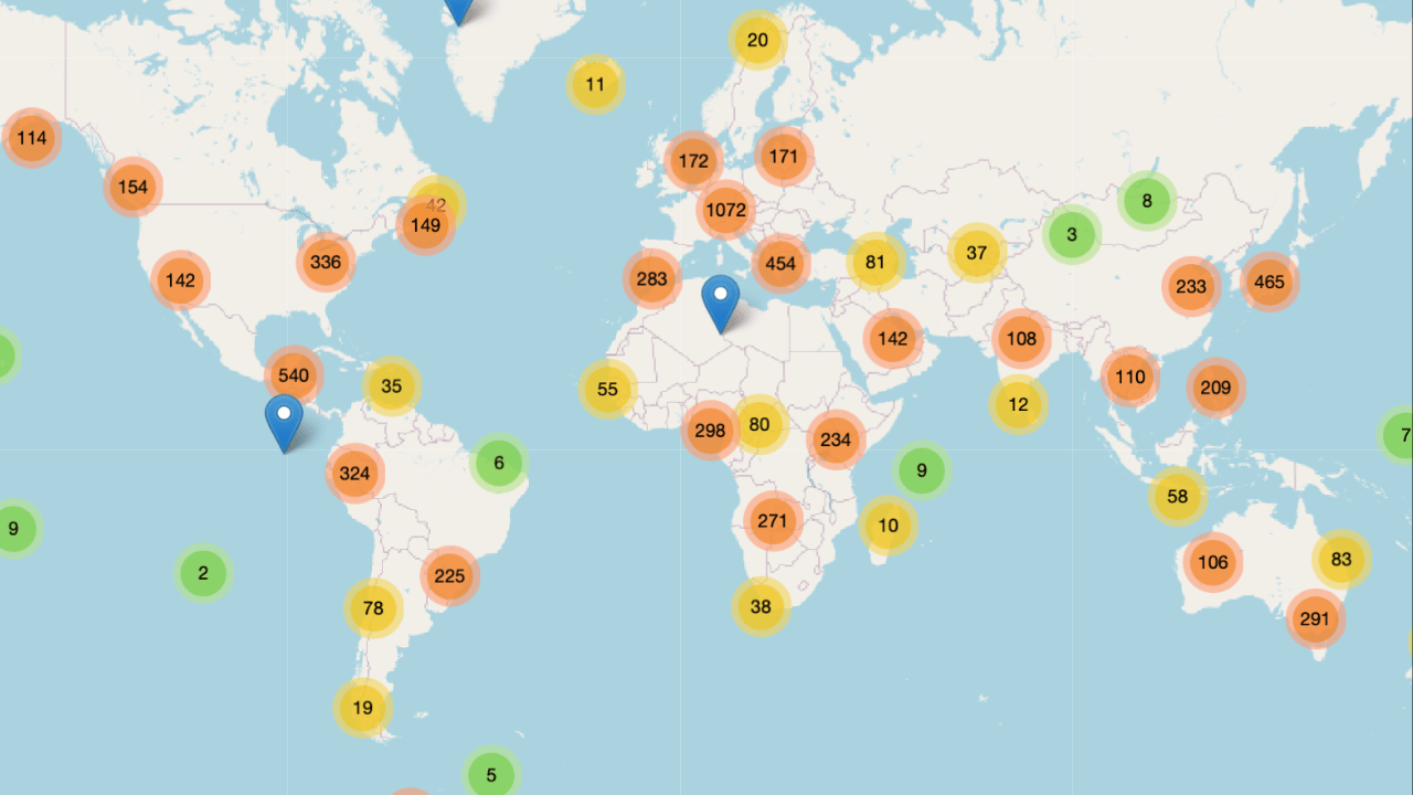
Get access to the world’s best photography location map - explore tens of thousands of amazing photo spots across the globe!
Photographer of the Week
Photographer of the week goes to: Adrian Grillo
You can find him on Instagram as: @adrian.grillo_foto
A few photos of his:


The Rest of this Issue is for Premium Subscribers
