📸 The Magazine For Photographers - Bite Size
Read the Latest Photography News and Updates in the Creative Industry in 3-4 minutes or less ;)
In partnership with

Important Note: All photography articles are NOT sponsored
The Latest News:
Sony’s Upgraded 28-70mm f/3.5-5.6 Zoom Lens
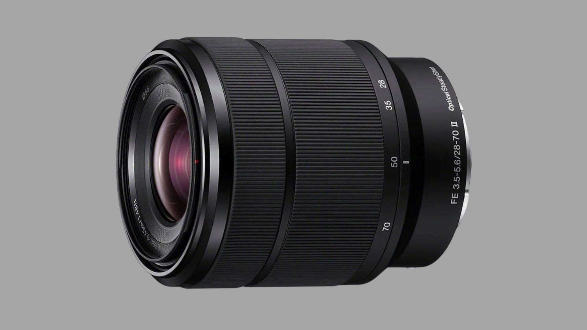
credits: Sony
Sony has refreshed one of its most basic full-frame zooms, introducing the FE 28-70mm f/3.5-5.6 OSS II. On paper, it looks almost identical to the original kit zoom from 2013, but the update brings faster communications and autofocus performance to better match Sony’s modern bodies. Sony says the lens can now keep up with AF/AE tracking at up to 120 fps (something the old version couldn’t do) though it is obviously not a natural companion for a flagship like the a9 III. Beyond that, the core optical design remains unchanged, still nine elements in eight groups with one ED and three asphericals, along with a seven-blade aperture.
Physically, the OSS II version mirrors the original almost exactly. Weight is basically the same at 293 grams (10.3 ounces), the 83 mm length is unchanged, and it retains the same 55 mm filter thread. Sony also didn’t revise the stabilisation hardware, though the built-in OSS is still compatible with the company’s in-body Active Mode. Minimum focus distance stays at 30 centimeters (11.8 inches) with a 0.19x magnification ratio. Weather sealing is present but remains a lighter implementation compared to Sony’s G or GM lenses.
While Sony positions the FE 28-70mm f/3.5-5.6 OSS II as a general-purpose zoom for landscapes, travel, and everyday shooting, early reactions from the community are… not exactly enthusiastic. Many users hoped for a more meaningful optical refresh, something closer to a constant f/4 design or sharper edge performance. Some people even say their past copies of the original lens were among the weakest kit zooms on the market, with soft corners on high-resolution bodies and inconsistent performance between units. The lens arrives in February for $449.
You can see full details on Sony’s website here
No New Pixii Camera In 2025
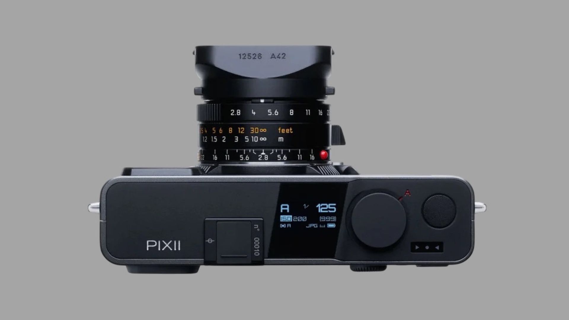
credits: Pixii
Pixii is putting the brakes on its yearly release cycle and won’t launch a new camera in 2025, a first since the company began its annual update rhythm back in 2020. In a newsletter to users, founder David Barth joked about whether Pixii had accidentally turned itself into “the Apple of photography” with its consistent timing, before explaining why 2025 will be a gap year. The team is deep into developing what he calls a genuinely new successor, one that apparently needs more time than a normal refresh. Barth says the goal is to stay true to Pixii’s philosophy, a modern rangefinder with neither a pixel-heavy rear screen nor the “blind camera” experience of fully screen-less concepts, but to rethink that formula in a way that actually moves things forward.
According to Pixii, the new model is planned for summer 2026, assuming development stays on track. Until then, the company is leaning on its current lineup, especially the Pixii Max, which has become the brand’s fully realised take on the digital rangefinder. Pixii stresses that it already offers photographers a choice between full-frame and APS-C models, and that both share the same upgraded 64-bit architecture, improved rangefinder, and award-winning sensor. Rather than rush out an incremental update, Pixii says it wants to “prepare properly” for whatever new hardware and design direction the next camera demands.
To soften the wait, Pixii has discounted all current bodies through the end of the year. The Max now starts at €3,499 for the 32 GB version and €3,749 for 128 GB, while the Pixii Plus drops to €2,499 and €2,749 respectively. Pixii also reiterates that its cameras are among the few digital models designed with genuine upgrade paths, meaning buyers can carry parts of their investment forward once the new model arrives. And just to keep things interesting, the company quietly teased an outline of a display-less camera on Instagram in October, possibly hinting at a lower-cost addition to the future lineup.
Explore The World’s Best Photography Locations
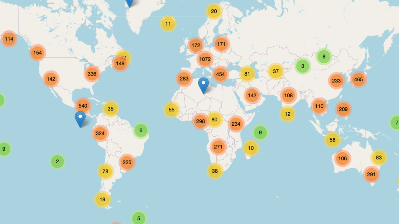
Get access to the world’s best photography location map - explore tens of thousands of amazing photo spots across the globe!
Something You Have To Check Out
AI is something that most photographers/creatives see critically, and for absolutely good reason. HOWEVER the fact at the end of the day is that there sadly is no stopping AI, so the best thing you can do is learn how to use AI to your own advantage, whether that be with helping you with daily tasks, writing, editing, your day-job etc.
This is where the ‘‘Superhuman AI’’ Newsletter comes in. It will teach you how to use AI to your advantage, increase your work efficiency (something every creative needs) etc.
Feel free to check it out, I read it myself (+it is free) ⬇️
The Gold standard for AI news

AI keeps coming up at work, but you still don't get it?
That's exactly why 1M+ professionals working at Google, Meta, and OpenAI read Superhuman AI daily.
Here's what you get:
Daily AI news that matters for your career - Filtered from 1000s of sources so you know what affects your industry.
Step-by-step tutorials you can use immediately - Real prompts and workflows that solve actual business problems.
New AI tools tested and reviewed - We try everything to deliver tools that drive real results.
All in just 3 minutes a day
Photo Analysis
Welcome to a new addition to the magazine: the photo analysis, where I will analyse a photo and talk about the composition, lighting what’s positive, what’s negative etc. so that you can learn and better your own photography from it ;)
This week’s photo by: Krzysztof
You can find him on Instagram as: @qs.street
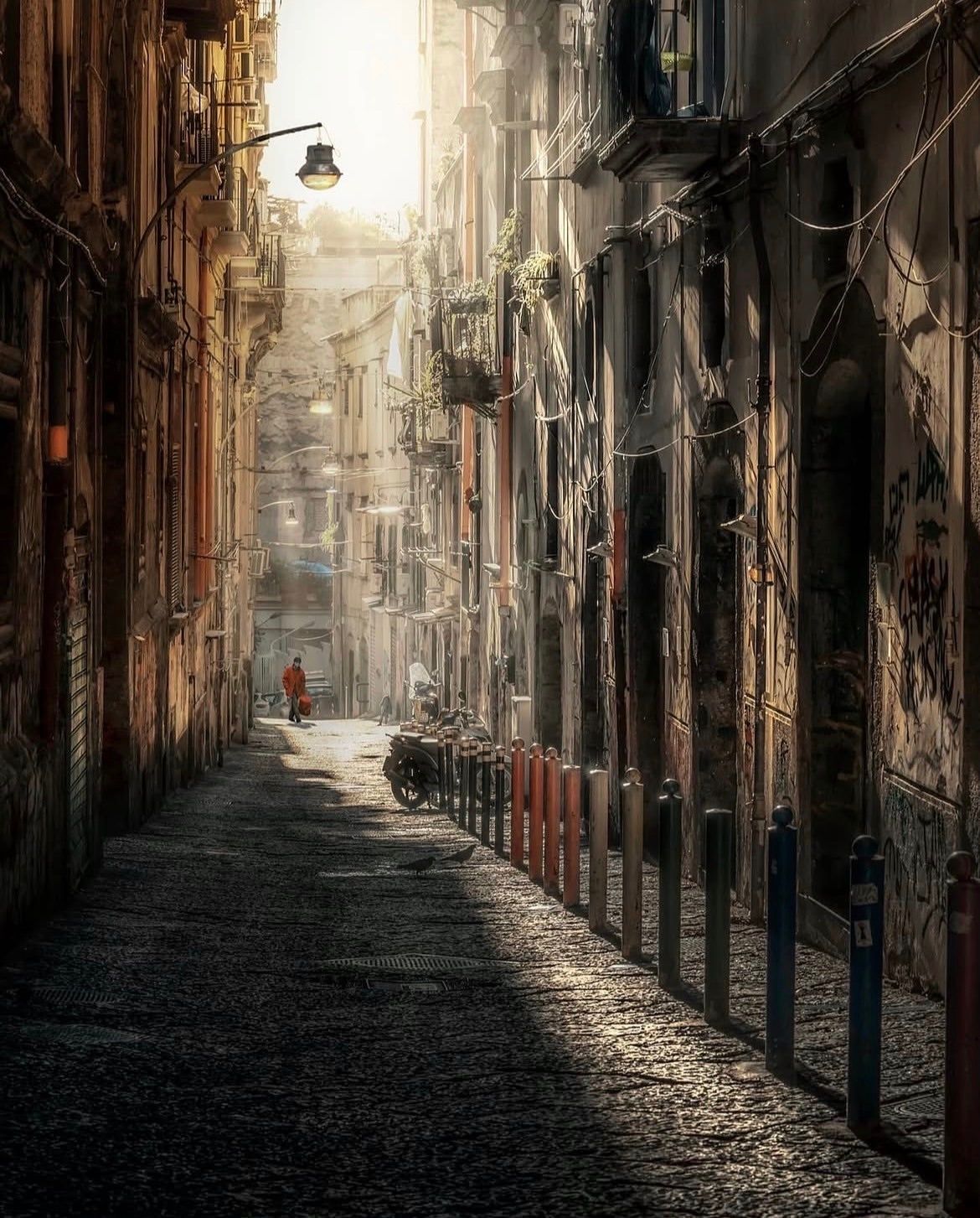
Let’s Analyse this Image:
Composition & Framing
What works well:
Composition is pretty strong, the alley naturally forms a long tunnel, and that tunnel effect adds a ton of depth and the 3D effect.
The leading lines aren’t just the walls, the cobblestones. the shadow/light, but especially the polls on the right guide your eye toward the centre, which is a nice touch.
The layers are great as well, we have the textured ground, polls, scooters and balconies, the person, and finally the hazy background. It all stacks nicely without feeling chaotic.
Again, the architecture itself does half the job → narrow, tall, full of repeating shapes all of which naturally funnels you inward.
The man at the vanishing point anchor everything (your eye naturally settles on him).
What could be better:
The person is pretty tiny in the frame. Waiting just a few more seconds until he walked further toward us would have strengthened the composition and made the leading lines land more effectively on him, for example → If the man were closer to the first/last poll (depending on your philosophy) on the right, that leading line would have felt even more intentional and punchy.
The right side is a little heavy with all those polls, but not in a way that ruins the shot (+ the shadows on the left sort of balances that out, more on that below).
The lamp sticking in from the top left is a small distraction, but not a lot you can do about that (well editing it out would technically be an option).
Light & Atmosphere
What works well:
The light is beautiful, we have that hazy beam pouring in from the top of the alley which gives the whole scene a warm, dusty glow that feels very cinematic.
The way the light falls more on the right wall (you can even slightly see the light streaks) and leaves the left in deep shadow creates such a natural contrast and pulls your eye right down the street.
The atmosphere is rich overall with that bit of haze and dust catching the sun
That lighter background also helps separate our subject nicely. Even though he is small, he pops just enough.
What could be better:
The highlights at the top are super blown out, they are basically completely gone. A little bit of control there could have kept some structure in the sky.
The shadows on the left side are pretty heavy, swallowing a lot of detail that could have added even more atmosphere.
Emotion & Story
What works well:
In this photo, the atmosphere alone tells most of the story —> warm light, the narrow alley, the old buildings, the iconic look. It all screams Naples.
The man in the orange jacket gives the scene a focal point and a sense of life. He just walks through the alley and that alone immediately adds a bit of everyday human presence to that otherwise still/calm/empty scene.
What could be better:
Because our subject is so small, we don’t see what he is carrying or exactly what he is wearing, so the storytelling stays open-ended.
A closer view or clearer silhouette could have made it easier to understand who he is or guess what he is doing, where he is going etc.
Emotionally it leans more atmospheric than narrative, which works, but it means the viewer doesn’t connect strongly with the person.
Colour & Tone
What works well:
The warm golden tones fit the location and the time of day perfectly, very Mediterranean, very soft, very natural.
The orange jacket is a great colour anchor. As mentioned before, it stands out without feeling disconnected from the rest of the palette.
The overall tone is cohesive and matches the mood of the environment well.
What could be better:
The overall colour cast leans very yellow/orange. It fits the vibe, definitely, but it does make everything feel a little monotone. A touch more variation could have helped give certain elements more identity (for example the polls on the right are quite colourful if you really look at them, but if you just glance over, it looks like they are all some sort of a ‘orange variation’).
The blown-out highlight area is so bright that it slightly throws off the tonal balance.
Some areas on the right wall get a bit muddy in the midtones, losing some structural detail there.
Balance
The frame is actually pretty well balanced overall, considering how much is going on. The strong vertical architecture definitely helps with that.
The right side (overall) is a bit heavier with all the posts and shapes, but the darker left wall counterbalances that weight well enough.
Even though the shot is busy, nothing really distracts from the subject, the whole scene feels quiet at first glance, but once you look longer, there is a ton to explore, birds, scooters, laundry, plants, balconies, graffiti.
The Rest of this Issue is for Premium Subscribers
