📸 The Magazine For Photographers - Bite Size
Read the Latest Photography News and Updates in the Creative Industry in 3-4 minutes or less ;)
In partnership with

Important Note: All photography articles are NOT sponsored
The Latest News:
Godox’s New TR TTL Hot Shoe Riser

credits: Godox
Godox just released a new accessory to go with its recently announced iT20 and iT22 ultra-compact flashes: the TR TTL hot shoe riser. Made for Nikon, Sony, Fujifilm, Canon, and Olympus cameras, the TR version lifts your flash by 30mm, giving it a bit more breathing room over bigger lenses and helping avoid dark corners in your shots. It keeps full TTL metering and high-speed sync, so you still get automatic flash control, just with a better angle and clearance.
The TR riser tilts from 0° to 90°, so you can switch between direct and bounce flash quickly without taking it off the camera. It works with Godox’s iT30Pro, iT20, iT22, iM30, iM20, and iM22 flashes, though the iM series will only run in manual mode on it. It will also take single-contact flashes, but without TTL or HSS.
There’s also the Godox FS-R single-contact riser, a lighter, foldable version for manual flashes under 300 grams. It skips TTL and HSS, but still gives you that same 30mm lift. The TR comes in at 26.5 grams, and the FS-R at 16 grams. Both are available now, with prices between $13 and $18 depending on the version and mount.
You can see full details on Godox’s website here
OM-Systems Upcoming Tele Zoom Lens

credits: OM System
OM System is one of the few camera makers that still shares a public lens roadmap, and the latest update, shows a new telephoto zoom lens planned for release this year. The roadmap even includes a tiny preview image (up top), though without any real specs. That hasn’t stopped the rumours circulation , and the latest word is that this could be a 70-200mm f/2.8 IS PRO.
Up until now, most people were expecting a 50-200mm f/2.8 PRO, which would fit nicely into the Micro Four Thirds lineup. But a source speaking to 43rumors claims OM System has gone with a 70-200mm instead. That’s led some to wonder if it might be a reworked Sigma 70-200mm f/2.8. There’s no proof of that, and side-by-side comparisons show some clear differences, for example, the zoom and focus rings are swapped compared to Sigma’s design, which suggests OM System may have made some noticeable changes.
Even so, the rumored 70mm starting point doesn’t really line up with the roadmap teaser, which seems to show the zoom starting closer to 50mm. It’s possible the image is from an older prototype, since lens designs can change a lot before release. Whether it’s an original OM System design, a heavily tweaked Sigma, or something in between, the company has been working on this telephoto for a while. If it really does get the PRO label, it should have weather sealing, strong optics, and in-lens stabilisation to work alongside OM System’s IBIS.
Something Worth Checking Out
Growing on Social Media, especially as a Photographer/Creative is hard. This is where Hubspot’s Social Media Playbook comes in. It includes thousands of strategies used by social media marketing experts that can help you boost your own social media presence.
Make sure to check it out ⬇️

Is your social strategy ready for what's next in 2025?
HubSpot Media's latest Social Playbook reveals what's actually working for over 1,000 global marketing leaders across TikTok, Instagram, LinkedIn, Pinterest, Facebook, and YouTube.
Inside this comprehensive report, you’ll discover:
Which platforms are delivering the highest ROI in 2025
Content formats driving the most engagement across industries
How AI is transforming social content creation and analytics
Tactical recommendations you can implement immediately
Unlock the playbook—free when you subscribe to the Masters in Marketing newsletter.
Get cutting-edge insights, twice a week, from the marketing leaders shaping the future.
Explore The World’s Best Photography Locations
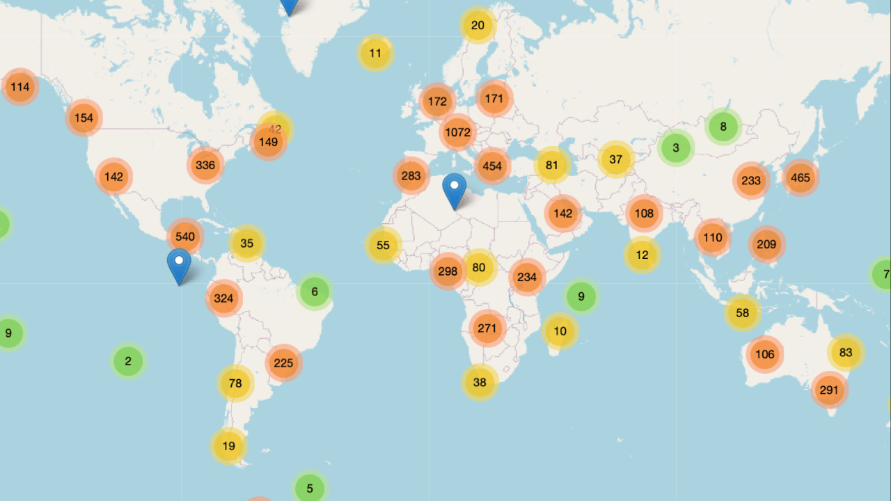
Get access to the world’s best photography location map - explore tens of thousands of amazing photo spots across the globe!
Photo Analysis
Welcome to a new addition to the magazine: the photo analysis, where I will analyse a photo and talk about the composition, lighting what’s positive, what’s negative etc. so that you can learn and better your own photography from it ;)
This week’s photo by: Karunchai Treetrong
You can find him on Instagram as: @blowithand

Let’s Analyse this Image:
Light & Atmosphere
What works well:
The neon sign is definitely the star (in terms of lighting) in this shot. It’s bright, instantly pops and throws a warm spill onto the surrounding walls and pavement, which not only creates mood, but it also works as a spotlight that ‘‘lights up the stage’’ for our subject, the old man.
There’s a nice mix between the warm neon and the cooler tones further down the street (as well as on the bottom right). This warm–cold contrast gives the scene more depth and keeps it visually interesting.
The way the light falls off into the darker area behind works really well, it keeps your attention on the main stretch while still hinting at the rest of the environment and letting the background ‘‘exist’’.
What could be better:
The streetlight in the bottom right corner is a bit too bright, it starts to fight for attention with our subject. That said, I do like how it brings in that cooler light, which like I said, works nicely against the warmth of the sign + the street lamp with the neon sign sort of ‘‘box in’’ our subject.
The man could use a bit more light on him in post, just a subtle lift would make him pop more against the darker road. Right now, it feels like he was intended to be the main subject (and he still is), but the neon sign ends up stealing more of the attention. You could either brighten him or tone down the sign to shift the balance.
Composition & Framing
What works well:
The elevated perspective works great. It gives you a clear view down the street, with the neon sign acting as a horizontal anchor.
The leading lines of the street, especially that yellow edge/line, pulls you straight in. Combine that with the vertical lines of the buildings, and you get a nice 3D effect that adds depth.
The layering from foreground sign to the man in the midground to the cooler-toned background buildings is solid and keeps your eye moving.
What could be better:
The sign is sitting very centrally vertically, which means the man doesn’t have as much space infront of him to “walk into.” Lowering the framing slightly could help. However to be fair that could come at the cost of lessening the ‘‘setting the stage’’ effect.
The neon sign is so dominant in size and position that it sort of abruptly splits the photo into two separate parts (the upper buildings and the street below) without much connection between them. Ideally you want your photo and it’s composition to ‘‘flow’’.
Emotion & Story
What works well:
The man walking down the middle of the street instantly becomes the human anchor for the scene. He’s clearly an older gentleman, hunched over, leaning on a walking stick and that adds a sense of vulnerability/hardship to the image and makes it more impactful and special.
The street being mostly empty gives the shot a quiet/cinematic vibe and you can just tell that this is a 2 a.m. in the morning shot.
What could be better:
Storytelling wise there are not a lot of negatives to point out. The man’s hunch, walking stick and shopping bag already add a lot. Maybe if there were a bit more light on him you could read a bit more.
Colour & Tone
What works well:
As already touched on, the warm–cool colour split is great: the neon sign provides the warmth, and the rest of the street drifts into cooler blue-green tones.
The contrast is well-handled, there’s a nice range without the shadows becoming completely flat.
The neon reds and yellows are bold but not oversaturated to the point of looking artificial.
What could be better:
The background’s cooler tones could be just a little richer to balance the warmth of the sign, especially if you also were to tone down the street lantern on the bottom right.
There’s a slight colour contamination where the warm spill from the neon sign into the cooler mid-background, it’s not a huge issue and barely noticeable, but it makes the transition between warm and cool feel slightly less clean.
The Rest of this Issue is for Premium Subscribers
