📸 The Magazine For Photographers - Bite Size
Read the Latest Photography News and Updates in the Creative Industry in 3-4 minutes or less ;)
In partnership with

Important Note: All photography articles are NOT sponsored
The Latest News:
The New Viltrox Air 15mm f/1.7 Lens

credits: Viltrox
Viltrox has added a new wide-angle option to its compact and budget-friendly Air series: the AF 15mm f/1.7. It’s the widest lens in the Air lineup so far, joining the existing 25mm f/1.7 and 50mm f/2. Designed for APS-C mirrorless cameras, it has a 22mm full-frame equivalent field of view, so wide enough for landscapes, interiors, street photography and even some creative video work. It’s also surprisingly fast for such a small lens, with a bright f/1.7 aperture that gives a bit of flexibility in low light or when shooting with shallow depth of field.
At 180 grams and a bit over 5.5 centimetres long, this lens is quite compact. It can focus as close as 23 centimetres, which is good for shots with strong foregrounds (or close-up videos). Optically, the lens includes 12 elements in 10 groups, with three ED elements, three high-refractive-index elements, and two aspherical elements. Viltrox also uses advanced coatings to minimise flare and ghosting, which should help in tricky lighting.
The company says sharpness holds up even wide open, though real-world tests will tell the full story. The lens accepts 58mm filters and is available in Sony E, Nikon Z, and Fujifilm X mounts. Pricing currently sits at $227 as a launch promo, before it moves to its regular $239 price.
You can see full details and sample shots on Viltrox’s website here
Kodak Teases New Camera

Mock-up made by Kodak
Kodak is set to unveil a new superzoom bridge camera, the Pixpro AZ653, at this year’s IFA show in Berlin, which kicks off on September 5. While the official launch is still a few weeks away, a few key details have already leaked/been teased by Kodak.
The AZ653 will feature a 65x optical zoom lens with built-in image stabilisation, paired with a 20-megapixel 1/2.3-inch CMOS sensor. All that sounds almost identical to the older AZ652 from 2014, which suggests this is more of a refresh than a brand-new design. One noticeable downgrade, though, is the display. The AZ653 is said to have a fixed 3-inch 460k-dot screen, rather than the fully articulated LCD found on its predecessor. Thankfully, the camera will still offer a built-in electronic viewfinder for composing shots more traditionally. It also swaps out the old Mini USB port for a more modern USB-C socket, in line with recent EU charging rules.
There’s one catch however that has the internet talking: even with a 20MP sensor, the AZ653 won’t shoot 4K video, it’s limited to Full HD. That could be a deal-breaker for anyone used to sharper video footage, but for ‘everyday photography’, it’s likely to be a capable, affordable all-rounder. We will see on September 5th!
Something You Have To Check Out
Down below you will find an AMAZING newsletter that I myself read every single day (absolutely recommend subscribing + it’s completely free) ⬇️

Join over 4 million Americans who start their day with 1440 – your daily digest for unbiased, fact-centric news. From politics to sports, we cover it all by analyzing over 100 sources. Our concise, 5-minute read lands in your inbox each morning at no cost. Experience news without the noise; let 1440 help you make up your own mind. Sign up now and invite your friends and family to be part of the informed.
Photo Analysis
Welcome to a new addition to the magazine: the photo analysis, where I will analyse a photo and talk about the composition, lighting what’s positive, what’s negative etc. so that you can learn and better your own photography from it ;)
This week’s photo by: Morgan Oliver-Allen
You can find him on Instagram as: @moliverallen

Let’s Analyse this Image:
Composition & Framing
What works well:
The timing here is perfect. The kid mid-kick with his foot up and the ball flying, is exactly the kind of split-second (candid) moment you hope to catch when shooting street photography.
There’s a nice sense of depth, too. Kids/people in the front, car in the middle, and the background. It all gives the photo this layered, 3D like feeling. Also because of that dust/haze in the air, the boy in the very front just pops.
The light shining through the alley is doing a lot of work compositionally. It pulls you right down the frame and straight into the action. It’s almost like a spotlight.
What could be better:
The left side of the frame feels a bit visually heavy (there is a person sitting, a car, the sun is shining from there etc.) and it kind of pulls the balance off a bit. The right side doesn’t quite hold up in comparison.
A slightly lower framing would have been interesting, just to give more space to those long shadows. They’re doing a lot of visual storytelling, but we only get the top half of them.
One slight nit pick I have, is the half-cut lantern at the top right. It certainly does not add anything, but definitely distracts you once you notice it. The linen hanging from the top however adds to the story and is a nice touch!
Light & Atmosphere
What works well:
That backlight is beautiful and it is what makes this shot (it’s also a big part of the emotional feel of the photo).
The dust being kicked up by the kids catches the light nicely and gives the whole photo this extra layer of depth and texture.
The long shadows are also nice. They stretch right across the street and sort of pull you into the moment, almost like leading lines.
What could be better:
It’s really backlit, maybe a bit too much. The silhouettes are great, but we lose all detail in the faces and clothes, and I do think that takes away a bit from the personal feel (like imagine you could see the smiles/expressions on the faces of the kids).
The sun flare blasting out of the top centre is very strong. It’s a great effect, but it also blows out the middle. Maybe shifting slightly to the side or blocking part of it could have helped tone that down. HOWEVER, all that being said, the very strong golden glow definitely add something special to the photo.
Emotion & Story
What works well:
The whole photo feels alive. You can tell the kids are completely in the moment, and that energy translates right through the image. It doesn’t feel staged or posed at all, it’s just raw, cuban real street life.
There’s something really relatable about it. Doesn’t matter where you’re from, kids playing football in the street is one of those things that everyone understands. Football in general is one of the few things that really connects and transcends the whole world.
It also has this slight nostalgic vibe. Like, this could’ve been taken twenty years ago and it’d still feel the same. Timelessness in photos is always great (in my opinion).
What could be better:
That said, as already noted on the top, the image is a bit anonymous. All the kids are mostly in shadow, and we don’t really get a look at any expressions.
Some of the gestures don’t read super clearly. The kid on the right (right next to the main kid), for example, I’m not sure what he’s doing or where he’s looking and I just have to keep guessing.
Color & Tone
What works well:
The golden hour warmth carries the entire photo, it gives everything a soft, glowing feeling. The light really does all the heavy lifting here.
The overall colour grade is nice and doesn’t feel over-processed.
What could be better:
The cooler tones on the right edge feel a bit disconnected from the warmth in the middle. A bit of colour balancing across the frame could help unify everything a little more(But I wouldn’t over do it, the cooler tones in the buildings do contrast the warmth nicely).
For some people the strong yellow/orange colour could be too much, so maybe backing it off by 5–10% would be the way to go.
Some of the shadow areas go a bit muddy, a bit of chroma in those blacks would help them feel less dead.
Explore The World’s Best Photography Locations
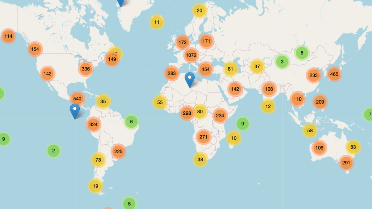
Get access to the world’s best photography location map - explore tens of thousands of amazing photo spots across the globe!
The Rest of this Issue is for Premium Subscribers
