📸 The Magazine For Photographers - Bite Size
Read the Latest Photography News and Updates in the Creative Industry in 3-4 minutes or less ;)
In partnership with

Important Note: All photography articles are NOT sponsored
The Latest News:
Brightin Star’s 50mm f/0.95 Mark II Lens

credits: Brightin Star
Brightin Star has introduced an updated version of its ultra-fast full-frame 50mm f/0.95, simply called the 50mm f/0.95 Mark II. The new model sticks to the same basic idea as the original (a large aperture at a more attainable price) but comes with a revised exterior design and a slightly different aperture setup. Even though the optical formula still uses 10 elements in 9 groups, including extra-low dispersion and ultra-high refractive elements, Brightin Star says the Mark II has been tuned for better resolution and improved flare control. It remains a manual-focus-only lens and it keeps the same 0.5 m minimum focusing distance.
In terms of size and handling, the Mark II doesn’t stray far from the earlier version. It weighs roughly 750g and still takes 62mm filters, but the control layout has been adjusted with a wider focusing ring and updated markings. One notable change is the shift from a 10-blade aperture to a 9-blade design, which will slightly alter the look of out-of-focus highlights. The integrated hood is also new, redesigned to offer better protection against stray light.
The Brightin Star 50mm f/0.95 Mark II is available for Sony E, Canon RF, Nikon Z, and L-mount, priced at $369.99. In this range it sits alongside other f/0.95 options like the Mitakon Zhongyi Speedmaster 50mm f/0.95 III, which competes directly with similar specs and the same mount availability.
You can see full details and sample shots on Brightin Star’s website here
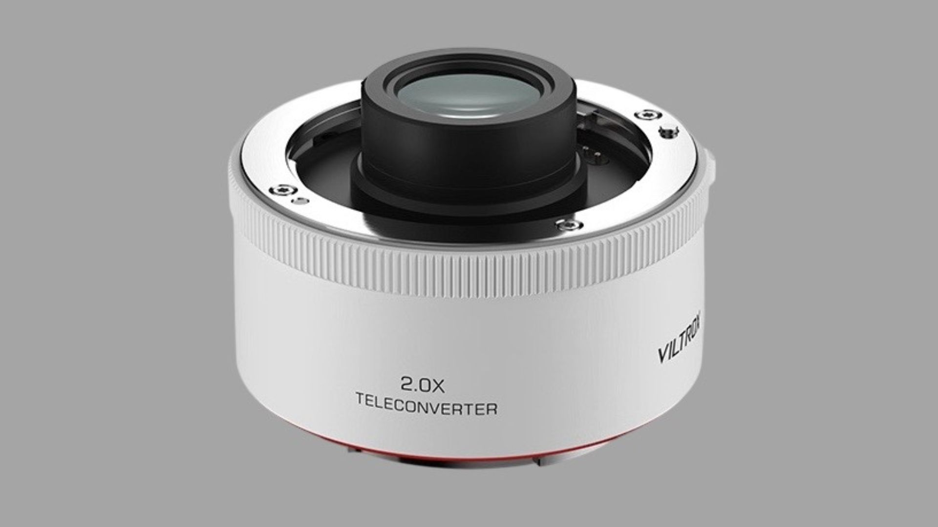
Viltrox’s Upcoming 2.0x Teleconverter
credits: Viltrox
Viltrox’s upcoming 2.0x teleconverter is shaping up to be a much more ambitious accessory than many expected. For those of you that don’t know, a teleconverter is a small optical adapter that sits between the camera and lens to increase the lens’s focal length, essentially giving you more “zoom”. The first leaked photo surfaced a few weeks ago, and now the converter appears to have been quietly unveiled in China, where detailed specs have been posted on Weibo. According to those early listings, it uses an optical design of 9 elements in 5 groups, includes full electronic contacts, is dust- and splash-resistant and weighs about 229 grams.
What really stands out though, assuming the information is accurate, is performance compatibility. The converter reportedly supports EXIF transmission, lens-based stabilisation, and (most surprising) up to 120 fps continuous shooting on Sony bodies that can achieve that speed natively. If that holds true, it would represent an unusually high level of compatibility for a third-party teleconverter. Traditionally, Sony limits third-party electronic lenses and accessories to much lower burst rates, often around 15 fps, so this claim naturally raised a few eyebrows.
Another unexpected detail concerns lens compatibility. Early speculation suggested the 2x converter might be limited to Viltrox’s own autofocus lenses, but the published list points in the opposite direction, only one Viltrox lens appears to be supported, while the rest of the list consists of several Sony lenses, including telephotos. The expected price of the teleconverter is around $160, though official global details haven’t been released yet.
You can see full details on Weibo’s website here
Explore The World’s Best Photography Locations
Get access to the world’s best photography location map - explore tens of thousands of amazing photo spots across the globe!
Something You Need To Check Out
Master ChatGPT for Work Success

ChatGPT is revolutionizing how we work, but most people barely scratch the surface. Subscribe to Mindstream for free and unlock 5 essential resources including templates, workflows, and expert strategies for 2025. Whether you're writing emails, analyzing data, or streamlining tasks, this bundle shows you exactly how to save hours every week.
Photo Analysis
Welcome to a new addition to the magazine: the photo analysis, where I will analyse a photo and talk about the composition, lighting what’s positive, what’s negative etc. so that you can learn and better your own photography from it ;)
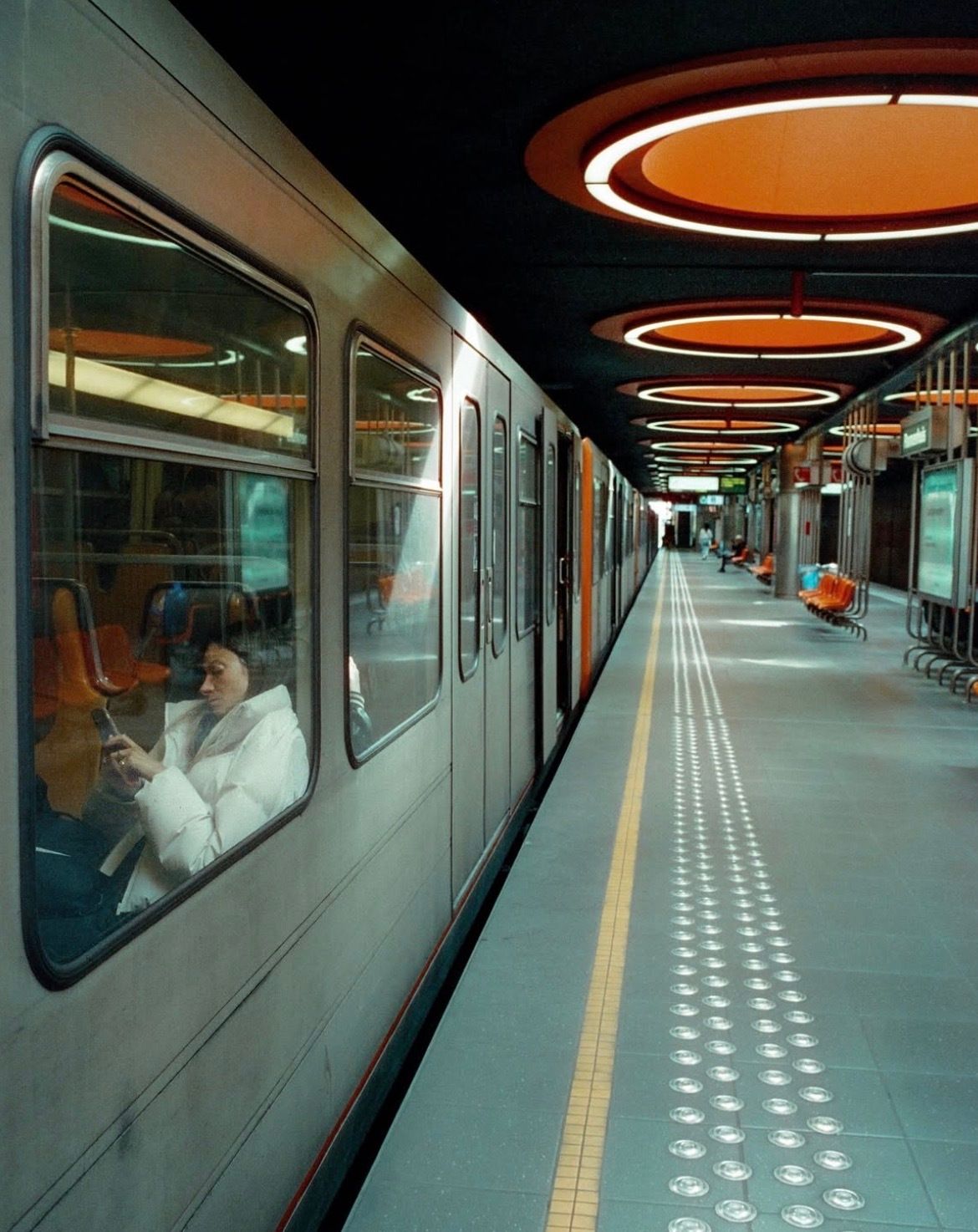
This week’s photo by: Peter Varsic
You can find him on Instagram as: @p_varsic
Let’s Analyse this Image:
Composition & Framing
What works well:
Leading lines are definitely strong here, the yellow strip on the ground, the whole train (/the edges), all the floor markings, even the reflections on the metal. It all creates a ton of depth.
It is also nice that the leading lines coming from the train basically start right from the edges of the frame, which makes the whole perspective feel very intentional and immersive.
The orange ceiling lights add rhythm with their repeating circular shapes, giving the top left part structure and visual flow.
The architecture itself plays a huge role obviously, that retro-futuristic design of that underground station is stunning to look at and adds a ton of character.
What could be better:
One unfortunate thing about the composition is that the leading lines don’t actually lead anywhere specifically. They are beautiful no doubt, but there is nothing at the end to reward the viewer. A person stepping into the train in the distance would have been amazing for example, but obviously, with street photography, you can’t stage what you wish you had you just have to work with what you get.
The right side of the frame gets a (tiny) bit busy with chairs, signage, and reflections.
The display screen in the middle of the station (which probably has the train info) can’t really be read. That is normally something that helps immensely with location and storytelling, more on that down below.
Light & Atmosphere
What works well:
The lighting overall is soft and very even, which really fits this kind of clean, modern (yet retro) station. It gives the photo a calm, almost sci-fi metro vibe which is great.
The reflections in the train windows add atmosphere, especially where the ceiling lights bounce around, it creates a layered look that feels cinematic.
Those glowing orange ceiling circle lights keep the mood interesting. They add warmth to an otherwise cold, grey environment and again instantly give the place character.
What could be better:
Here and there the platform light is a bit flat, which makes some textures and shadows feel muted. A touch more contrast might have added some more punch (though to be fair the orange accents already pop a lot).
Inside the train, it is dim compared to the platform. A bit more light on the woman would have made her pop even more and strengthened the storytelling/human touch.
Emotion & Story
What works well:
The woman inside the train adds almost all the human feeling to this photo. Her body language is hunched, tired, her face looks exhausted, and her jacket + bag + the phone all give us clues. You can instantly imagine she is commuting after an exhausting day at work.
There is a very calm, everyday-life vibe to the scene, especially with how empty the platform is.
What could be better:
We don’t get to see the woman fully, only through a window, so the emotional connection stays a bit surface-level.
The moment is interesting, but there isn’t a second human element to build tension or narrative. As I mentioned before, one more person stepping off/on the train or walking down the platform would have enriched the mood.
As touched on before in the middle of the station there is a display which presumably has the time and train stop on it but we cant really read it, it is always nice to have that readable because it gives you an incredibly good sense of location (and if you can see the clock you immediately know what time of day it is), now obviously the distinct retro future architecture can tell you where we are if you know, for those that don’t this was taken in Brussels, Belgium.
Colour & Tone
What works well:
The warm orange ceiling lights contrast nicely with the grey/silver train and blueish station tiles. It keeps the colour palette cohesive without becoming monotone.
The orange feels like it is genuinely how the station looks, meaning it’s not overdone or overly stylised.
The tones are pretty natural overall, which is a good thing.
What could be better:
The orange tones could maybe be dialed back just slightly, not because they are ‘‘overdone’’, but because they do shift the visual balance to the right side, making it feel a bit heavier there.
As mentioned, the train interior could use a little light lift to make the woman stand out more.
A touch more contrast overall could have made the textures (like floor tiles and metal surfaces) pop even more.
Balance
The train on the left gives the photo weight, and the orange ceiling lights help spread visual interest across the right, so the balance generally holds up, even with that lopsided architecture.
The woman inside the train helps anchor the left side visually, but she is ‘‘hidden’’ enough that she doesn’t fully counter the strong right-side elements.
The architecture creates natural symmetry with the perspective lines, and the repeating ceiling circles keep the frame from feeling empty.
The Rest of this Issue is for Premium Subscribers
