📸 The Magazine For Photographers - Bite Size
Read the Latest Photography News and Updates in the Creative Industry in 3-4 minutes or less ;)

Important Note: All photography articles are NOT sponsored
The Latest News:
The New Noxlux DG 50mm f/1.2 Lens
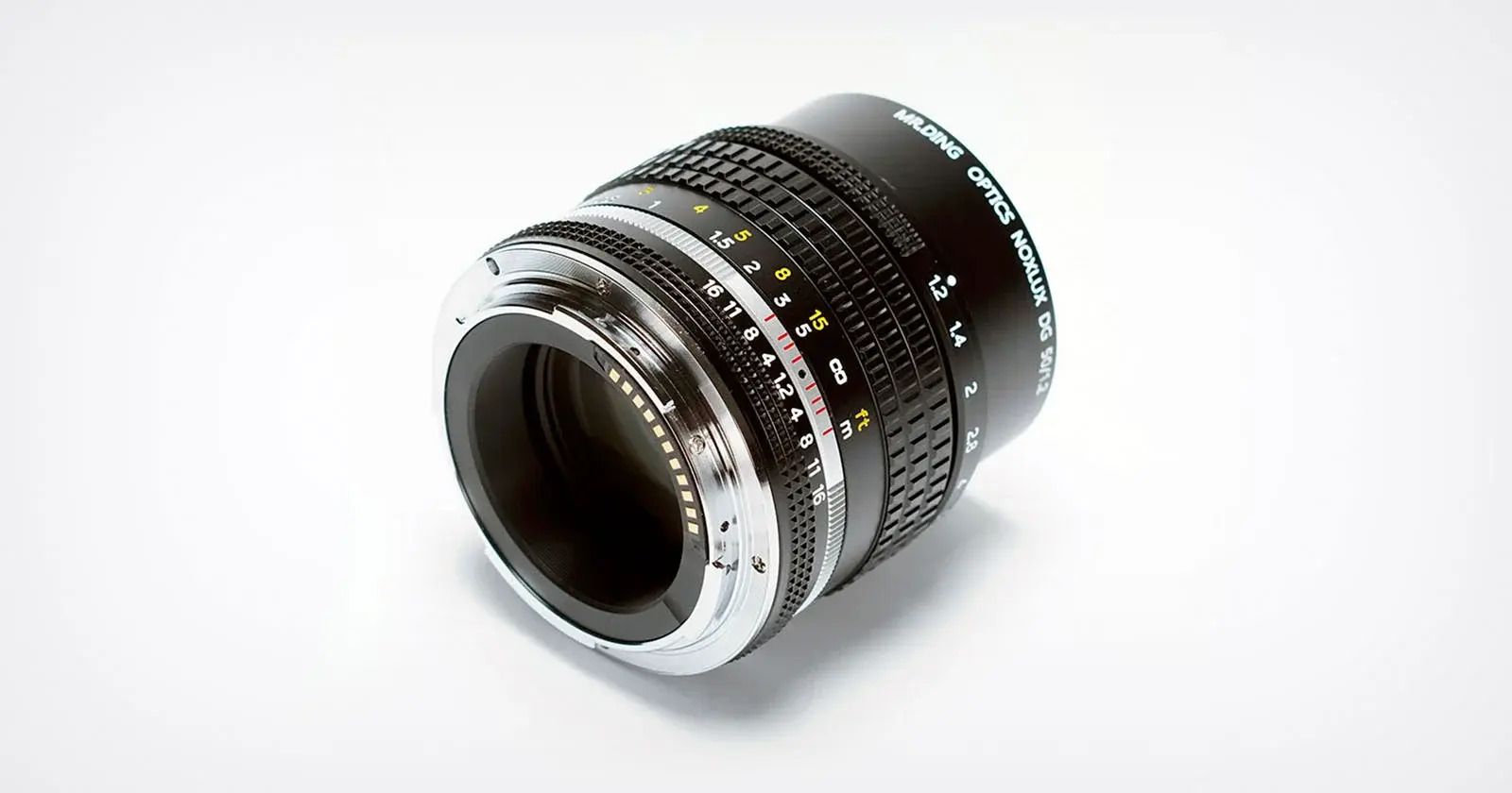
credits: Mr. Ding
After a long stretch of rumors, Chinese lensmaker Mr. Ding has officially launched its latest lens: the Noxlux DG 50mm f/1.2 for Nikon Z mount. Known for its Leica M-mount glass, like the 35mm f/1.8 and 50mm f/1.1, Mr. Ding is now stepping into the Nikon mirrorless space with a third-generation manual 50mm that blends vintage styling with some modern upgrades. This version includes electronic contacts, which means you’ll get access to Nikon’s focus assist tools, making it much easier to nail critical focus at f/1.2. They’ve also shortened the minimum focus distance from 0.7 meters to 0.45 meters, so you can get a bit closer to your subject than with previous versions.
The lens is built with eight elements in six groups, including four lanthanide glass elements for better clarity and character. The optical coating’s been improved to help reduce flare and ghosting, especially in backlit scene, something vintage-style lenses can struggle with. At 470 grams, it’s not heavy, and its chrome-plated black finish is clearly meant to pair beautifully with Nikon’s retro-styled Zf camera. It also takes 52mm filters and has a compact footprint overall.
Pricing for the Noxlux DG 50mm f/1.2 sits at $439. Sure, you won’t get autofocus or the clinical sharpness of Nikon’s $2,000 Z 50mm f/1.2 S, but that’s kind of the point. It’s about character and manual control. There are also other manual f/1.2 options out there, like the Nocty-Nonikkor for $550 or Meike’s for $250.
You can see full details on Mr. Ding’s website here
Harman’s Latest Colour Film

credits: Harman
Harman is back with a new film stock called Phoenix II, a follow-up to the original Phoenix C41 film that debuted in late 2023 as a limited-edition experiment. That first version was known for being bold, unpredictable, and a bit wild in how it rendered color and contrast, fun, but not exactly easy to work with. Phoenix II, on the other hand, is a complete overhaul. Harman says every part of the film has been redesigned, from the dyes and couplers to the experimental layering. It’s still an ISO 200 color negative film processed in C41, but this version promises to be much more polished and consistent.
Phoenix II is available in both 35mm and 120 formats and is meant to be a permanent part of Harman’s lineup this time, not just a one-off. Harman says this new version is “a step-change” from the original, offering better color, more controlled contrast, finer grain, and sharper results. It’s also designed to be easier to scan, which is great news for both home developers and lab users alike. If the original Phoenix was more of a chaotic creative tool, Phoenix II aims to be a reliable everyday color film that still maintains some of that analog character people loved about the first.
This release is part of a bigger analog push from Harman, who recently made their largest investment in film manufacturing since the 1990s. That’s already led to a new redscale film, the Kentmere Pan 200 black-and-white stock, and now Phoenix II. Pricing will vary depending on region, but it’s already available through retailers starting today.
You can see full details and sample shots on Harman’s website here
Photo Analysis
Welcome to a new addition to the magazine: the photo analysis, where I will analyse a photo and talk about the composition, lighting what’s positive, what’s negative etc. so that you can learn and better your own photography from it ;)
This week’s photo by: Marion Mou
You can find him on Instagram as: @moumarion
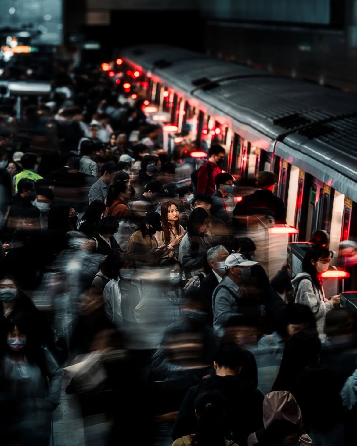
Let’s Analyse this Image:
Structure & Composition
What works well:
The train cuts clean across the frame and gives a strong sense of direction. It guides your eye but also locks the image in place.
The repetition of the red lights on the doors (well next to the train’s doors, the safety barriers) adds this rhythmic pulse that carries through the entire photo and doubles the effectiveness of the leading lines of the train.
The top-down perspective is great. It flattens the scene just enough to make it feel overwhelming (as it is in reality). It really carriers through how crowded and busy that train station is.
There’s a really nice controlled messiness here that I really like. All the movement, all the blur and then that single woman locked in stillness.
What could be better:
The crop is tight (and it mostly works) but the top feels slightly clipped. A bit more space above the train might help the frame breathe better.
There's not a strong secondary anchor in the frame. Once you see the main figure, there’s not much to discover afterward, however to be fair that is part of the charm too.
Light & Atmosphere
What works well:
The red light spilling from the train doors is perfect. It’s eerie and cinematic, it doesn’t just light the scene, it gives it a special mood.
There’s a sharp contrast between the cool shadows and those warm red highlights. That tension adds energy to what could’ve felt like just another busy station.
The light slowly falls off towards the top and back of the frame, which adds a tunnel-like compression. It pulls you inward, toward the chaos.
The darkness isn’t muddy, it’s controlled. The blacks are rich but not too crushed, and that’s a tough balance to strike in a scene like this.
What could be better:
The red is great, but it’s doing a lot of heavy lifting. A touch more ambient light or bounce on the left side could help balance the whole frame better.
Some of the shadows, are almost too dense. There’s visual weight there that doesn’t give back much.
A bit more rim lighting or bounce on our main subject would separate her from the crowd even more without losing mood.
Timing & Gesture
What works well:
Her stillness is timed perfectly. Everyone’s moving, but she’s right in that pause and the world is moving around her.
She’s not looking at anything. That aimless glance gives the photo a beautifully open-ended feeling. You as the viewer can project your own narrative onto it.
The movement of the crowd is chaotic but doesn’t smear the image. You can feel the energy without losing the scene to motion blur.
What could be better:
The people around her are moving in similar ways, which of course is logical, it is a train station at the end of the day, however a more varied set of gestures and paths would’ve added more layers.
Some of the blur at the bottom gets a bit messy. It feels like motion just for motion’s sake, not tied to anything expressive.
Focus & Subject Isolation
What works well:
This is the strongest part of the photo. She’s perfectly in focus while everything else is moving, and that contrast is amazing.
The blur isn’t just technical, it’s emotional. It makes her feel alone, maybe even overwhelmed (well judging by her facial expression maybe even slightly annoyed by the crowd).
The sharpness on her face and coat is spot-on. It’s clean but not overly crisp. This makes it feel real and not clinical.
What could be better:
The person next to her slightly competes with her shape. A slight repositioning or taking the shot a second sooner or later, might’ve clarified her silhouette better.
There’s a little softness creeping into her lower half, it definitely doesn’t ruin the image, but it breaks the spell a tiny bit. Sharpening selectively could lock that back in.
While the blur is working (I like it very much), for a lot of people there’s a fine line where it starts to become a visual gimmick. Some people would argue that one or two sharp, clear secondary elements/subjects might’ve helped anchor the scene better. I’d say it’s all about what you as the photographer are going for and this image clearly goes for that ‘‘one special person (to focus on) inside a big crowd’’ moment.
Join Our Private Photographer Community

Join our private photographer community - connect with other photographers from all over the world, collaborate creatively, talk about gear, get feedback on your work and more!
The Rest of this Issue is for Premium Subscribers
