📸 The Magazine For Photographers - Bite Size
Read the Latest Photography News and Updates in the Creative Industry in 3-4 minutes or less ;)
In partnership with

Important Note: All photography articles are NOT sponsored
The Latest News:
Rollei’s New 24mm f/1.8 Lens

credits: Rollei
Rollei has announced its new AF 24mm f/1.8 lens for Sony E-mount full-frame cameras, arriving just days after the company introduced its 35mm sibling. From a technical standpoint, this is a fairly conventional modern wide-angle prime, built around an 11-element, 14-group optical design. That layout suggests an emphasis on controlling aberrations, especially toward the edges of the frame. The maximum aperture is f/1.8, stopping down to f/16, and the diaphragm uses 11 blades, to help keep out-of-focus highlights round as the lens is stopped down.
Autofocus is driven by an STM motor, which should give quiet and smooth focus transitions. This makes sense given the lens supports face and eye AF on Sony bodies and is intended to work equally well for stills and video. Focusing is internal, so the physical length does not change and the front element does not rotate. Minimum focusing distance is 32 cm, allowing for relatively tight framing for a 24mm lens, though maximum magnification remains modest, as expected for this focal length. The lens also includes electronic contacts for full EXIF data, in-camera corrections, and firmware updates via a built-in USB-C port.
Physically, the lens uses a metal housing and weighs about 477 grams, which puts it on the heavier side compared to some compact 24mm primes. Dimensions come in at roughly 9.2 × 8 × 8 cm, and it uses a 62mm filter thread. The angle of view is approximately 84 degrees on full frame. An aperture ring is included for direct exposure control. The Rollei AF 24mm f/1.8 is priced at $325.
Photoshop 27.2 Is Here
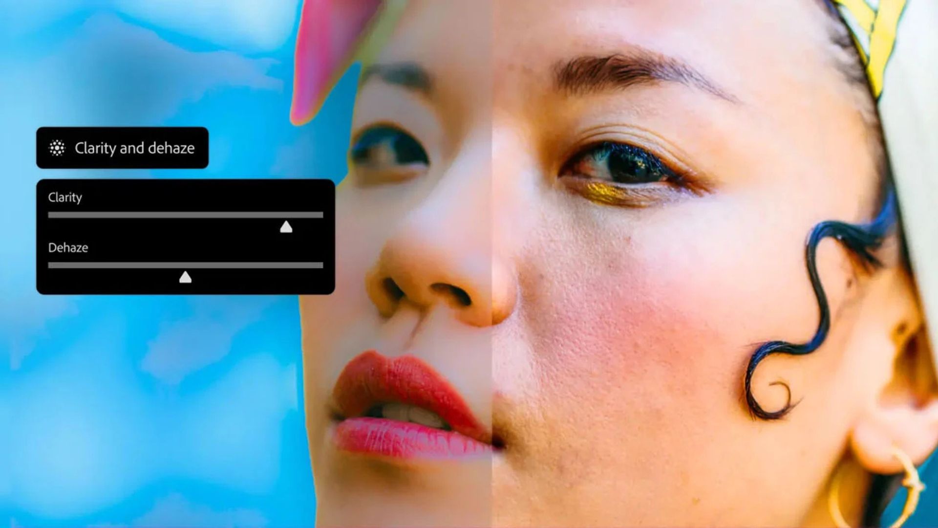
credits: Adobe
Photoshop version 27.2 is here, an update that mostly brings familiar tools into places where they arguably should have been all along. According to Adobe, the focus is on reducing friction for photographers and creatives who already spend a lot of time inside Photoshop, especially when moving between Camera Raw-style adjustments and layer-based editing.
The biggest additions are the new Clarity and Dehaze and Grain adjustment layers. These tools have long been staples of Adobe Camera Raw, but they can now be applied as fully non-destructive, maskable adjustment layers directly in Photoshop. This makes it easier to fine-tune local contrast, cut through atmospheric haze, or add controlled grain without committing changes early in the edit. Because they behave like standard adjustment layers, they can be stacked, masked, and changed at any stage, which should feel more natural for people who rely on layered workflows.
The update also brings incremental improvements to Firefly-powered tools. Generative Fill, Generative Expand, and the Remove tool now produce higher-quality 2K outputs with cleaner detail and fewer visible artifacts. Adobe has also refined how reference images influence generative results, making it easier to maintain a consistent look when extending or compositing images. Rounding things out is Dynamic Text, currently in beta, which allows text layers to be quickly reshaped into curves or circular forms while preserving spacing and readability. Photoshop 27.2 is available now to Creative Cloud subscribers, with the beta tools accessible through the Creative Cloud app.
Explore The World’s Best Photography Locations
Get access to the world’s best photography location map - explore tens of thousands of amazing photo spots across the globe!
Something You Have To Check Out
Receive Honest News Today

Join over 4 million Americans who start their day with 1440 – your daily digest for unbiased, fact-centric news. From politics to sports, we cover it all by analyzing over 100 sources. Our concise, 5-minute read lands in your inbox each morning at no cost. Experience news without the noise; let 1440 help you make up your own mind. Sign up now and invite your friends and family to be part of the informed.
Photo Analysis
Welcome to a new addition to the magazine: the photo analysis, where I will analyse a photo and talk about the composition, lighting what’s positive, what’s negative etc. so that you can learn and better your own photography from it ;)
This week’s photo by: Casey Herzog
You can find him on Instagram as: @herzawg

Let’s Analyse This Image
Composition & Framing
What works well:
The leading lines are pretty great. The tram tracks are doing exactly what they should, pulling you straight into the photo and guiding your eye directly toward the man.
The low viewpoint really helps here, it exaggerates the rails and makes the leading lines feel even stronger and more intentional.
Subject separation works well too, the man’s dark clothing against the generally lighter street and background makes him stand out well.
The buildings on both sides create a strong tunnel effect, creating a nice sense depth and giving the photo a clear direction (along with the leading lines).
Repeating things like red signs, balconies, lanterns etc. along the street, help create depth as well.
What could be better:
Our subject, the man, is quite centred, which works of course, but a slight offset could have added more visual tension and ‘‘excitement’’ (however that might have come at the loss of the really strong ‘direct’ leading lines effect from the tracks).
The blown-out background weakens the tunnel/depth effect a bit, all the lines lead you there, but the detail disappears (it sort of creates a blown out wall). That being said, the brightest area being in the distance does actually pull the eye away, which DOES help with depth. → Optimal would be light in the distance but not blown out.
The foreground blur helps keep attention on the subject, but it also reduces the ‘‘fell’’ of texture at the very there.
Light & Atmosphere
What works well:
The light is soft and fairly neutral, which works with the street scene. It doesn’t feel harsh or overly dramatic, and that keeps everything grounded and realistic.
The subtle shimmer on the tram tracks is a really nice detail. It catches just enough light to make the rails pop which again accentuates the leading effect.
The overall atmosphere feels calm, just a quiet moment in the city where nothing special is happening (and that is kind of the point I guess).
What could be better:
As mentioned before, the background further down the street is quite blown out.
Because the brightest area sits (close to) right behind our subject, it competes a little with him instead of supporting him.
The light overall is pleasant but very safe, adding a bit more contrast between foreground and background could give the scene a little more punch.
Emotion & Story
What works well:
The photo has a quiet, everyday feeling to it. Nothing dramatic, just a regular day.
Seeing the subject (and facial expression) clearly this time (most street photos I analyse are not like this) makes the scene more approachable and less ‘anonymous’.
What could be better:
Even though we see the man fairly well, there is not much narrative to latch onto. He is not carrying anything, wearing something special or doing anything particularly distinctive. A more expressive gesture or interaction could have added emotional depth. (Even the facial expression is pretty neutral)
Colour & Tone
What works well:
The colour treatment is very restrained, which definitely keeps the photo from feeling over-processed.
The neutral tones allow the composition and lines to take center stage rather than colour doing the ‘heavy lifting’.
The subtle highlights on the rails add just enough visual interest and shine without overpowering the rest.
What could be better:
The colours might just be too restrained in my opinion. Lisbon streets are often full of character and colour, here for example we have some green, pink, yellow, light blue buildings. Bringing those colours out a bit more could have added more life + character to the photo.
The bright background washes out colour entirely, which further flattens that part.
Balance
The frame is well balanced overall, with the subject anchored in the centre and the architecture, more or less, evenly on both sides.
The tunnel effect keeps the composition stable and focused.
The Rest of this Issue is for Premium Subscribers
