📸 The Magazine For Photographers - Bite Size
Read the Latest Photography News and Updates in the Creative Industry in 3-4 minutes or less ;)
In partnership with

Important Note: All photography articles are NOT sponsored
The Latest News:
Viltrox’s 35mm f/1.2 Lens For Nikon Z

credits: Viltrox
Viltrox’s 35mm f/1.2 LAB lens is now available for Nikon Z-mount cameras. It mirrors the earlier Sony E-mount version in both design and specifications, aiming to offer the same level of performance. The optical formula consists of 15 elements in 10 groups, including five ED elements, three high-refractive elements, and two ultra-aspherical elements. Viltrox says the goal here is consistent sharpness across the frame, even when shooting wide open at f/1.2, which is often where lenses at this speed struggle the most.
Autofocus is handled by Viltrox’s Quad HyperVCM motor system, which supports Nikon’s eye- and face-detection AF. According to Viltrox, focusing remains fast and quiet, making the lens usable for both stills and video work. The lens can focus down to 0.34 meters (1.1 feet), resulting in a maximum magnification of 0.17x. That is not macro territory, but it does allow for relatively close framing for a fast 35mm prime. The smooth focus response is also intended to reduce focus jumps and noise when recording video.
Physically, the Z-mount version looks identical to the E-mount model. It includes a small information display on the barrel that shows focus distance and depth-of-field markings, along with a wide focus ring, a de-clickable aperture ring, customisable function buttons, and an AF/MF switch. Weather sealing is built in throughout the barrel. The Viltrox 35mm f/1.2 LAB lens for Nikon Z is priced at $999.
You can see full details and sample shots on Viltrox’s website here
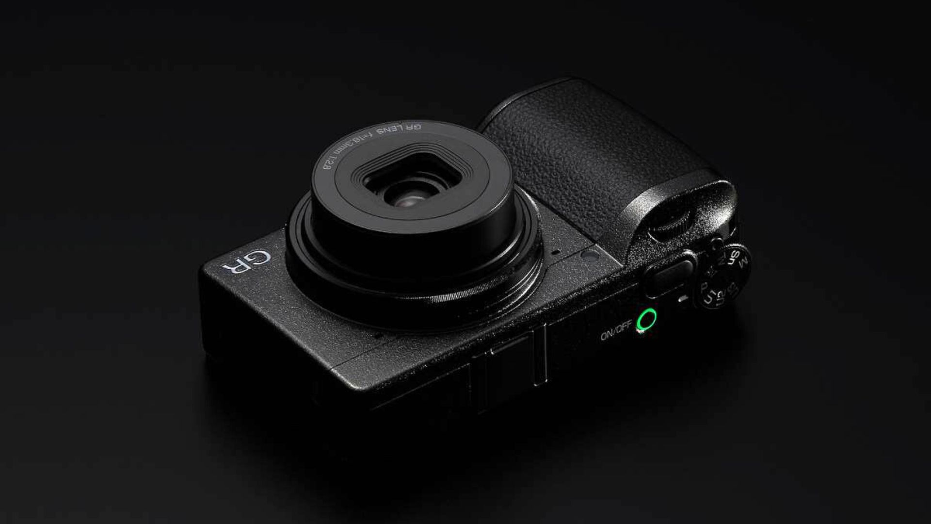
Ricoh’s New GR IV HDF Camera
credits: Ricoh
Ricoh has officially added another variant to its GR lineup with the launch of the GR IV HDF. At its core, it is the same GR IV that was announced earlier, built around a new 25.7-megapixel APS-C sensor and an updated 28mm-equivalent f/2.8 lens, along with the familiar GR handling and interface. What makes the HDF version different is the inclusion of Ricoh’s Highlight Diffusion Filter, which can be switched on or off using a dedicated button on the back of the camera.
Ricoh first introduced the HDF concept with the GR III HDF and GR IIIx HDF in 2024, and it carries over unchanged here. The filter is extremely thin and sits close to the lens aperture, using structures printed directly onto its surface with Ricoh’s inkjet technology. These tiny, precisely placed droplets alter how light reaches the sensor, diffusing bright areas and slightly softening edges across the frame. When the filter is disabled, it physically moves out of the optical path, allowing the camera to behave like a normal GR IV.
Because the HDF model replaces the standard built-in ND filter, Ricoh has added a new high-speed electronic shutter capable of speeds up to 1/16,000s, compared to 1/4,000s on the mechanical shutter, helping maintain exposure control when shooting wide open in bright conditions. Aside from that, the camera retains features like Snap Distance Priority, a focus limiter, Full HD 1080/60p video recording, and built-in storage (53GB internally) alongside a microSD card slot. The GR IV HDF is scheduled to ship in late January 2026 for $1,599.95, which is $100 more than the standard GR IV.
You can see full details on B&H’s website here
Explore The World’s Best Photography Locations
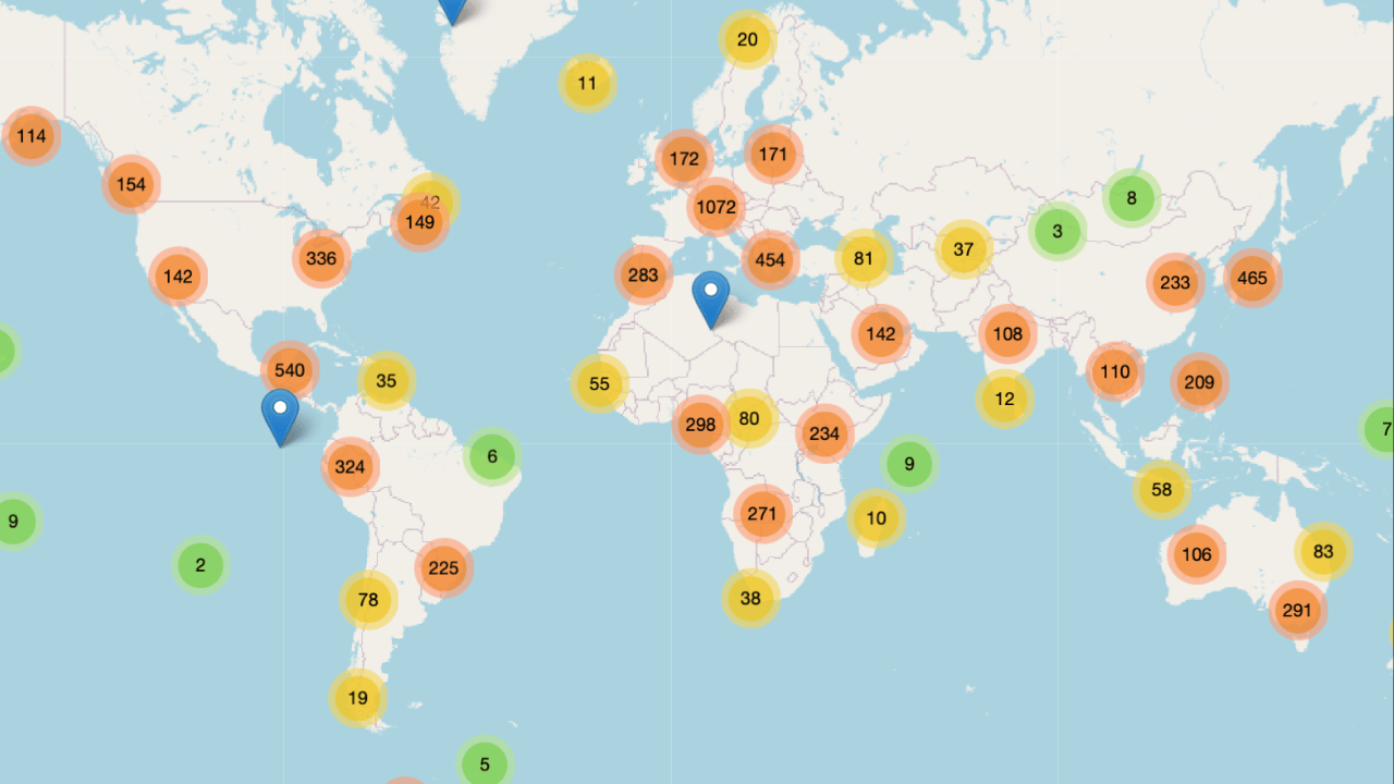
Get access to the world’s best photography location map - explore tens of thousands of amazing photo spots across the globe!
Something You Have To Check Out

Join over 4 million Americans who start their day with 1440 – your daily digest for unbiased, fact-centric news. From politics to sports, we cover it all by analyzing over 100 sources. Our concise, 5-minute read lands in your inbox each morning at no cost. Experience news without the noise; let 1440 help you make up your own mind. Sign up now and invite your friends and family to be part of the informed.
Photo Analysis
Welcome to a new addition to the magazine: the photo analysis, where I will analyse a photo and talk about the composition, lighting what’s positive, what’s negative etc. so that you can learn and better your own photography from it ;)
This week’s photo by: Jack Suson
You can find him on Instagram as: @susonsjack
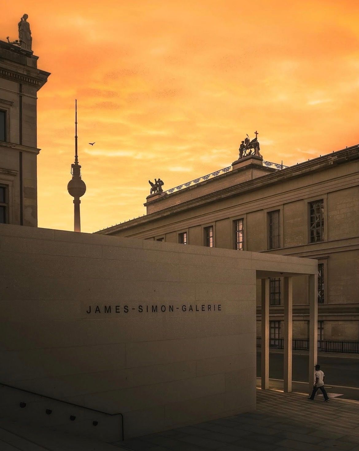
Let’s Analyse this Image:
Composition & Framing
What works well:
The layering is pretty strong. You have the modern James-Simon-Galerie in the foreground (along with the stairs and the man on the bottom right), the classical building behind it, and then the TV tower peeking through in the background, that creates a really nice sense of depth.
The clean, minimalist geometry of the foreground gallery building contrasts nicely with the more detailed historic architecture behind it (also the fact that all buildings have the same tile colour is very satisfying (meaning it is coherent and the modern architecture doesn’t stick out like a sore thumb, which a lot of times it does)).
The opening on the bottom right works like a frame within a frame, naturally pulling your eye toward the man walking into it.
The tower (I think it’s the Berlin TV tower) in the background adds a subtle vertical counterpoint to all the horizontal lines.
What could be better:
Compositionally, it is a bit unclear what the actual subject is. Is it the James-Simon-Galerie, the orange sky, the TV tower, or the man in the corner, or all of them?
→ Because there are several strong elements competing for attention, the photo feels a little uncertain in its intent. Reframing, or committing more clearly to one subject, could have helped. The man especially is very small and pushed into the corner, which makes him feel almost accidental rather than intentional (he also doesn’t separate from the background too well which again does kind of make him fade away and not really stand out, bringing him out in post could have been a way of clearly distinguishing him as the main subject for example).
Light & Atmosphere
What works well:
The warm sunset light is definitely the biggest mood-setter. That orange-yellow sky instantly gives the image a calm, almost golden-hour feeling that fits Berlin very well.
The light feels soft and diffused, which does suit the architecture and keeps the scene from feeling harsh or contrasty.
There is a quiet, end-of-day atmosphere to it, making it feel very peaceful in my opinion.
What could be better:
The shadows are a little too dark in the lower part of the frame. You lose quite a bit of detail there, and lifting them slightly wouldn’t hurt the mood.
The sky’s colour spills a bit too much into everything else. Almost the entire photo gets dipped in that orange/yellow tone, which can feel slightly overbearing.
The light doesn’t really guide the eye toward a clear subject, which again makes it hard to really say what the subject actually is.
Emotion & Story
What works well:
The man walking does add scale and a subtle human presence, which keeps the image from feeling purely architectural.
As touched on before, there is a quiet, calm, everyday quality to it, nothing dramatic, just a normal day in the city.
What could be better:
We don’t really connect with the man emotionally. He is a little too far away to see an expression or any meaningful gesture (+ he is obviously turned away from us).
→ This is why storytelling wise, we can only speculate. From the casual clothing and the fact that he is not carrying anything, it feels like a relaxed stroll, maybe a Sunday afternoon walk, but that is about as far as it goes.
Colour & Tone
What works well:
The warm colour palette is cohesive and generally aesthetically pleasing. Nothing clashes, and it all feels intentional.
The beige, stone tones of the buildings pair nicely with the golden sky.
What could be better:
Again, the sky colour dominates a bit too much. Everything feels tinted by the same orange/yellow wash, which reduces colour separation.
Introducing slightly cooler tones in the shadows could have added more balance and depth.
Balance
The photo is fairly balanced overall, but visually the architecture and sky definitely carry much more weight than the human element.
The left side does feel a little heavier because of the large, solid wall (and tall horizontal building) compared to the more open right side.
The TV tower adds a strong vertical anchor, but again it also competes with the person for attention (as do many other elements).
Because there isn’t a single clear focal point, the balance feels more distributed than directed, which in that sense is interesting, but slightly unfocused.
The Rest of this Issue is for Premium Subscribers
