📸 The Magazine For Photographers - Bite Size
Read the Latest Photography News and Updates in the Creative Industry in 3-4 minutes or less ;)
In partnership with

Important Note: All photography articles are NOT sponsored
The Latest News:
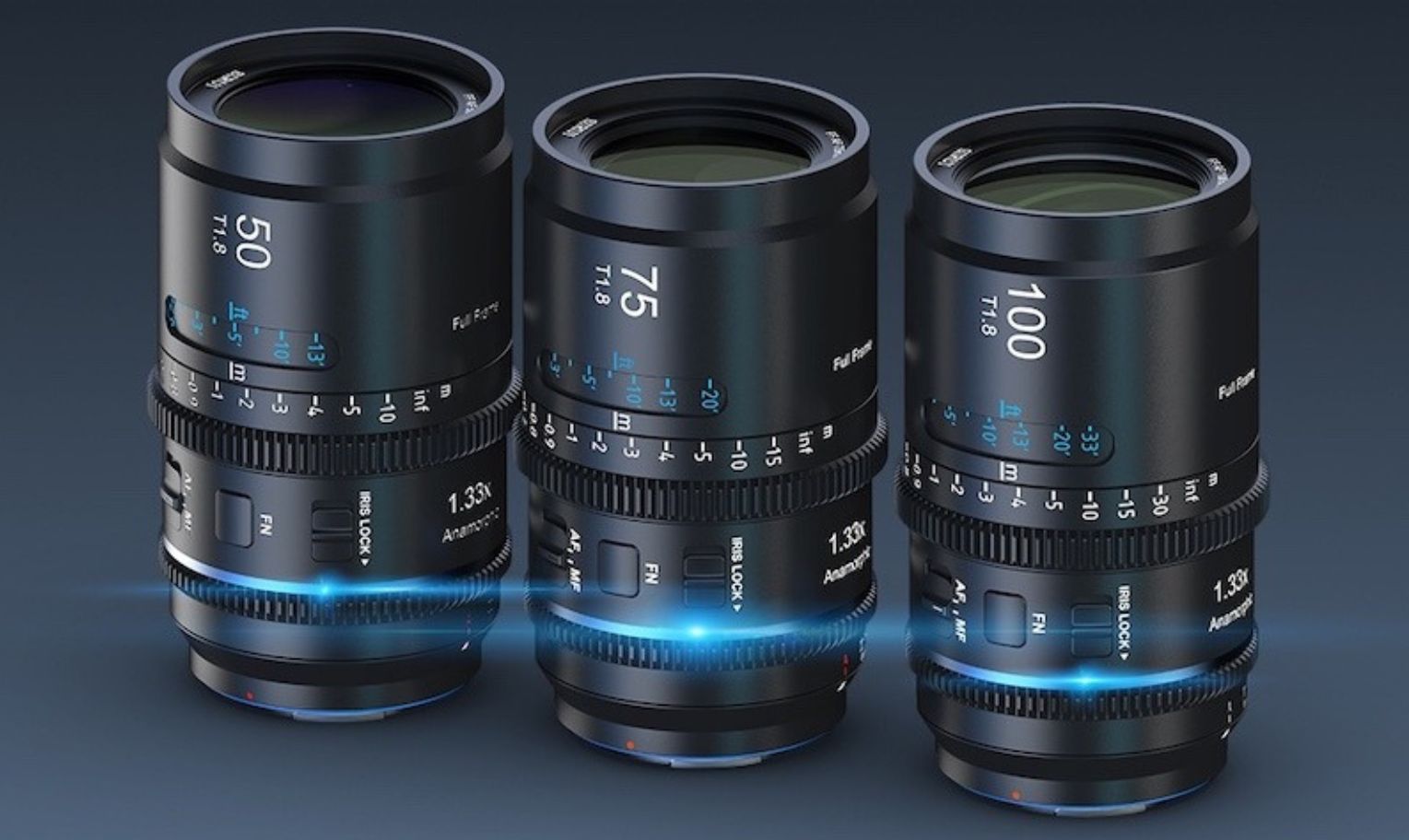
Sirui’s New Astra 1.3x Anamorphic Lenses
credits: Sirui
Sirui has introduced Astra, a new line of 1.33x full-frame anamorphic lenses that come with autofocus, something we haven’t seen before in full-frame anamorphics. The lineup starts with three focal lengths, 50mm T1.8, 75mm T1.8, and 100mm T1.8. All three share the same exterior design, use 67mm front threads, and weigh between 600 and 700 grams (roughly 21–25 ounces). The lenses cover a 44mm image circle and all have 72mm outer diameters, plus dust- and drip-resistant construction.
Inside, the lenses use a 1.33x squeeze, which on a full-frame sensor desqueezes to a 2.39:1 aspect ratio. Sirui also emphasises the uniform T1.8 aperture across the set, giving you a consistent look and enough light for both low-light work and shallow depth-of-field shots. Autofocus, as mentioned is a big part of the Astra pitch, the motors support smooth and reasonably quick AF for handheld or gimbal setups, but users can switch to manual focus at any time. The MF rings include marked distance scales and are compatible with follow-focus units and LiDAR setups.
The lenses are available in Sony E, Nikon Z, and L-Mount, with two flare options, blue or neutral, depending on the look you want. Early-bird pricing through Kickstarter is $799 per lens or $2,399 for the full three-lens set, which also includes a custom case. Once the campaign wraps up, standard pricing will be $999 per lens or $2,999 for the set.
You can see full details on Sirui’s Kickstarter website here
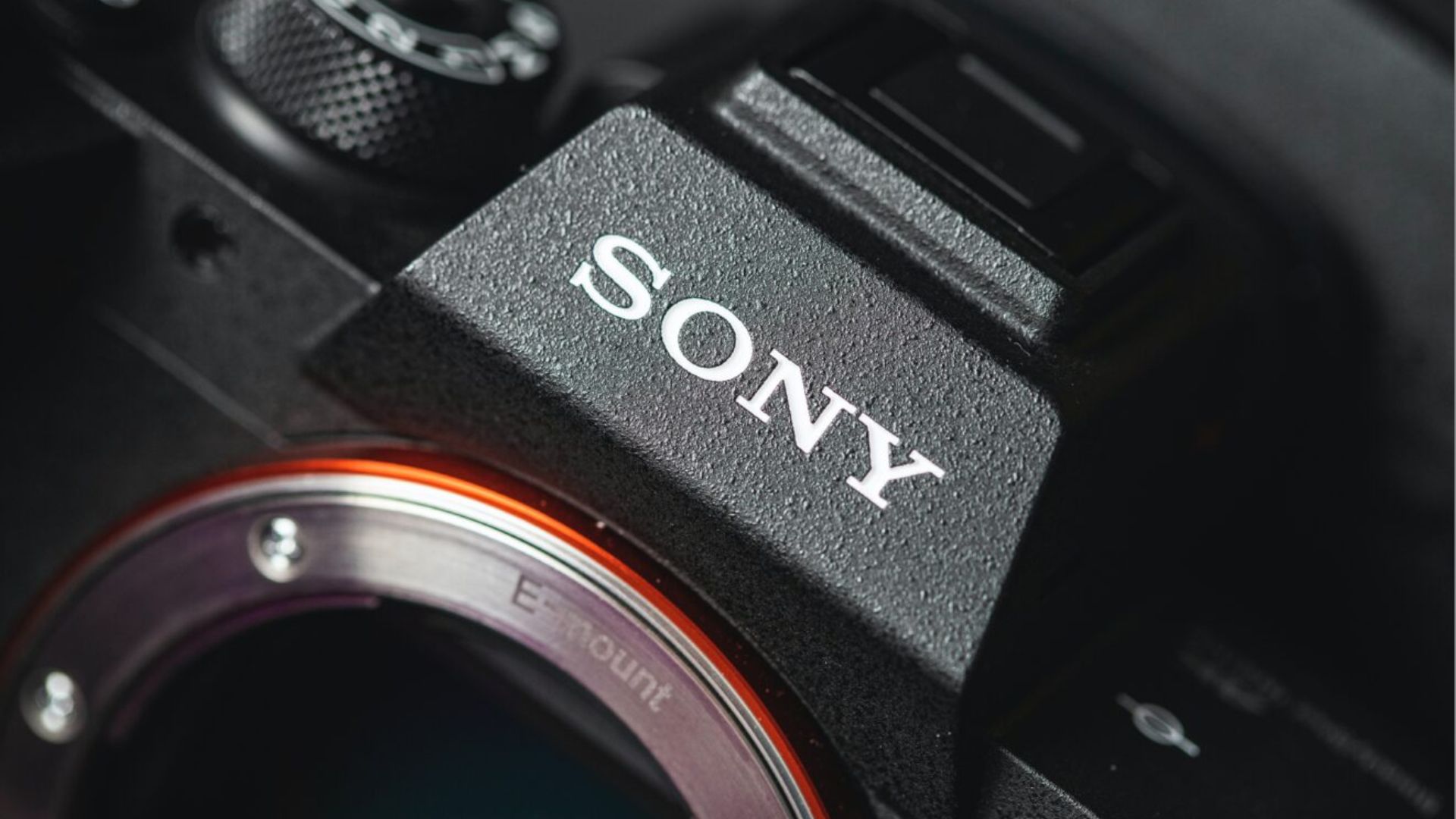
The Latest Sony A7 V Rumours
credits: Sony
Sony fans have been waiting patiently for weeks, and now there is finally something concrete, the upcoming Sony A7 V is getting an all-new sensor. Not just a refresh, a completely redesigned, partially stacked 33-megapixel sensor. This is the same sensor tech we have seen in cameras like the Nikon Z6 III and Panasonic S1 II, but those top out at 24 megapixels. Sony’s version bumps the resolution noticeably, which makes the A7 V the first Sony camera to use this newer architecture at that higher pixel count.
The big advantage of a partially stacked sensor is speed, early info suggests the A7 V will hit 30 frames per second with the electronic shutter, a big jump from the A7 IV’s 10 fps limit. The mechanical shutter is expected to stay at 10 fps, but the boost on the electronic side puts the new model in a much more competitive position. It still doesn’t hit the Canon R6 Mark III’s 40 fps, but 30 fps is plenty for most real-world shooting, the bigger question now is what image quality will look like at those top speeds and what formats will be available at full burst rates.
Dynamic range is the one area everyone will be watching closely. Partially stacked sensors haven’t always had the best reputation there, and while Panasonic squeezed a bit more out of the S1 II using its DR Boost mode, that comes with trade-offs in readout speed. Sony is working with more pixels and a brand-new design, so how the A7 V performs compared to the Z6 III and S1 II is going to be interesting to see. On the video side, at least, the camera clears an important bar, 4K/60p with no crop. Anything less at this point would have been hard to justify. Sony is expected to officially unveil the A7 V around December 2, 2025.
Explore The World’s Best Photography Locations
Get access to the world’s best photography location map - explore tens of thousands of amazing photo spots across the globe!
Something You Need To Check Out
Master ChatGPT for Work Success

ChatGPT is revolutionizing how we work, but most people barely scratch the surface. Subscribe to Mindstream for free and unlock 5 essential resources including templates, workflows, and expert strategies for 2025. Whether you're writing emails, analyzing data, or streamlining tasks, this bundle shows you exactly how to save hours every week.
Photo Analysis
Welcome to a new addition to the magazine: the photo analysis, where I will analyse a photo and talk about the composition, lighting what’s positive, what’s negative etc. so that you can learn and better your own photography from it ;)
This week’s photo by: Yuya Hakozaki
You can find him on Instagram as: @box_box_you
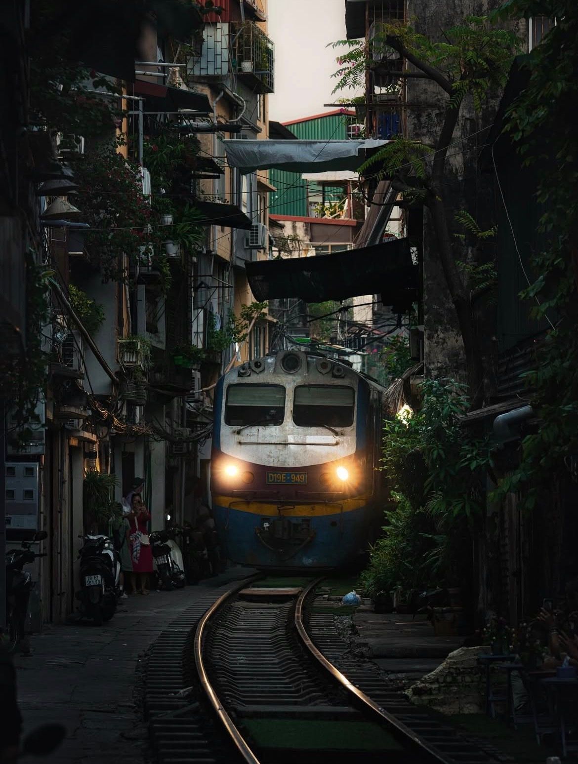
Let’s Analyse this Image:
Composition & Framing
What works well:
The composition is pretty solid. Everything sort of funnels you straight toward the train → the walls, the balconies, the hanging tarps, and especially the curve of the tracks with the slight shimmer.
The thick, cluttered environment creates great layers depth and visual interest. Even though the space is tiny in itself, it still feels rich in therms of exploration possibilities.
The little group of people on the left adds a nice sense of scale and everyday life. They make the train look even bigger and more intimidating.
The whole scene has a natural tunnel effect, the buildings squeeze your view to the middle, and the tracks are the icing on the cake.
What could be better:
Getting down lower could have been another option. A lower POV would have made the rails feel bigger and more dramatic, and the tracks would have pulled your eye even more forcefully in (but that is just a suggestion).
The composition leans slightly left-heavy with the people, lighter wall sections, and visible details all sitting on that side.
The right side disappears into shadow, so it becomes the “weak” side even though it probably has interesting details we can’t really see.
The train sits a little low in the frame. Bringing it up slightly could have added a bit more balance (another point that speaks for getting a bit lower).
Light & Atmosphere
What works well:
The light is moody and fits the setting overall. It is soft, nothing harsh, and it wraps itself nicely around the alley.
The train headlights are a strong element, they immediately pull you in and make the train the star of the show.
The faint shimmer on the rails is great. It catches just the right amount of light, exaggerating the leading-line effect and again guiding your eye straight to the train.
The atmosphere is, as noted, rich —> all the clutter, the plants, the tarps, the cables everywhere. It feels raw and interesting to see.
What could be better:
The train headlights are maybe a bit too strong compared to the rest of the scene. They dominate the light balance a little and make that section feel a touch unnatural compared to the surroundings.
The shadows are very heavy overall. A lot of texture disappears completely into darkness.
Normally in an urban/street scenes, deep shadows wouldn’t matter too much because you would still have lots going on in the background + deep shadows might even be necessary to lock the viewer in on the part that matters. But here, the alley is so narrow and cramped that the viewer actually has no way to go and thus wants to explore these little side areas and you can’t, because the shadows swallow them.
Emotion & Story
What works well:
The whole scene has the wild “life happening around the train” story/vibe that only places like this can produce. It is pretty surreal, people casually standing around and living life as this massive machine squeezes by probably multiple times every day.
What could be better:
Because the shadows are so dark, you lose a lot of the small human details that could have added even more emotional texture, such as facial expressions, gestures, objects in the surrounding area, etc. (for example if we could see kids toys laying around we would be like ‘‘wow even kids just play around here even with this massive train driving be every now and then)
Overall as it is it’s more of a documentation shot rather than storytelling, which of course is not a bad things just depends on what you are going for, but as mentioned a bit more visibility in the darker zones might have opened up more narrative details and possibilities.
Colour & Tone
What works well:
The colour palette is very natural and fits the scene, nothing feels too artificial or forced.
The greens from the plants break up the browns and greys nicely.
The train’s blue and yellow colours pop just enough to guide the eye without overwhelming anything.
The overall restrained edit keeps it grounded and true to the environment.
What could be better:
As mentioned, the headlights are a bit too bright relative to everything else. Pulling them back a bit would make the tonality feel more unified.
The sky at the top is brighter than it needs to be it steals a bit of attention and doesn’t really match the rest. (so either could be done —> making the sky darker or lifting the bottom)
Balance
The train, with the headlights, is the natural anchor point, it keeps everything grounded.
The left side is a bit heavier because of the people, lighter tones, and more visible details.
The hanging plants, cables, and overlapping things above the train help keep the frame balanced vertically and add to the enclosed, tunnel-like feeling.
The Rest of this Issue is for Premium Subscribers
