📸 The Magazine For Photographers - Bite Size
Read the Latest Photography News and Updates in the Creative Industry in 3-4 minutes or less ;)

Important Note: All photography articles are NOT sponsored
The Latest News:
Hasselblad’s New Standard Zoom Lens

credits: Hasselblad
Hasselblad has officially introduced a new standard zoom to its XCD lineup: the XCD 35-100mm f/2.8-4 E. On Hasselblad’s medium format bodies, that translates to roughly a 28-76mm equivalent in full-frame terms, giving it a slightly longer reach on both ends compared to the classic 24-70mm zoom. Inside, the lens is built with 16 elements in 13 groups, including three aspherical and five extra-low dispersion elements to keep sharpness and control aberrations across the zoom range.
The new lens was designed with the new X2D II 100C in mind, taking full advantage of its recently added continuous autofocus. Hasselblad says this is the fastest-focusing XCD lens yet, thanks to a newly developed stepping motor. It can focus as close as 0.4 meters at the wide end and 0.5 meters at the tele end, which should be enough for general close-up shooting but won’t replace a true macro lens. Physically, the zoom comes in at 138mm in length and weighs just under 900 grams, with an internally focusing design that helps with handling and balance.
Like other modern XCD lenses, the 35-100mm f/2.8-4 E includes a built-in leaf shutter, offering speeds up to 1/4000s and full flash sync at any shutter speed. It takes large 86mm filters, and Hasselblad is also rolling out matching UV, ND8, and CPL filters alongside the release. Hasselblad says the new zoom is sharp edge-to-edge and essentially replaces the need to carry multiple primes in its range. The XCD 35-100mm f/2.8-4 E is available for $4,599 (€4,800). A closer look at Hasselblad’s new lens, X2D II camera and filters will follow in this week’s Sunday magazine issue ;)
You can see full details on Hasselblad’s website here
Nikon Z6 III Gets First Major Firmware Update

credits: Nikon
Nikon has released firmware version 2.00 for its Z6 III, marking the first major update since the camera launched last summer. The Z6 III made headlines with its unique partially stacked sensor and strong autofocus, and this update builds on that foundation with new autofocus modes, expanded automation, and Nikon’s first step into content authenticity.
The most notable addition is the Nikon Authenticity Service, a C2PA-compatible system that lets photographers embed digital certificates into image files. These certificates confirm the origin of an image, flag whether it has been altered, and record when and where it was captured. Nikon says this feature, will strengthen trust in digital photography. The Z6 III becomes the first Nikon camera to offer this, with the Z9 and Z8 still waiting for their promised implementation.
Beyond authenticity, Nikon has also expanded the camera’s shooting capabilities. A new ‘Birds’ mode has been added to subject detection, designed to better track birds in flight even against complicated backgrounds. The firmware also introduces Auto Capture, borrowed from the Z9 and Z8, which allows the camera to automatically trigger when specific subjects or movements are detected, turning the Z6 III into a customisable remote or even a wildlife camera trap. Other improvements include the ability to use JPEG fine with Pre-Release Capture, a focus limiter for tighter AF control, USB streaming without extra software, and streamlined updates through Nikon Imaging Cloud.
You can see full details on Nikon’s website here
Something You Have To Check Out
The AI Wearable That Makes Your Life Unforgettable
Your greatest asset is your time. So stop wasting it jotting notes or chasing forgotten conversations.
The Limitless AI Pendant captures, transcribes, and organizes every meaningful interaction automatically. Get instantly searchable transcripts, smart summaries, and contextual reminders - all at your fingertips, all fully encrypted.
Tap into the future of productivity and free your mind to focus on what truly matters with Limitless.
Explore The World’s Best Photography Locations
Get access to the world’s best photography location map - explore tens of thousands of amazing photo spots across the globe!
Photo Analysis
Welcome to a new addition to the magazine: the photo analysis, where I will analyse a photo and talk about the composition, lighting what’s positive, what’s negative etc. so that you can learn and better your own photography from it ;)
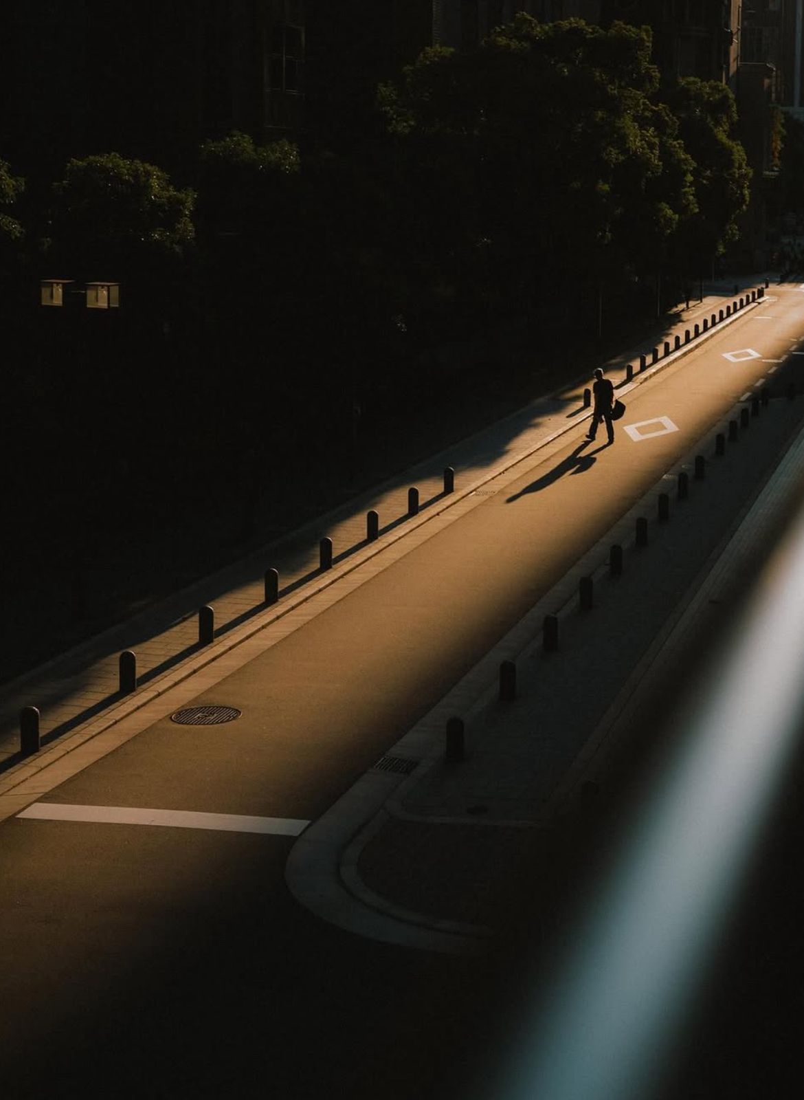
This week’s photo by: Takumi Matsuo
You can find him on Instagram as: @takumi_0491

Let’s Analyse this Image:
Light & Atmosphere
What works well:
The light is very nice. That shaft of golden light cutting across the road creates a really strong stage-like effect. It is basically a spotlight for our subject.
The contrast between the lit section of road and the surrounding darkness is dramatic and makes the atmosphere feel cinematic.
The length of the shadow adds to the mood and story. You can tell it’s either early morning or late afternoon just by the way everything stretches out.
What could be better:
The patch of light in the middle left (in the bushes) is a bit distracting and pulls attention away from our subject. Pulling that back would help. Also, just in general, darkening the bushes/trees down a little more could have been a better choice since this photo tries to go for that ‘‘50% shadow, 50% light’’ look, however it doesn’t quite go all the way and now it just feels a little undecided (one thing to keep in mind is that by darkening the tree/bush area you would obviously loose all the detail there, which is also not considered perfect, the issue with this shot in particular is that, like I said, it is undecided on which way to go (this is the actual ‘‘negative’’)).
The lit areas on the road (at the top) lose a little bit of texture because of the strong highlights. Keeping more detail in the surface would add to the richness of the scene.
Composition & Framing
What works well:
The leading lines here are very good. The bollards, the pavement edges, the shadows and light itself all guide your eye straight into the frame and toward the man.
The man is positioned (almost (more on that down below)) perfectly in that strip of light, it feels candid and makes him the subject without needing to force it.
The long shadow pointing down the road is a strong compositional element. It not only emphasises the man’s presence but also gives balance.
What could be better:
The bottom foreground (that railing) is a bit too heavy with brightness and lighter colour. It competes with the man and makes the frame feel slightly unbalanced. Simply holding the camera over the railing could have fixed this (Unless! —> the ground down below were completely visually empty, then the railing actually helps with balancing out the trees/bushes (it is however still too shiny and bright, creating imbalance that way and competing))
The man is placed quite nicely yes, however there are a few ‘‘negative’’ things that stand out. The man is not perfectly in the centre and he stands quite close to the marking on the road, which starts to compete for attention a bit. One way to ‘‘fix’’ this is to simply wait for another subject to cross the road and time things better. However, keep in mind that street photography is not really about chasing perfection, but more about capturing candid moments as they happen (and a lot of people prefer ‘‘imperfections’’). The only reason I noted these things is because this image tries to lean more into this sort of minimalist, perfectionist vibe.
Emotion & Story
What works well:
The man becomes the whole story here. With the bag (a gym bag I think) he is carrying and the way he is caught in the light, he feels like a character in a little movie.
The emptiness of the street helps the mood and makes the scene feel solitary and cinematic.
The man’s long shadow doubles his presence and makes him feel even bigger and more important.
What could be better:
Because he is small in the frame, you don’t really connect with him, you connect more with the scene itself. That makes it feel a little detached emotionally.
Right now, the story feels more about the light and shadow than about him. It works, and is not a ‘‘problem’’ but if you wanted more emotional pull, you would need something stronger from the subject. To be fair thought, that is very hard to pull off when it comes to silhouette shots.
Color & Tone
What works well:
The warm golden tone of the light is very nice, it gives the photo its atmosphere and contrast.
The cool tones in the asphalt and railing balance the warmth of the sunlight and trees.
The limited palette works well. By keeping it simple, the photo feels clean and deliberate (again, it is sort of going for that minimalistic look).
What could be better:
Some areas of the sunlight on the street shift slightly green around the edges, especially toward the middle of the road. It is very subtle, but once you notice, it just feels off. That little colour cast could be corrected in post so the light stays consistent.
Another issue with the railing on the right edge (even though it adds some balancing coolness) is that it introduces a colour/colour-brightness that doesn’t really exist anywhere else in the frame, which breaks the otherwise consistent palette and again pulls your attention away.


