📸 The Magazine For Photographers - Bite Size
Read the Latest Photography News and Updates in the Creative Industry in 3-4 minutes or less ;)
In partnership with

Important Note: All photography articles are NOT sponsored
The Latest News:
Lomography’s New 35mm Film Camera
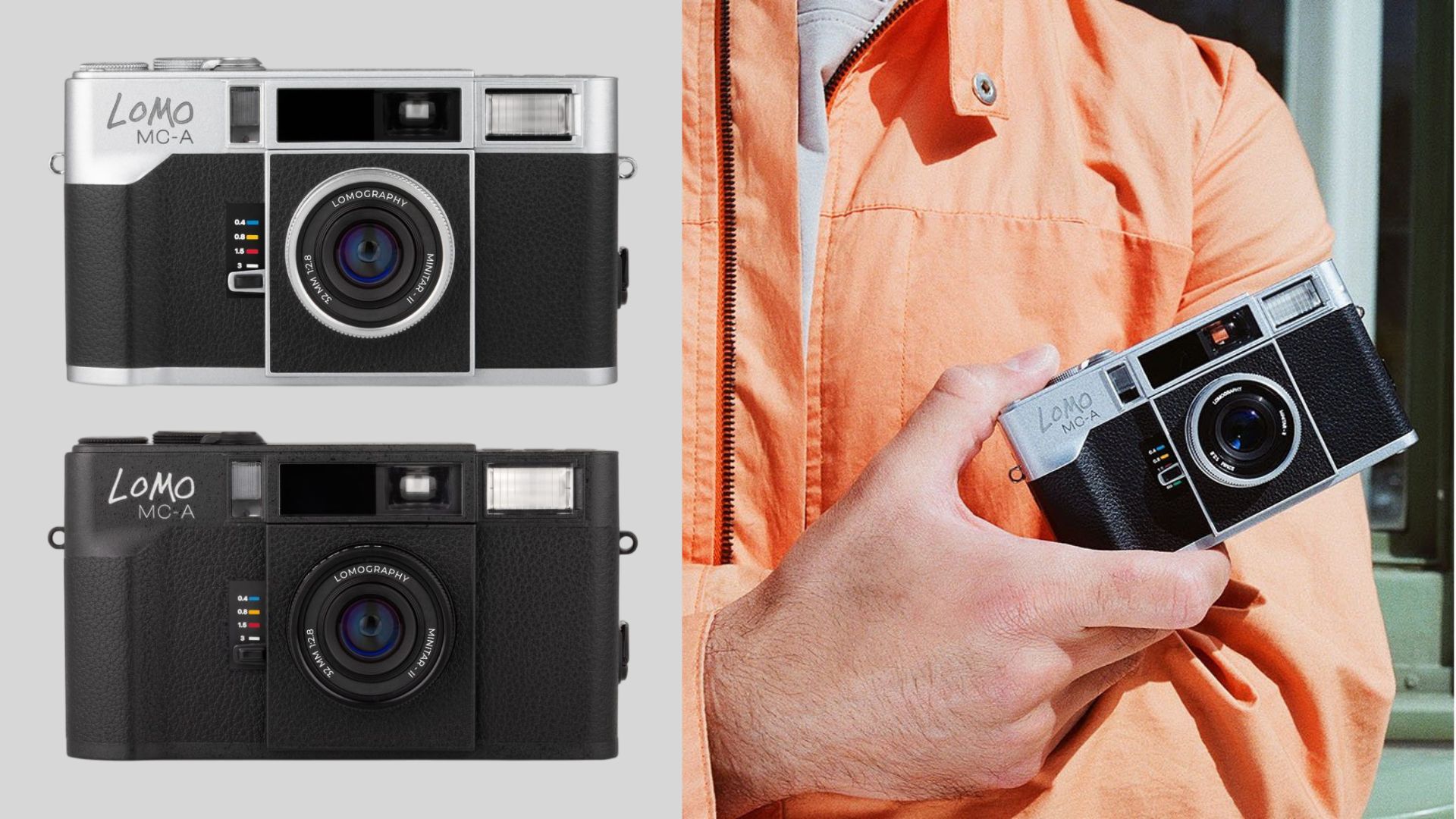
credits: Lomography
Lomography just launched the Lomo MC-A, a brand-new 35mm film camera that comes with a built-in 32mm f/2.8 autofocus lens. True to the brand’s analog spirit, the MC-A is designed as a fully manual film camera with modern touches, including autofocus and a USB-C rechargeable battery. The body is made of metal and comes in black or silver. Lomography calls it “unapologetically analog,” and says the multi-coated 32mm f/2.8 lens delivers that distinct, character-filled film look the company is known for.
The MC-A offers three shooting modes, auto, aperture priority, and full manual. In auto mode, the camera handles exposure for you, while aperture priority and manual give you the ability to adjust aperture, shutter speed, ISO, and flash settings. The built-in flash has a guide number of 9 and supports automatic and first-curtain sync modes, along with a PC sync portfor external flash setups. Lomography’s color gel filters are also compatible for those who want to experiment with lighting effects.
The autofocus system is still a bit of a mystery, but the lens can focus as close as 0.4 meters (1.3 feet), and there is also a zone focusing option for faster shooting. The lens has five elements in five groups, an aperture range from f/2.8 to f/16, and a 30.5mm filter thread for accessories like UV filters or Lomography’s Splitzer. Shutter speeds range from bulb to 1/500s, and the camera supports manual ISO from 12 to 3200 with DX code reading. Film advance is manual, and multiple exposures are unlimited. The MC-A measures 125.8 x 69.5 x 42mm, weighs 332 grams, and runs on a rechargeable CR2 battery via USB-C. The Lomo MC-A is priced at $549.
You can see full details and sample shots on Lomography’s website here
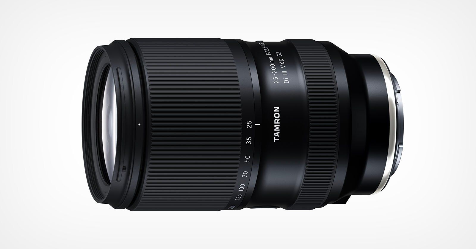
Tamron’s 25-200mm f/2.8-5.6 Lens Is Here
credits: Tamron
Tamron has officially announced that its new 25–200mm f/2.8–5.6 Di III VXD G2 lens will be released on November 20, 2025, priced at $899. The lens, first teased back in September, is the follow-up to the 28–200mm f/2.8–5.6 Di III RXD and brings a few key changes, most notably a wider 25mm starting point while keeping the same aperture range. That extra bit of width might not sound like much on paper, but it makes the lens more versatile for travel or general everyday shooting.
The lens is built with 18 elements in 14 groups and features a nine-blade aperture diaphragm, promising smoother background blur and improved overall rendering. Minimum focus distance is 6.3 inches (0.16 meters) at the wide end and 31.5 inches (0.8 meters) at the telephoto end, offering a maximum magnification ratio of 1:1.9, effectively giving it “half-macro” capability. Like the previous version, it is designed for Sony E-mount full-frame cameras, and Tamron says the new VXD (Voice-coil eXtreme-torque Drive) autofocus system is faster, quieter, and more precise than before.
Tamron also notes that the G2 version manages to keep the same compact size as the original while offering better image quality across the zoom range. Its timing, coming just weeks after Sigma announced its 20–200mm f/3.5–6.3 DG Contemporary lens, seems deliberate, especially since Tamron’s version undercuts Sigma’s price by about $100.
You can see full details on Tamron’s website here
Explore The World’s Best Photography Locations

Get access to the world’s best photography location map - explore tens of thousands of amazing photo spots across the globe!
Something You Have To Check Out

Join over 4 million Americans who start their day with 1440 – your daily digest for unbiased, fact-centric news. From politics to sports, we cover it all by analyzing over 100 sources. Our concise, 5-minute read lands in your inbox each morning at no cost. Experience news without the noise; let 1440 help you make up your own mind. Sign up now and invite your friends and family to be part of the informed.
Photo Analysis
Welcome to a new addition to the magazine: the photo analysis, where I will analyse a photo and talk about the composition, lighting what’s positive, what’s negative etc. so that you can learn and better your own photography from it ;)
This week’s photo by: Takumi Matsuo
You can find him on Instagram as: @takumi_0491
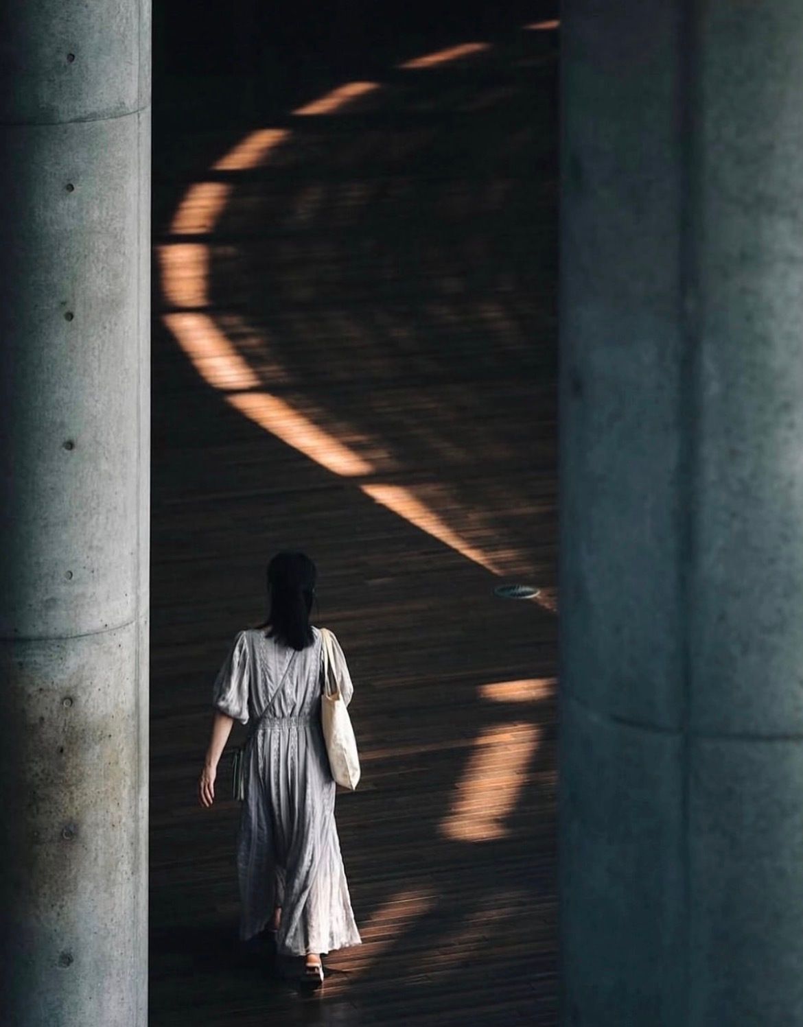
Let’s Analyse this Image:
Composition & Framing
What works well:
The framing is really nice, those two concrete columns left and right work perfectly as natural frame, they draw you straight toward the middle where the action is happening, just like looking through a window.
The line of light on the floor is probably the most interesting part + it is what makes this shot unique —> it works almost like a secret leading line, you notice it first, follow it along, and then realise it is pointing you to the woman. It is funny because it kind of works like a boomerang: your eye starts just before the subject (my eye at least) because this is were most of the visual weight is but you notice the light first and because of that you then move up with it, when you are at the top there is nothing more left to see and you get pulled back down along the line to the woman again. That flow gives the image a rhythm that feels very interesting.
The placement of the woman feels very intentional, she is off-center to the left, which gives the shot some asymmetry and movement. The light itself acts like the balance point + it is sort of this ‘‘follow the light’’ metaphor → the light carves out the way for the woman.
What could be better:
The depth is not super strong here. The floor almost feels like it is turning vertical, making the whole shot feel a bit flat/2D like. Shooting from a slightly lower angle could have added more depth, but honestly, that might have come at the cost of losing the view of the light and that light is the main character here, so it is kind of worth the trade-off.
The right column is a bit heavy visually, it is thicker and darker, which gives that side just a touch more weight (more on that down below).
Light & Atmosphere
What works well:
Light here is pretty good, it is a nice mix of soft and directional. The way it hits the floor creates this beautiful arc of highlights that instantly grabs your attention the moment you see it.
As mentioned before that curved shape of light is what makes this shot special. It really is one of those interesting frames that makes you stop and look for a second.
The atmosphere fits with the scene, it all feels kind of still and meditative.
What could be better:
The contrast between the light and shadow is a bit strong, it gives mood and really carves out the light S-line yes, but lifting the shadows just slightly could help bring out a little more texture on the wooden floor.
The light is the hero here, however it does fall off (in therms of brightness) towards the end/top. Just a touch more punch there (again only the last bit) would make the photo/line feel more balanced.
Emotion & Story
What works well:
The whole scene feels really poetic. There is this sense of quiet solitude, just a woman walking through the space, unaware that she would become part of a perfect visual moment.
The lighting adds a layer of mystery/metaphor as noted before → it is like she is walking into something symbolic, a metaphorical “spotlight” or stepping into clarity, just following her instincts, letting the universe guide her etc.
The minimalism also helps, not a lot of clutter, no distractions, just a calm, isolated moment.
What could be better:
The emotional connection between the viewer and the woman is subtle, it is more about the atmosphere and light than the woman. You don’t really get much sense of who she is or what she is feeling.
Since the scene leans so heavily on design and light, it risks feeling a bit detached emotionally, not necessarily bad, but very stylised.
Colour & Tone
What works well:
The tones are controlled, warm light on cool surfaces always works. The golden tones of the light play nicely against the grey concrete and dark brown wood.
The soft beige of her dress fits nicely into that palette too. Nothing feels out of place, it is very cohesive without being too matchy-matchy.
The shadows are rich but relatively clean, giving nice contrast without any muddy areas.
What could be better:
The overall tone could use a touch more lift, it is a bit dark in the upper section, which slightly flattens the range.
The colours are natural and subtle, but perhaps too muted for some, a tiny bit of saturation could add more life without breaking the mood.
Balance
The overall balance is ok. The woman being off-centre to the left works because the column on that side is smaller and lighter, while the one on the right is thicker and darker.
Horizontally, there is more light (in terms of visual weight) in the upper two-thirds of the frame, which helps balance out the woman in the lower section and keeps the eye moving upward.
The heavy right column still dominates just a little, but the glowing light on the floor helps pull your attention back to the centre —> especially the visually heavier part in the upper third having the arch to the left, it sort of snaps you back to the left.
The Rest of this Issue is for Premium Subscribers
