📸 The Magazine For Photographers - Bite Size
Read the Latest Photography News and Updates in the Creative Industry in 3-4 minutes or less ;)
In partnership with

Important Note: All photography articles are NOT sponsored
The Latest News:
Leica SL3 And Q3 Get Lightroom Tethering

credits: Leica
Leica photographers are finally getting proper tethering support in Lightroom Classic. With version 15.0, both the Leica SL3 and Q3 now work natively with Lightroom, no extra plugins or tools needed. Leica and Adobe apparently teamed up to make this happen, and it is the first time Leica cameras have been directly built into Adobe’s workflow like this.
The update goes beyond basic tethering as well, you now get real-time live view, autofocus point selection, and full control over exposure, aperture, ISO, and white balance, all from within Lightroom. For photographers, especially in a studio setup, being able to see your shot instantly on a bigger screen makes a huge difference. It is easier to spot tiny issues, adjust lighting or focus, and just generally feel more confident that you are getting the shot.
Lightroom’s 15.0 update also arrives just in time for Adobe MAX, where the company is expected to showcase more AI-driven features and workflow upgrades across its Creative Cloud suite, later this week. For Leica users, this integration could signal a deeper partnership between Adobe and Leica, potentially paving the way for future support of additional camera models like the M11 or future S-system bodies.
Sigma’s Full-Frame Foveon Sensor
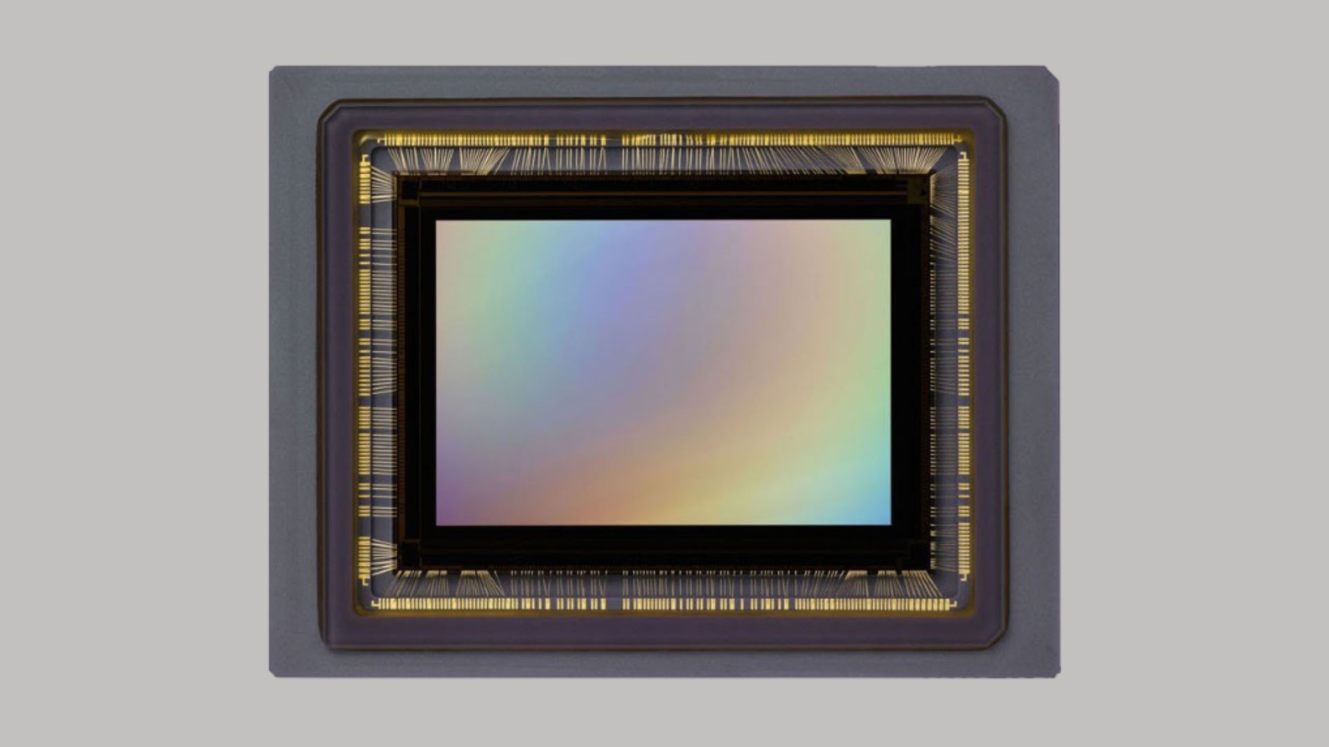
credits: Sigma
Sigma’s full-frame Foveon sensor has been in the works for years, and while progress has been slow, CEO Kazuto Yamaki says the project is still very much alive. In a recent interview with photographer and YouTuber Matt Granger, Yamaki admitted that Sigma is still in the technology development phase, they haven’t even started designing the final sensor yet. “We’re still working on the design of the pixel architecture,” he explained, adding that every time they run a new prototype, they run into fresh technical problems. It has been a challenge partly because Sigma has never designed a sensor completely on its own before.
Right now, Sigma’s engineers are testing small-scale prototypes to fine-tune the design before they move to a full-frame version. The new Foveon sensor is expected to use a stacked BSI structure and include on-chip phase detection, both major steps up from earlier designs. It will keep the traditional X3 layered setup, which captures red, green, and blue light at every pixel, promising richer colour and better dynamic range, maybe even reaching 60 megapixels. But the same old challenges are still there, managing heat, reducing power draw, and making sure each pixel performs perfectly. Sigma wants to get all of that right before even thinking about mass production.
Even with the delays, Yamaki says Sigma isn’t giving up. The company knows the Foveon will always be niche, but it is a project they believe in, something for photographers who care about image quality above everything else. He described the effort as a kind of “beautiful foolishness,” a passion project that goes against the grain of the wider camera market. It is still a long road ahead, and a full-frame Foveon camera probably won’t appear until 2026 or later, but Yamaki’s update makes clear that Sigma isn’t done chasing this dream just yet.
You can see the full interview with Sigma’s CEO on YouTube here
Explore The World’s Best Photography Locations
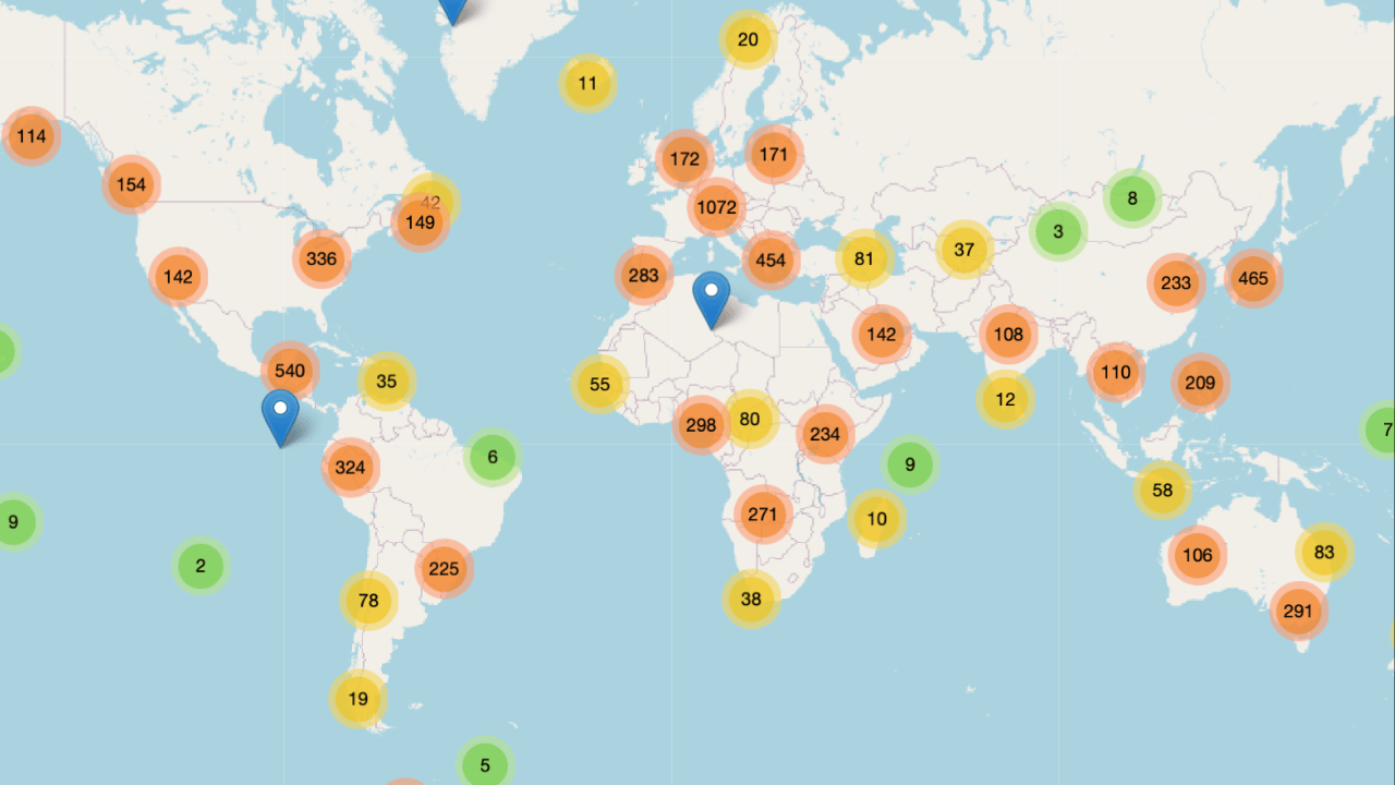
Get access to the world’s best photography location map - explore tens of thousands of amazing photo spots across the globe!
Something You Have To Check Out
AI is something that most photographers/creatives see critically, and for absolutely good reason. HOWEVER the fact at the end of the day is that there sadly is no stopping AI, so the best thing you can do is learn how to use AI to your own advantage, whether that be with helping you with daily tasks, writing, editing, your day-job etc.
This is where the ‘‘Superhuman AI’’ Newsletter comes in. It will teach you how to use AI to your advantage, increase your work efficiency (something every creative needs) etc.
Feel free to check it out, I read it myself (+it i free) ⬇️
The Gold standard for AI news

AI keeps coming up at work, but you still don't get it?
That's exactly why 1M+ professionals working at Google, Meta, and OpenAI read Superhuman AI daily.
Here's what you get:
Daily AI news that matters for your career - Filtered from 1000s of sources so you know what affects your industry.
Step-by-step tutorials you can use immediately - Real prompts and workflows that solve actual business problems.
New AI tools tested and reviewed - We try everything to deliver tools that drive real results.
All in just 3 minutes a day
Photo Analysis
Welcome to a new addition to the magazine: the photo analysis, where I will analyse a photo and talk about the composition, lighting what’s positive, what’s negative etc. so that you can learn and better your own photography from it ;)
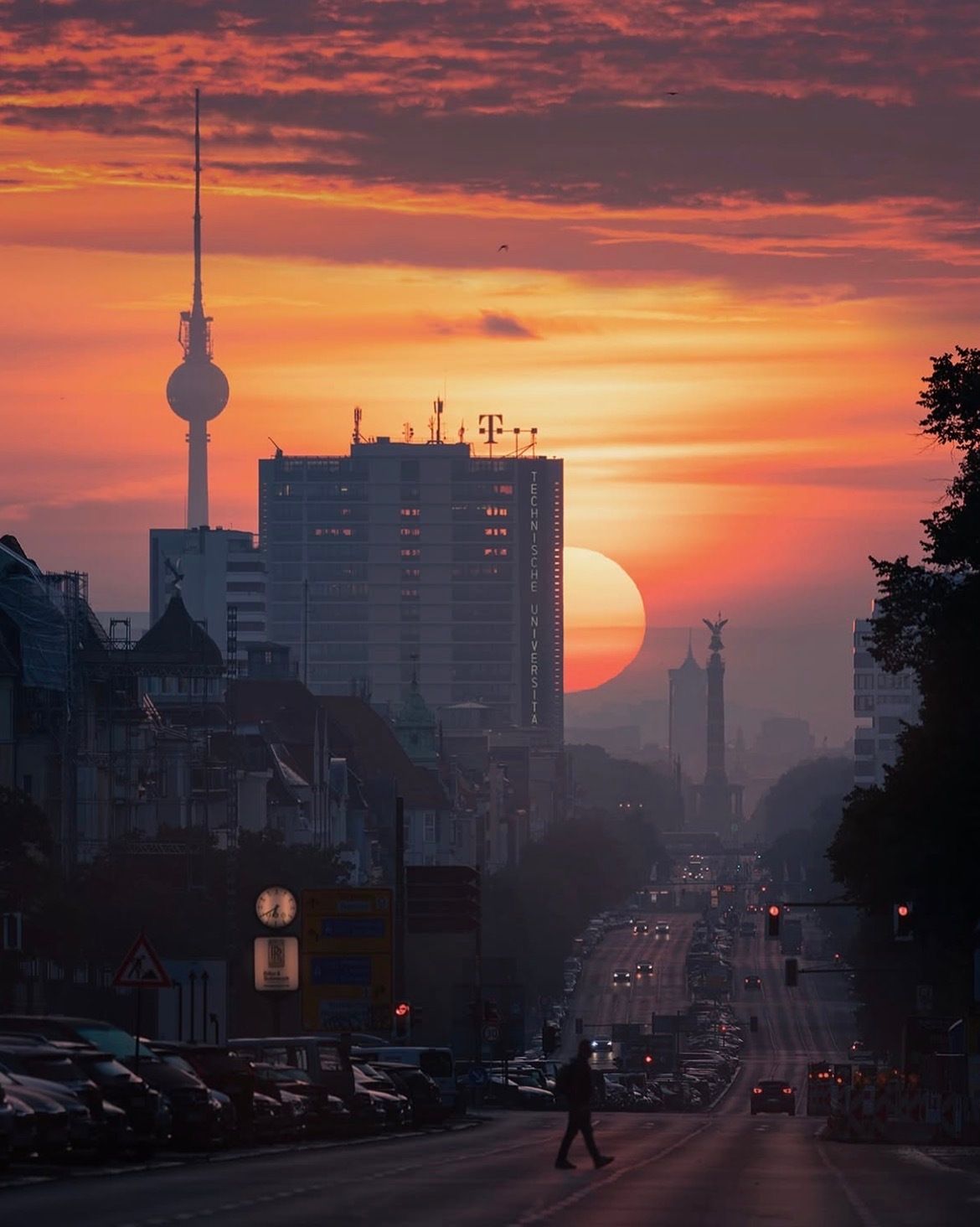
This week’s photo by: Patrick Noack
You can find him on Instagram as: @patrick.noack
Let’s Analyse this Image:
Composition & Framing
What works well:
Composition-wise, this photo is definitely interesting. In my opinion there are three main subjects → the man crossing the street, the sun, and the TV tower and they are all sitting in this sort of triangular balance. Your eye kind of bounces between them, which gives the image a nice flow and a touch of energy.
The leading lines of the street are subtle but powerful. They stretch into the distance and pull you right toward the sun (and the distant buildings of course (their shape/look will tell you where this was taken → Berlin)), adding a nice 3D sense of depth.
The layering here is also adds to the depth/3D look. You have got the man and the parked cars in the foreground, the midground street, and the faint outlines of the buildings, tower, and sun in the background.
The whole frame is full of detail but somehow doesn’t feel too busy. It is probably because the darker tones naturally quiet down certain areas, so the eye only focuses on what matters most, however if the viewer wishes to explore more they definitely can (for example the very faint ‘‘Technische Universität” (technical university) sign on the big building etc.)
What could be better:
The man crossing the street is great compositionally, but he is just a bit too underlit. Bringing him out slightly in editing could have helped anchor the foreground more clearly (and help paint a better story, more on that later).
The clock/sign on the left (where the parked cars are), is a bit of a distraction. It is bright and sits close to one of the main visual paths, pulling the eye away from the more meaningful parts of the image.
The framing overall is strong, though a tiny bit more sky above might have opened the image up more and given the composition a touch more breathing room (but that is only a suggestion).
Light & Atmosphere
What works well:
The light is definitely the star of the show, the huge glowing sun sitting on the horizon is what makes the shot special. It casts this warm, golden glow that fills the city with a cinematic mood.
The atmosphere is pretty great, there is that soft haze hanging over the scene (noticeable more towards the back), which helps separate the layers and gives the photo depth.
The orange and pink tones in the sky blend nicely into the cooler blues of the city. It is colourful and warm without feeling overdone, the edit is restrained enough that it still feels like something you could have actually seen with your own eyes, which I really like.
What could be better:
The shadows in the foreground are really dark, especially that bottom section around the man crossing the street. A bit of lifted shadow or local dodge could have helped define him and the surrounding area more clearly without ruining the mood.
Again, the clock sign on the left side feels a bit too bright and draws attention unnecessarily. It doesn’t ruin the balance, but your eye keeps catching it before moving back to the sun or tower.
Emotion & Story
What works well:
There is a really nice emotional tone to this shot, a kind of quiet, reflective city mood when the day is just about to end. The warm light makes it feel soft and nostalgic, but the long street leading into the distance adds a feeling of motion and life.
The person crossing the street adds just enough of a story to ‘‘humanise’’ everything. It is not much, just a silhouette walking across, but it says enough to make you wonder where they are going or what kind of day they have had.
The sun setting behind the buildings gives the whole shot this “end of day” symbolism. (+ you can also look at the clock and see exactly what time it is, that I guess is the only advantage of the clock, but again the sunset obviously already symbolises the time of day)
What could be better:
Story-wise, we are kind of left guessing a bit. We can assume the person is heading home after work or maybe just out for a walk, but because they are mostly in shadow, it is impossible to read more into them. If we could see their outfit or facial expression a bit better, it would help shape a clearer narrative.
The shot leans a little more toward aesthetic perfection than emotional storytelling, which isn’t necessarily bad, but it does make the story feel more distant.
Colour & Tone
What works well:
The colour palette is nice. Warm sunset oranges melting into cool blue-grey shadows.
Tone control is also pretty good. The bright sky, mid-level city haze, and deep shadows create a strong dynamic range that feels balanced overall.
As noted before, the editing is restrained in a way that keeps everything natural. It doesn’t feel like a “over-processed sunset photo”.
What could be better:
The lower section of the image could use a bit more tonality, some areas go from midtone straight to black, flattening the shadow detail.
A touch more cool tint in the foreground shadows might have helped balanced out all that warmth up top and added a touch more visual contrast.
Balance
The balance is good overall. The sun anchors the center of the frame, while the man and the tower help distribute visual weight across both vertical and horizontal axes.
The left and right sides balance nicely, the heavier shadow on the right gets offset by the buildings and light on the left.
The bottom is maybe just a little dense (between the cars, road, and signage, it holds a lot of weight) but it still works because the light and leading lines pull you upward so naturally.
The Rest of this Issue is for Premium Subscribers
