📸 The Magazine For Photographers - Bite Size
Read the Latest Photography News and Updates in the Creative Industry in 3-4 minutes or less ;)
In partnership with

Important Note: All photography articles are NOT sponsored
The Latest News:
Viltrox’s New AF 50mm f/1.4 Pro Lens

credits: Viltrox
Viltrox has announced the AF 50mm f/1.4 Pro, a fast standard prime lens built for full-frame Sony E mirrorless cameras. The lens uses a fairly complex optical formula with 15 elements in 11 groups, including three extra-low dispersion elements, one aspherical element, and eight high-refractive index lenses. This setup helps control colour fringing and distortion while keeping images sharp across the frame. With a wide f/1.4 aperture, it is capable of handling low light well and produces a shallow depth of field.
The minimum focusing distance is 0.45 meters, offering a maximum magnification of 0.145x. Viltrox says sharpness stays consistent even wide open at f/1.4, which should make it a strong performer for both stills and video. Autofocus is powered by a Hyper VCM (voice coil motor) system that operates quietly and quickly, an important detail for tracking moving subjects or recording video where noise can be an issue. The lens also uses an internal focusing design, so the barrel doesn’t extend while focusing.
For video work, the AF 50mm f/1.4 Pro shows minimal focus breathing and almost no field-of-view shift when changing focus. It has an 11-blade aperture for rounder bokeh, a 77mm filter thread, and weighs about 800 grams. Physically, it measures 111mm long with a diameter of 84.5mm and it offers a 46.6° field of view.
You can see full details and sample shots on Viltrox’s Amazon page here
VSCO Launches AI Lab For Photographers

credits: VSCO
VSCO is stepping further into AI-powered editing with something they are calling AI Lab, a new set of tools built to make photo editing faster and more intuitive inside the VSCO app. The first tool to launch is called Remove, which lets you erase unwanted objects from your shots using simple Brush, Tap, or Lasso selections. Another tool, Upscale, is on the way and will let users boost resolution and sharpen details without throwing off colours or textures.
At the core of AI Lab is Black Forest Lab’s FLUX.1 Context model, which VSCO has combined with its own in-house tech tuned specifically for photographers. It supports high-resolution RAW editing and automatically creates non-destructive copies so originals stay untouched. The company says the goal is not to automate creativity, but to give photographers smarter ways to handle repetitive edits and cleanup work.
AI Lab follows VSCO’s earlier experiment with VSCO Canvas, an AI mood board tool for creatives that came out earlier this year. Both are part of a larger move by the company to blend AI with traditional photography tools without losing the artistic side of image-making. AI Lab is available now in VSCO Studio for iOS, though it is limited to VSCO Pro members.
You can see full details on VSCO’s website here
Explore The World’s Best Photography Locations
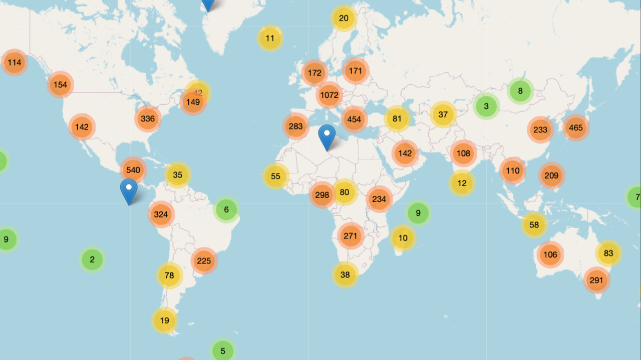
Get access to the world’s best photography location map - explore tens of thousands of amazing photo spots across the globe!
Something You Have To Check Out
AI is something that most photographers/creatives see critically, and for absolutely good reason. HOWEVER the fact at the end of the day is that there sadly is no stopping AI, so the best thing you can do is learn how to use AI to your own advantage, whether that be with helping you with daily tasks, writing, editing, your day-job etc.
This is where ‘‘The Rundown AI’’ Newsletter comes in. It will teach you how to use AI to your advantage, increase your work efficiency (something every creative needs) etc.
Feel free to check it out, I read it myself (+ it is completely free) ⬇️
Learn AI in 5 minutes a day

This is the easiest way for a busy person wanting to learn AI in as little time as possible:
Sign up for The Rundown AI newsletter
They send you 5-minute email updates on the latest AI news and how to use it
You learn how to become 2x more productive by leveraging AI
Photo Analysis
Welcome to a new addition to the magazine: the photo analysis, where I will analyse a photo and talk about the composition, lighting what’s positive, what’s negative etc. so that you can learn and better your own photography from it ;)
This week’s photo by: Bruno Sousa
You can find him on Instagram as: @the.brunosousa.view

Let’s Analyse this Image:
Composition & Framing
What works well:
The composition is pretty strong overall —> it’s clean, balanced, and intentional. Everything lines up nicely, and the perspective pulls your eye right to the center.
The leading lines are great, everything from the lanterns to the railings (also very subtle those light rails in the asphalt) naturally guides your eye straight to where our subject is standing.
The colour pop on the subject is really good. The orange outfit grabs attention instantly, but it doesn’t feel overdone or too saturated so it fits right in with the muted tones around it very naturally.
The depth is amazing. All those repeating structures and lines disappear into the distance, creating depth. And because of how the bridge is built (so the structure of it), it gives the photo almost a tunnel-like effect, meaning it really boxes everything in and keeps your eye locked in the middle.
What could be better:
The foreground feels a bit too strong in my opinion. It takes up a lot of the frame, and even though it is technically almost around the middle, it just feels heavy. A slightly higher shooting angle might have helped balance that out.
The vertical balance (so left/right) is interesting —> the building on the left gives the left side some weight, and that gets “sort of” balanced out by the trees + the one bird on the right. The noteworthy part is, that the bird doesn’t actually balance it out in terms of ‘‘visual weight’’ of course, but it gives us something to look at on that side, and even that helps with balance.
The depth is great, but maybe just a bit more visibility in the distance could have made it even stronger.
Light & Atmosphere
What works well:
The atmosphere in this shot is solid, the heavy fog gives the whole image a calm and cinematic touch. It softens all the background details and makes the bridge structure look like it is fading into infinity.
The light is very soft and diffused, which works for this type of scene and mood. No harsh shadows, no blown-out highlights, just the even lighting that ties everything together.
The fog also does a great job simplifying the palette (this of course can be a positive or negative depending on your own philosophy). It lets the orange of our subject’s clothes really stand out without feeling unnatural.
What could be better:
The light, while beautiful and fitting, is maybe a little too flat. A touch more contrast could have helped bring out some of the nice texture in the floor and the details in the bridge without destroying the mood.
A tiny hint of warmth in the highlights might have helped balance all the cool blue tones and made the atmosphere feel a bit richer.
Emotion & Story
What works well:
There is something really calm and introspective about this. The man walking alone on this bridge, one little bird flying around, it all gives the photo a feeling of solitude, but not in a sad way, more in a reflective/peaceful way.
The soft fog and muted tones add to that story perfectly. It definitely feels/looks like an early morning run (supported by the clothes the man is wearing —> bright orange t-shirt, shorts and orange running shoes).
Again, the pop of orange adds a bit of life into all the stillness. It gives the image a small touch of energy without taking away from the peaceful mood.
What could be better:
The photo is a little bit more about mood than story. It looks great, but it doesn’t really go beyond “a man walking/running in the fog.” Maybe a closer look at our subject could have helped create a better connection (we can’t see his face so he readings anonymous), but also not every photo needs a huge and spectacular story. (And to be fair, because we can actually clearly identify what the man is wearing we can paint a better picture/story —> he was/is on a run)
Colour & Tone
What works well:
The colours are controlled nicely. The cool grey-blues dominate the frame, and then that single orange accent from the subject really pops out, it is a nice balance.
The fog naturally desaturates everything, which again works for this kind of moody tone —> it makes the photo feel cohesive and cinematic.
Tones are soft and low contrast, which fits the atmosphere well. It is all minimal and clean, and nothing feels overly edited/pushed.
What could be better:
The colours might be a little too desaturated overall. A slight bump in contrast or saturation could make the photo feel a bit more dynamic without losing the mood (for example —> a bit more saturation on the lights could have given overall more balance/dynamic + even exaggerate the leading lines effect (because then they would have popped out more)) .
The highlights could use a small lift, the sky looks a bit too flat and could use a tiny touch of brightness to balance the darker/heavier floor.
A little more separation between the midtones of the subject and the foggy background would make the man pop even more.
Balance
The photo is well-balanced overall, the symmetry of the bridge and the centred subject make it all look clean.
Again, the left side, with the faint outline of the building, carries a bit more weight, but the bird on the right helps offset that imbalance and gives the eye a little counterpoint to land on.
The horizontal balance with the strong foreground might be a bit too ‘‘off’’ for some tastes.
The Rest of this Issue is for Premium Subscribers
