📸 The Magazine For Photographers - Bite Size
Read the Latest Photography News and Updates in the Creative Industry in 3-4 minutes or less ;)
In partnership with

Important Note: All photography articles are NOT sponsored
The Latest News:
Lomography’s Revived Petzval Art Lenses
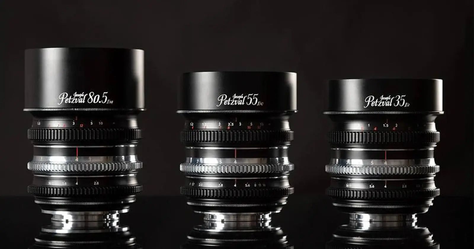
credits: Lomography
Lomography has revived its classic Petzval lens design with a modern twist, announcing the new Joseph Petzval Focus-Coupled Bokeh Control Art Lens Series. Designed for full-frame mirrorless systems, the new lineup spans five focal lengths (27mm, 35mm, 55mm, 80.5mm, and 135mm) and blends vintage optical character with modern usability. Inspired by Joseph Petzval’s 1840 portrait lens, the refreshed designs now feature mechanical bokeh controls tied to the lens’s focus ring, creating a more fluid transition of bokeh as focus shifts. Other upgrades include refined manual controls and native mirrorless mounts (Sony E, Canon RF, Nikon Z).
The standout feature of these lenses is the adjustable swirling bokeh, a hallmark of the Petzval look. Each lens now offers seven levels of bokeh intensity, controlled by a chrome ring near the lens mount. The swirl effect varies naturally depending on how far the subject is from the background, and thanks to the new focus-coupled system, this transition now happens smoothly during focus pulls. That’s paired with a fully de-clicked aperture ring, a 180° focus throw, and standardised 0.8 pitch gears across the series for use with follow-focus systems.
Three lenses (the 35mm f/2, 55mm f/1.7, and 80.5mm f/1.9) are available for preorder now at $499 each, while the 27mm and 135mm models are still in development. Each lens features a compact optical design, with the 35mm offering a five-element/four-group formula and the others using four-element designs. All three currently announced lenses share a 67mm filter thread. A closer look at the new lenses will follow in this week’s Sunday magazine issue ;)
You can see full details on Lomography’s website here
Ulanzi’s New Compact Flash
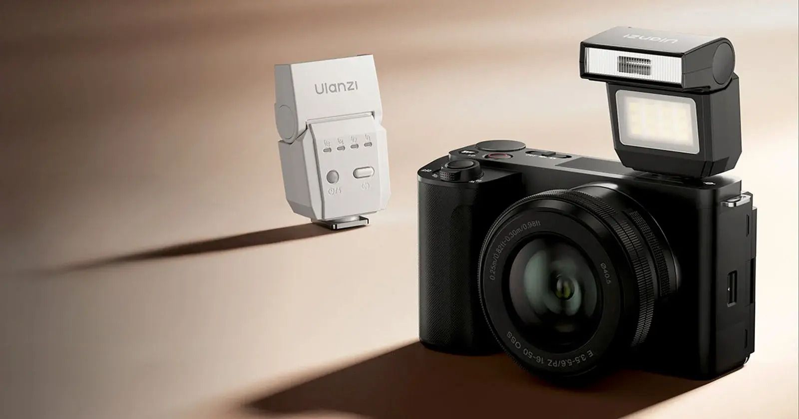
credits: Ulanzi
Ulanzi has officially introduced the SL03 Spark Lite, a compact and affordable camera flash fort photographers who need a lightweight, travel-friendly lighting option. Measuring just 2.7 by 1.7 by 0.9 inches and weighing 43 grams, the unit is notably smaller than most flashes on the market and is built with a durable plastic shell. It charges via USB-C and is powered by a 300mAh battery, which provides up to 500 full-power flashes per charge. The flash is compatible with a wide range of cameras via a single-pin hot shoe, though it lacks support for brand-specific features like TTL metering.
The SL03 Spark Lite includes both a traditional flash mode and a constant light mode. In flash mode, users can cycle through four power levels, with a maximum Guide Number of 8 at ISO 100. Recycle times range from near-instant at lower power levels to around 2.5 seconds at full power. The constant mode offers a fixed 1W output at roughly 130 lux from half a meter, with a stable color temperature of 5600K and a CRI around 97, which should be suitable for basic video or ambient light support.
At a price of $25, the SL03 positions itself as a basic little utility tool rather than a high-performance lighting solution. While it won’t replace more powerful or feature-rich flashes, it could serve as a useful backup or entry-level option, especially for casual shooting scenarios or beginners.
You can see full details on Ulanzi’s website here
Something You Have To Check Out
Down below you will find an AMAZING newsletter that I myself read every single day (absolutely recommend subscribing + it’s completely free) ⬇️
Looking for unbiased, fact-based news? Join 1440 today.
Join over 4 million Americans who start their day with 1440 – your daily digest for unbiased, fact-centric news. From politics to sports, we cover it all by analyzing over 100 sources. Our concise, 5-minute read lands in your inbox each morning at no cost. Experience news without the noise; let 1440 help you make up your own mind. Sign up now and invite your friends and family to be part of the informed.
Photo Analysis
Welcome to a new addition to the magazine: the photo analysis, where I will analyse a photo and talk about the composition, lighting what’s positive, what’s negative etc. so that you can learn and better your own photography from it ;)
This week’s photo by: Kam
You can find him on Instagram as: @kam_visions
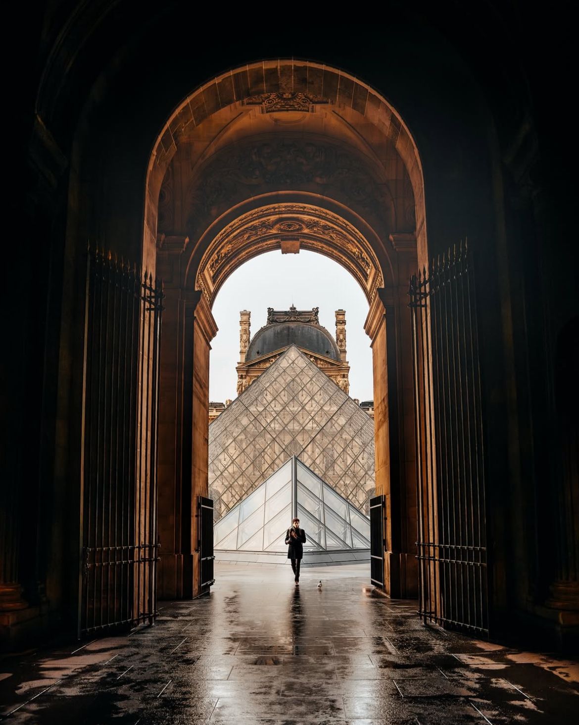
Let’s Analyse this Image:
Light & Atmosphere
What works well:
The light is soft but purposeful. It spills in from outside, hitting the arches and floor just enough to bring out the warm textures.
That light, golden glow on the stone architecture is rich and moody. It balances really nicely with the cool tones of the glass pyramids and sky.
What could be better:
The shadows inside the archway are a touch too deep. Lifting them just slightly would bring out more detail without losing the mood.
The light on the person is a bit flat. A subtle rim light or more directionality could make them pop better (but it is not that bad).
Some parts of the stone (especially near the base) feel a little muddy/underexposed.
Structure & Composition
What works well:
There are good leading lines and overall balance in this picture. The viewer’s eye is guided straight to the pyramid and person with zero confusion (well your eyes might go down and right to the little pigeon once you notice it).
The arch creates a literal frame within the frame, very effective.
The vertical lines (from the gates, the pyramid edges, even the pavement reflections) make the whole thing feel stable and structured.
What could be better:
It’s very centred (which works here) but the symmetry isn’t totally perfect. The person got caught mid step and thus leans a hair to the left, and that slight imbalance becomes more obvious the longer you look (and then there is the pigeon of course, however a lot of people would say that this is a welcome break from the symmetry (like and imperfect perfection)).
The horizon line cuts just below the pyramid cap, which creates an odd stacking of shapes. Slightly adjusting the camera angle/repositioning yourself could have solved this.
Colour & Tone
What works well:
The colour grading is tasteful, subtle golds and soft blues that contrast without clashing.
The dark interior against the bright exterior is a strong tonal play. It creates depth without feeling too high-contrast or artificial.
What could be better:
There’s a very subtle color cast in the shadows (slightly greenish (around the gates)), not a dealbreaker, but it could be cleaned up.
The blues in the glass pyramid feel a bit muted compared to the warmth in the stone. A slight lift there could balance them better.
As noted before, some floor tiles feel a bit washed out in places. A touch more contrast or warmth in the reflections could pull the bottom half together.
Framing & Geometry
What works well:
This whole shot feels like it was composed by a perfectionist, in a good way. Arches, triangles, verticals, it’s a nice play of geometry.
The more you look, the better it gets. The pyramids are nested within the dome, all inside the arch, behind is the Louvre and all is ‘‘opened up’’ because of the open gates. It’s like Russian dolls of architecture.
What could be better:
The slight imperfection in the person’s stance, stands out more because the frame is so geometric (as does the pigeon). So either embracing asymmetry, or nailing the centre could have been the call here. However the longer I look at it, the better I like the pigeon.
The top of the arch is incredibly detailed, but gets lost in the shadows. A bit more light or dodge could bring out the carvings. I think this deserves to be seen!
Explore The World’s Best Photography Locations

Get access to the world’s best photography location map - explore tens of thousands of amazing photo spots across the globe!
The Rest of this Issue is for Premium Subscribers
