📸 The Magazine For Photographers - Bite Size
Read the Latest Photography News and Updates in the Creative Industry in 3-4 minutes or less ;)
In partnership with

Important Note: All photography articles are NOT sponsored
The Latest News:
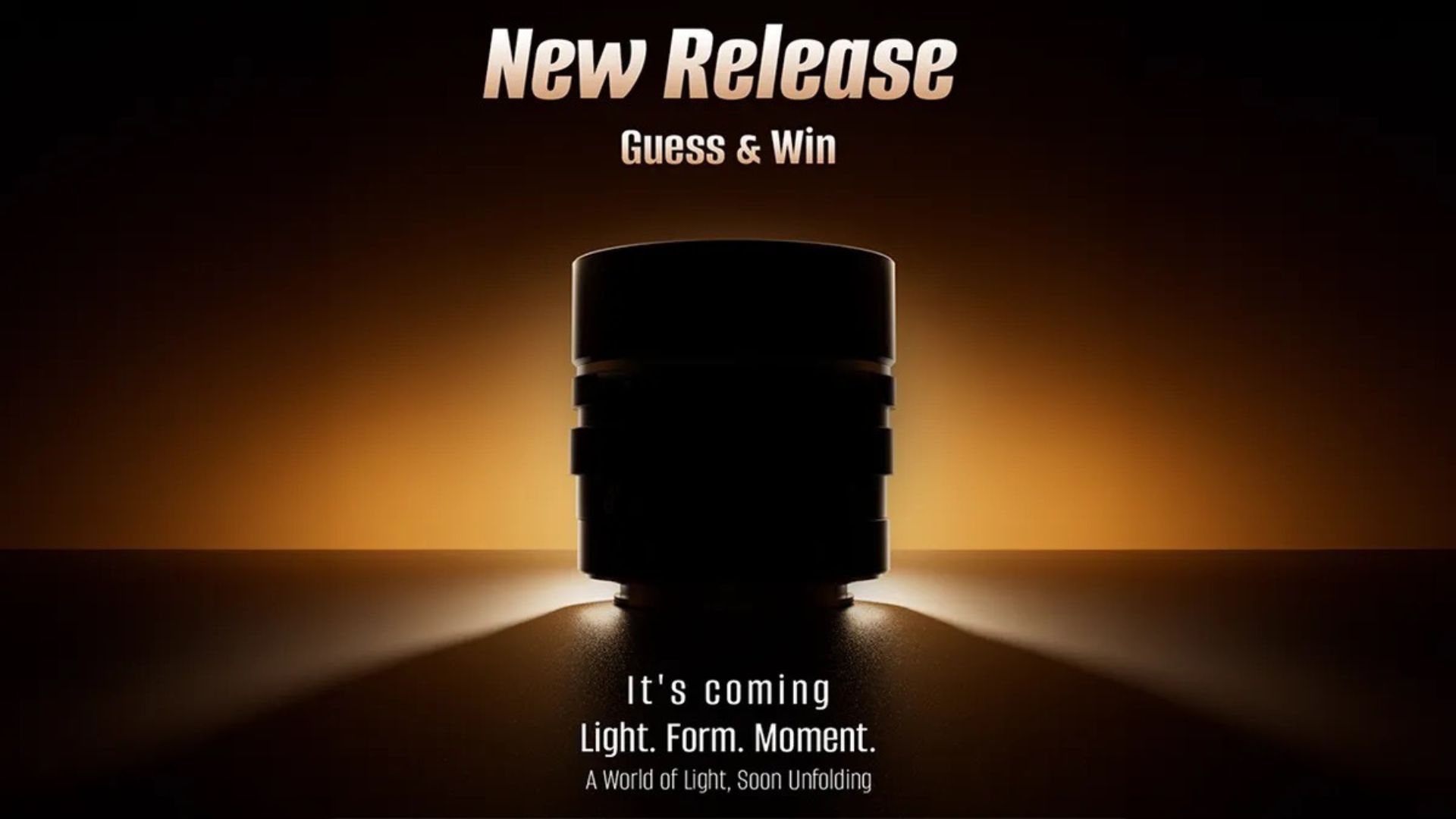
Viltrox’s New 2x Teleconverter Is Here

credits: Viltrox
Viltrox has had a busy December, and on top of its new X100-series conversion lenses (which we will take a closer look at in this week’s Sunday issue), the company has also rolled out a 2x teleconverter for Sony E-mount. The new converter is already listed at B&H, and Viltrox says it works with the same Sony telephoto lenses supported by Sony’s own 2x converter. That includes the Sony 70–200mm f/2.8 GM and GM II, the 100–400mm, 200–600mm, and 400–800mm zooms, plus Sony’s big primes like the 300mm f/2.8 GM, 400mm f/2.8 GM, and 600mm f/4 GM. Viltrox also adds compatibility with its own 135mm f/1.8, giving that portrait lens a much longer, more unusual reach option.
While compatibility mirrors Sony’s lineup, pricing certainly doesn’t. Sony’s FE 2x Teleconverter comes in at $598, and Viltrox is positioning its version at $280, so about half the cost. The company claims comparable optical performance, and the usual trade-offs of using a teleconverter apply regardless of the brand. A 2x converter doubles the focal length of whatever lens it’s attached to, so a 400–800mm zoom becomes an 800–1600mm lens. But maximum aperture also drops by two stops, meaning a constant f/2.8 zoom becomes an f/5.6, and slower super-telephoto zooms (like the 400–800mm f/6.3–8) can hit f/16 at the long end.
That makes reach the main selling point here, with the teleconverter giving photographers a way to push their Sony telephotos into far longer territory without buying a dedicated super-tele lens. The downside of course is the expected loss in light and potential autofocus limitations, especially at very small apertures. The Viltrox 2x Teleconverter for Sony E-mount is available to order for $280, with B&H estimating availability within the next couple of weeks.
You can see full details on B&H’s website here
7Artisans Teases Upcoming Lens
credits: 7Artisans
7Artisans started teasing its next lens, posting a silhouetted shot of it along with three clues: 1. large aperture for stunning bokeh, 2. portrait focal length for beautiful detail, 3. precision focus for total creative control. Taken together, the hints point toward a classic portrait prime, most likely something in the 85mm range if it is full-frame, paired with an aperture faster than f/1.8. An f/1.4 (or even wider) which would match the kind of shallow-depth-of-field look the company is hinting at.
To stir the pot even more, 7Artisans also turned the reveal into a small guessing game on Instagram, where people can try to identify the lens based on the clues and teaser photo. Four lucky participants will be picked at random to receive some exclusive merch, with winners announced on December 16th.
The phrasing around ‘precision focus’ suggests this might be a manual-focus lens, especially if 7Artisans plans to release it across multiple mounts. Fast primes are harder and more expensive to engineer with autofocus, so going manual would make sense and would also separate the lens from the brand’s existing AF 85mm f/1.8 for Sony E-mount. That lens already covers the budget autofocus portrait niche, but its f/1.8 aperture leaves a gap for something faster and more character-driven. Past that, 7Artisans hasn’t shared any specific specs, no optical diagram, no mount list, not even a release window.
You can see the teaser on 7Artisans’ Instagram page here
Explore The World’s Best Photography Locations
Get access to the world’s best photography location map - explore tens of thousands of amazing photo spots across the globe!
Something You Have To Check Out
Turn AI Into Your Income Stream

The AI economy is booming, and smart entrepreneurs are already profiting. Subscribe to Mindstream and get instant access to 200+ proven strategies to monetize AI tools like ChatGPT, Midjourney, and more. From content creation to automation services, discover actionable ways to build your AI-powered income. No coding required, just practical strategies that work.
Photo Analysis
Welcome to a new addition to the magazine: the photo analysis, where I will analyse a photo and talk about the composition, lighting what’s positive, what’s negative etc. so that you can learn and better your own photography from it ;)
This week’s photo by: Pete
You can find him on Instagram as: @petewan

Let’s Analyse this Image:
Composition & Framing
What works well:
The S-shaped leading line is, in my opinion, the star of the composition. It is one of those rare cases where the environment naturally carves out a perfect visual path for us photographers to use.
There are actually two main leading lines, the row of concrete bollards and the faint reflective lines in the ground beside them (the fact that it rained before really plays into the cards of the photographer here because the shimmer exaggerates the lines beautifully).
Together, these lines guide your eye smoothly toward the relatively small silhouette (more on that below) in the fog, creating a strong sense of depth, 3D effect and because of that S shape a really nice flow.
What could be better:
As always with leading lines, a slightly lower shooting angle could have exaggerated the S-curve even more and made the leading lines even stronger (of course there is a limit to how low you want to get depending on several factors, for example you don’t want to get so low that it would hurt the sense of depth).
The person is quite small and not very distinguishable, especially the person’s light pants which blend a little too much with the fog behind them. The jacket, though, separates fairly well from the background, but the overall silhouette doesn’t anchor the frame as strongly as it could.
The bright blue sign on the first left building is a bit distracting, it pulls the eye away from the flow of the composition and could have been avoided simply by a slight shift in framing (or you could edit it out of course (controversial option, I know).
Light & Atmosphere
What works well:
The atmosphere is pretty great, we have that thick, milky fog softening everything in the background and giving the scene this dreamy, cinematic look.
The streetlights glowing through the haze create beautiful halos and make the whole upper part of the image feel pretty surreal and ghostly (in a good way).
As mentioned before, the faint shimmer on the wet ground nicely reflects the streetlights, and the glow is part of what strengthens the leading lines.
What could be better:
The first lamp on the left emits a strong blue light that feels a little inconsistent with the otherwise muted palette + it also pulls a bit too much attention (the ‘‘problem’’ is mostly that it’s only one blue light really and that it is COMPARATIVELY bright).
A few of the highlights blow out in the upper fog area, causing detail to disappear. Slight highlight recovery could help.
Some shadows are really crushed which removes potential texture that could have enriched the scene.
Emotion & Story
What works well:
The lone person walking through the fog immediately communicates solitude, introspection, and a sense of quiet nighttime stillness.
The soft glow of the streetlights reinforce a mood that feels both eerie and peaceful at the same time.
All things combined, so the fog, empty street, and long distance between viewer and subject all evoke a very late-night atmosphere (so the atmosphere itself helps immensely with storytelling here).
What could be better:
The person is simply a little too far away to read any real detail or gesture, we can’t see whether they are on the phone, holding something, dressed formally or casually, etc.
Without readable details, storytelling becomes pretty limited. The only clue is the maybe the jacket and posture, which implies cold weather.
Colour & Tone
What works well:
The relatively cool, foggy palette fits the atmosphere and enhances the sense of coldness/quiet.
The interplay between a few cool blue tones and warm/white lights adds subtle complexity + balance (so the bright blue street light on the left is not all negative (the sign though, in my opinion, still a bit of an issue)).
What could be better:
Colour-wise, there is some noticeable inconsistency/problems with transitions. The upper (left) street and the area directly hit by the street lights lean very white, while everything in shadow takes on a strong greenish tint. The part where you can notice the inconsistency (the bad transition most) is the top-right corner of the trees, right where the bright light from the left meet the shadows, the colour jumps abruptly from grayish-white to really full-on green with almost no transition.
The problem, or course, isn’t really the greenish tone that can be a stylistic choice but it is more about the consistency and not so great transitions (i am viewing this photo on my Samsung monitor, so just a note it could look slightly different (more or less exaggerated) on your own screen).
Balance
The left side has more visual weight because of darker buildings, the bright blue sign, and more visual clutter in general. The right has more breathing room due to the ‘openness’ of the fog, but that also means it visually feels lighter (so it is a bit off balance).
The glowing streetlights definitely help stabilise the image by drawing your eye back toward the centre.
The S-curve does a lot of work to keep the eye moving smoothly through the scene, preventing it from feeling too lopsided.
The Rest of this Issue is for Premium Subscribers
